
Coral
#FF7F50- Light Coral
- Coral Pink
- Tomato
Color comparison
“Coral and salmon are the same orangey pink.” Put each one by your face. One speaks up, the other sits back.
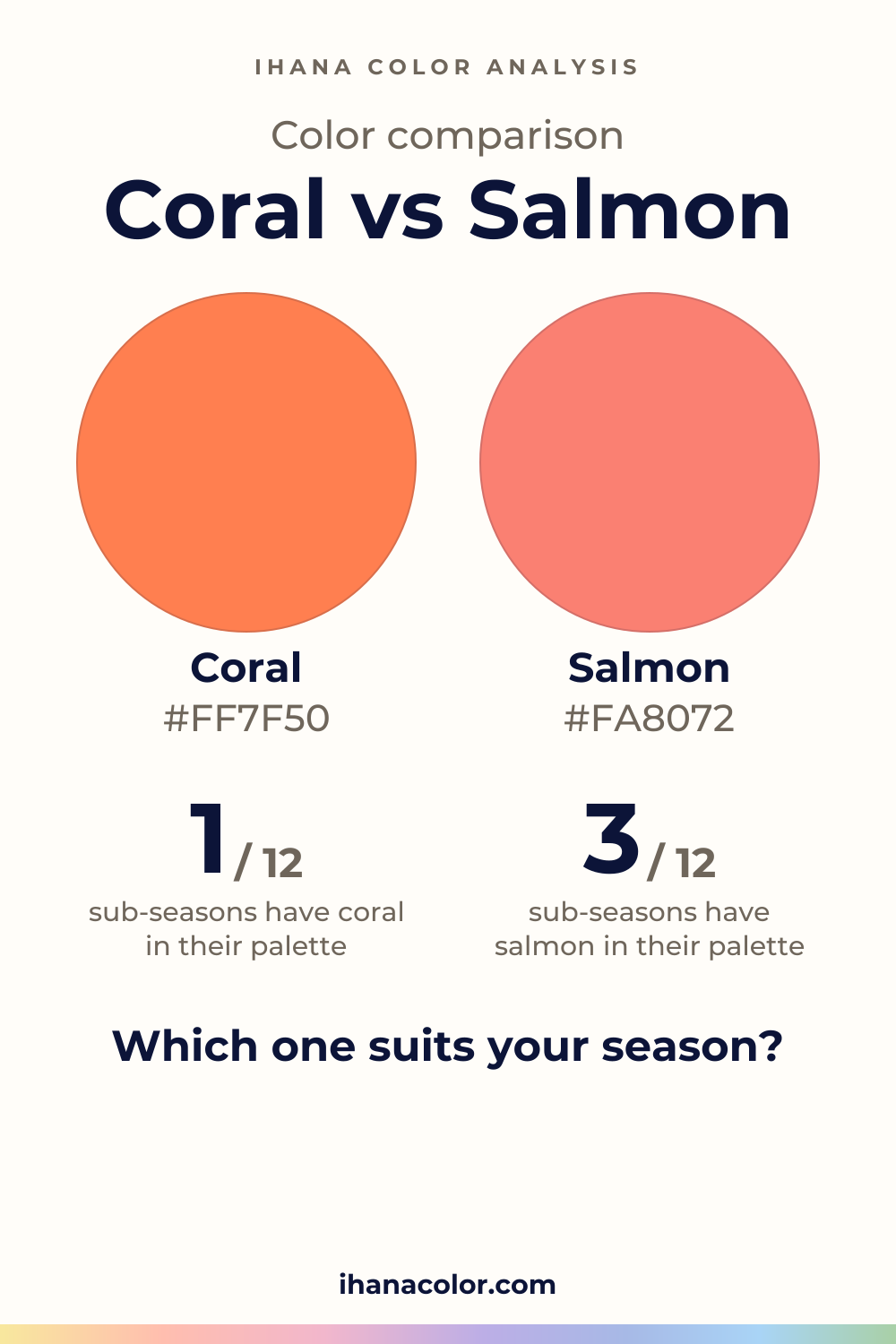
#FF7F50#FA8072Side by side
Coral is more vivid, and the two are about as light as each other; both sit in the red range.
Coral is a light, vivid red. It has energy, and it shows from across a room.
The shades I group under it are Coral, Light Coral, Coral Pink and Tomato. Coral Pink is the lightest of them, and Tomato the most intense. Light Coral is the gentlest, so if coral feels loud on you, start there before you give up on the family.
Near a face, coral asks for something in return. It brings a lot of color to the skin, so the face needs enough presence of its own to answer. When it does, the complexion looks lit. When it doesn’t, you see the sweater first and the person second.
On a fabric, coral reads as clear and saturated. It looks crisp in a plain knit and a little theatrical in a shiny one.
Salmon is also a light red, but a medium one in intensity. All four of its shades share that: Salmon, Light Salmon, Dark Salmon and Salmon Pink.
Light Salmon is the lightest. Salmon itself is the deepest and the most intense of the four. Salmon Pink is the one that leans toward pink.
Near a face, salmon behaves like a soft light. It adds warmth to the skin without taking over, and it forgives a low-contrast face that coral would swallow.
On a fabric, salmon looks calmer and more blended, closer to a tint than to a signal. If a coral top feels like a statement, a salmon one feels like a mood.
Only in one place, and it is intensity. Coral is the more vivid. Lightness is about the same for both, and both sit in the red range.
So don’t look for a difference in depth or hue. You will not find it. Hold a coral and a salmon side by side and ask one question: which one is louder?
On a face, the louder one competes with your own coloring. If your eyes, lips and hair are soft and close in tone, a vivid coral takes the lead and you follow. If your features are strongly defined, a vivid coral meets them halfway, and salmon can look a little pale next to them.
On a fabric, the gap is easiest to see in a flat color. A solid coral top looks charged. The salmon one looks quiet. In a print, the two blur, so test them as plain pieces.
Here the picks do the work. Five sub-seasons take salmon only: Light Spring, Bright Spring, Light Summer, Cool Summer and Soft Summer.
Take Light Spring. Salmon sits in its palette, matched with Light Coral. Coral is only a neighbor there. Light Spring is light and fresh, so the gentler version fits.
The three Summers are the clearest case. They are cool and soft, and coral is on their avoid list. Salmon is close to their palette: Pale Strawberry for Light Summer, Cool Watermelon for Cool Summer, Dusty Rose for Soft Summer. Coral is too vivid and too warm in feeling for a face that wants haze.
Warm Spring is the one sub-season that has both in its palette. It is very warm and bright, so it can carry the full strength of coral and the ease of salmon.
Two more have both, but only as neighbors: Soft Autumn and Warm Autumn. Coral is near Light Terracotta for the first and Burnt Coral for the second. Salmon is near Warm Dusty Rose for Soft Autumn and Burnt Coral for Warm Autumn.
Deep Autumn takes coral only, as a neighbor of Spiced Orange. It is dark, rich and intense, so the stronger color holds. Salmon is not for it, and Spiced Orange is the stand-in, not a match.
Deep Winter, True Winter and Bright Winter take neither. Their closest reds are Pure Red, Raspberry Red and Bright Red. Those are stand-ins, and they are a different color altogether.
Do the test once, in daylight with a bare face, one color at a time. The setup is in my article on color draping at home.
Watch for the glow, then for the shadows under your eyes. If the fabric wins, step down in intensity.
Coral pairs with white, navy, teal, light gray, tan and olive. White keeps it crisp, navy gives it weight, and teal makes the red look brighter. Light gray and tan quiet it down.
For salmon I list no partners. Look instead for colors that match its calm: nothing that shouts, nothing much stronger than it. The pair should look like one soft idea, not a contest.
If your sub-season takes neither, wear them away from your face, in a skirt or pants. For other near neighbors, see coral vs peach, or browse the color guides.
Which one suits you
Each color is checked against the palette of each sub-season, color by color. This is a first hint, not a verdict: see how it looks on your own face.
Salmon is the one for you
Both work for you
Salmon is the one for you
Salmon is the one for you
Salmon is the one for you
Salmon is the one for you
Both are close to your palette
Both are close to your palette
Coral is the one for you
Neither is for you
Closest in your palettePure Red
Neither is for you
Closest in your paletteBright Cool Pink
Neither is for you
Closest in your paletteBright Red
Questions
No. They share a lightness and the red range, but coral is more vivid and salmon is softer. That one difference changes how each behaves near a face. Coral takes the lead, salmon blends in.
About the same. Both are light, so lightness will not help you decide. Look at intensity instead. Coral is the more vivid, and salmon is the one that looks toned down beside it.
It depends on your sub-season. The free color analysis quiz points to a likely season and a hint of your sub-season. It can’t see your skin react to a color, so confirm with a drape near your face.
Yes, if your sub-season has both: Warm Spring does, and Soft Autumn and Warm Autumn come close. Elsewhere, pick the one your palette favors and keep the other away from your face.
White, navy, teal, light gray, tan and olive. White and navy give the clearest contrast, while light gray and tan soften it. Salmon has no listed partners, so keep it with quiet colors.
Carefully. A screen, a bulb and the dye all shift a color, so a swatch on your phone is only a reference. Check a real fabric near your face in daylight before you buy.
Keep it
The two colors side by side, ready to pin or to keep on your phone.
Download the imageKeep exploring
Colors that go with coral, and why the right coral changes with your sub-season. The shades, the pairings to skip, the stand-ins when coral is not yours.
Coral vs peach, settled: coral is vivid and red, peach is pale and muted. See which sub-seasons take one, both or neither, and how to test them at home.
The quiz shows you your likely season and a sub-season hint, with no sign-up. A first hint, not a verdict.
Full palette, capsule wardrobe, makeup, hair and a shopping list for each sub-season. Not on sale yet: join the waitlist.
Twelve sub-seasons instead of sixteen, the three things we look at, and why a quiz is only a first hint.
The free quiz shows you your likely season in two minutes. Then hold both colors up to your bare face, in daylight: a first hint, not a verdict.