
At the office
Terracotta blazer, cream shirt, charcoal pants
Oranges and yellows · 5 shades
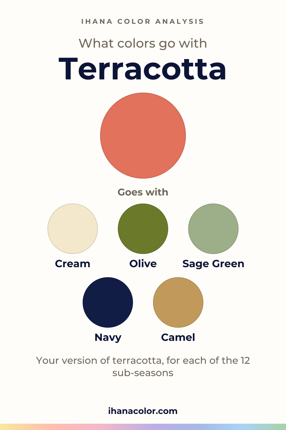
What goes with terracotta? Less than you’d think. The partners are easy. The color is the hard part. It’s a family of five, and your sub-season picks the member.
#E2725B#E97451#CB6D51#B7410E#A0522DFive colors that go with terracotta
Always works
Each block has three colors: the color itself and two partners.
Terracotta + Cream + Olive
Terracotta + Sage Green + Navy
Terracotta + Camel + White
Outfits
Three ways to wear it, written as color blocks you can rebuild with what you own.
Terracotta blazer, cream shirt, charcoal pants
Terracotta sweater, denim blue jeans, chocolate boots
Terracotta dress, olive jacket, camel heels
Four of the five shades read red. Only Sienna leans toward red-orange. So terracotta sits on the red side of orange on the color wheel, not in the middle of it.
What separates the five is mostly lightness and intensity. Burnt Sienna is the lightest and the only one called light. Terracotta, Copper Red, Rust and Sienna all sit at medium, with Sienna the darkest of them. Rust is the most intense of the family, and Sienna the least.
That’s why one tag can hide two different colors. A name on a tag is a direction, not one code. The fabric, the dye and the lamp in the room each pull it somewhere else.
If you’re weighing terracotta against a neighbor like burnt orange, the terracotta or burnt orange comparison goes further.
Because each sub-season has its own temperature, depth and softness, and terracotta has to fit all three.
Start with the palettes that keep it. Warm Spring wears Burnt Sienna, matched with Coral, in a medium-to-light, bright palette. Bright Spring wears Terracotta, matched with Bright Coral.
The Autumns take three different versions. Warm Autumn is very warm and rich, so it wears Rust, matched with Rust itself. Deep Autumn is dark and high in contrast, so it wears Sienna, matched with Dark Copper. Soft Autumn is very soft: its Copper Red is matched with Light Terracotta.
Two only have a neighbor. For Light Spring, a neighbor of Terracotta is in the palette: Light Coral. For Bright Winter, a neighbor of Rust is in the palette: Bright Red.
Five say no. Cool Summer avoids terracotta itself. Deep Winter avoids rust itself.
Light Summer, Soft Summer and True Winter sit close to an orange their palettes avoid. All five palettes run from slightly cool to very cool, and that is where the gap with this red-leaning family opens.
Near the face, put something between the color and your skin. A cream or another neutral from your palette, as a collar or a top, does the job. It sends light up and keeps the terracotta from taking over.
Depth matters too. Sienna, the darkest of the five, sits heavier under the chin than Burnt Sienna, the lightest. If your sub-season has no version, wear its stand-in near the face.
Build every outfit on one neutral and one accent, and let terracotta be the third voice. Olive and camel are quiet next to it. Navy gives it a firm edge. Sage green softens it. In my view, a fourth outfit comes easily: a terracotta sweater, charcoal pants, camel heels.
Lower down, terracotta asks for less. In pants, boots or heels, the choice of shade matters less than it does at the collar.
Skip orange. It lands on nearly the same tone, so the two melt into one patch and terracotta loses its edge. Skip hot pink as well: two loud colors compete, and your face is what gets overlooked.
If your sub-season says no, nothing stops you from wearing terracotta in pants or boots. Near the face, take the closest color of your palette instead, such as Pale Strawberry for Light Summer or Dusty Rose for Soft Summer. It substitutes for terracotta. It doesn’t copy it.
Your sub-season
Your own version of terracotta, the colors of your palette that go with it, or the color that stands in for it. Each answer is computed from the palette of the sub-season.
#E2725BClose to your Light CoralGoes with it, in your paletteIvoryMint
#E97451Matches your CoralGoes with it, in your paletteCreamGolden Apricot
#E2725BMatches your Bright CoralGoes with it, in your paletteWarm Off-WhiteTurquoise
#E77A96Terracotta sits close to Orange, one of the colors this sub-season avoids.
Goes with Pale StrawberrySoft WhitePale Turquoise
#E0607ETerracotta sits close to Terracotta, one of the colors this sub-season avoids.
Goes with Cool WatermelonSoft WhiteSoft Spruce Green
#C48A94Terracotta sits close to Bright Orange, one of the colors this sub-season avoids.
Goes with Dusty RoseGrayed NavySoft Plum
#CB6D51Matches your Light TerracottaGoes with it, in your paletteCreamSoft Mustard
#B7410EMatches your RustGoes with it, in your paletteCreamSaffron
#A0522DMatches your Dark CopperGoes with it, in your paletteCreamDark Mustard
#D0102ATerracotta sits close to Rust, one of the colors this sub-season avoids.
Goes with Pure RedPure WhiteDark Chocolate
#C8102ETerracotta sits close to Orange, one of the colors this sub-season avoids.
Goes with Raspberry RedPure WhiteIcy Pink
#B7410EClose to your Bright RedGoes with it, in your paletteBlackLight Pearl Gray
Not sure which sub-season you are? The free quiz gives you a first hint in two minutes: a hint, not a verdict.
What to skip
Questions
Find your sub-season first, then read its entry in the section above. If you don’t know it yet, the free color analysis quiz asks ten questions and points to a likely season, with a hint of the sub-season. It’s a starting point, not a verdict. Only colors held near your face show how your skin answers.
Yes, away from the face. A skirt, pants, a bag or shoes in terracotta cost your complexion nothing. Near the neckline, wear the stand-in of your palette instead, or put a neutral from your palette between the terracotta and your skin.
Yes, white is one of its partners. White is crisper than cream, so the contrast reads sharper. Cream is the gentler of the two, so try both beside your face.
No, though they are close. Both read red and both sit at medium lightness, but Rust is the most intense shade of the family and Terracotta sits lower in that order. Warm Autumn wears Rust. Bright Spring wears Terracotta. Each sub-season has its own pick.
It does. Denim blue is a quiet partner, and a terracotta sweater over jeans is an easy weekend look. Add dark brown boots and you have a base. Keep the sweater’s shade to the one your sub-season wears.
Keep exploring
Terracotta vs burnt orange: one is redder and softer, the other more orange and vivid. I show the difference on a face, and which sub-seasons take each.
Colors that go with orange, and which orange is really yours. I show you its four shades, what to skip and what changes from one sub-season to the next.
Colors that go with mustard yellow, and the version that belongs to your sub-season. I explain what each shade does near your face and what to avoid.
What colors go with pink? Here are the partners that work, the shades to choose from and the version each sub-season wears near the face, or away from it.
The quiz shows you your likely season and a sub-season hint, with no sign-up. A first hint, not a verdict.
Full palette, capsule wardrobe, makeup, hair and a shopping list for each sub-season. Not on sale yet: join the waitlist.
Twelve sub-seasons instead of sixteen, the three things we look at, and why a quiz is only a first hint.
The free quiz shows you your likely season in two minutes. Then try the shades above against your bare face, in daylight: a first hint, not a verdict.