
Terracotta
#E2725B- Burnt Sienna
- Copper Red
- Rust
- Sienna
Color comparison
Hold a terracotta piece and an orange one side by side at a window. Ignore the tags. Which one pulls toward red, and which one pulls toward orange?
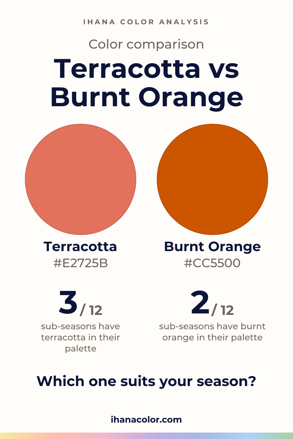
#E2725B#CC5500Side by side
Burnt Orange is more vivid, and the two are about as light as each other; Terracotta sits in the red range, Burnt Orange in the red-orange range.
Terracotta has the bigger family of the two: Terracotta, Burnt Sienna, Copper Red, Rust and Sienna. Its main shade is medium in lightness, medium in intensity and sits in the red range.
Burnt Sienna is the lightest of the five. Rust and Burnt Sienna carry the most intensity, Sienna the least. Sienna also leans red-orange, so the edge of this family already touches the other color.
Near a face, medium intensity means the color sits back. What your skin picks up is the red. On a sweater it reads as clay, not as orange.
Burnt orange is a tighter family: Burnt Orange, Alloy Orange and Pumpkin. All three are medium in lightness, vivid in intensity and red-orange in hue.
Pumpkin is the lightest of them, Burnt Orange the darkest. Burnt Orange is also the most intense. There is no quiet version to fall back on, so you choose by how much vividness your face can carry.
A vivid color arrives before you do. Your face has to answer back, which is why this one is easier to get wrong than to get right.
Terracotta wins in the three Springs and in Soft Autumn, and burnt orange stays behind.
For Warm Spring, the palette color that answers terracotta is Coral. For Bright Spring, it is Bright Coral. Light Spring has only a neighbor, Light Coral. Light Spring is very light and fresh, Warm Spring is very warm, Bright Spring is very bright. All three lean toward coral, and burnt orange stays at one remove: Orange Red for Warm Spring, Tomato Red for Bright Spring.
Soft Autumn is very soft and desaturated. Light Terracotta, a neighbor of terracotta, sits in its palette. Burnt orange is not for Soft Autumn: the same Light Terracotta is only a stand-in there, not a match.
One sub-season takes both: Warm Autumn. It is very warm and rich, slightly muted. Terracotta is matched with Burnt Coral, and Burnt Orange is in its palette under its own name.
One takes burnt orange only: Deep Autumn. It is dark and intense, and Burnt Orange is matched with Spiced Orange. Terracotta is only close there, with the same Spiced Orange as its neighbor.
Six sub-seasons take neither: every Summer and every Winter. Their palettes sit on the cool or neutral-to-cool side, so the closest colors are pinks and reds, such as Dusty Rose for Soft Summer, Pure Red for Deep Winter or Bright Red for Bright Winter. They are the closest colors in each palette: stand-ins, not matches.
Set up the test the way the article on color draping at home describes: bare face, daylight, one color at a time.
Terracotta has a long list of partners: cream, olive, sage green, navy, camel and white. The terracotta page shows the version for each sub-season. Try each partner beside it in daylight and keep the one that leaves your face in front.
For burnt orange I have no partners to list, so I won’t invent any. Look for a calm color beside it, one that doesn’t compete for attention. One vivid piece is a decision. Two start to argue.
My advice: if you’re unsure, wear the color below the waist first and move it up only when your face agrees.
Which one suits you
Each color is checked against the palette of each sub-season, color by color. This is a first hint, not a verdict: see how it looks on your own face.
Terracotta is the one for you
Terracotta is the one for you
Terracotta is the one for you
Neither is for you
Closest in your palettePale Strawberry
Neither is for you
Closest in your paletteCool Watermelon
Neither is for you
Closest in your paletteDusty Rose
Terracotta is the one for you
Both work for you
Burnt Orange is the one for you
Neither is for you
Closest in your palettePure Red
Neither is for you
Closest in your paletteRaspberry Red
Neither is for you
Closest in your paletteBright Red
Questions
No. They share their depth, but terracotta is medium in intensity and red, while burnt orange is vivid and red-orange. One sits back on a face and the other comes forward. Sienna, a shade of the terracotta family, leans red-orange, so the line blurs a little at the edge.
Burnt orange. Turn the fabric in daylight: terracotta shows red, like fired clay, while burnt orange looks lit from inside. Rust and Burnt Sienna are the terracotta shades closest to that glow, so a label alone won’t settle it.
Start from your sub-season. Both colors belong to Warm Autumn, and only burnt orange belongs to Deep Autumn. Not sure of yours? The free color analysis quiz names a likely season to check against fabric near your face. It is a hint, nothing more.
You can try it, with one near your face and the other lower down. Compare them in daylight and see whether they blur or argue.
Warm Autumn is the one sub-season with both in its palette. The color guides cover other pairs.
You can’t fully. A screen, a bulb and the dye all move a color, so treat any reference as a guide. Look at the hue: red points to terracotta, orange to burnt orange. Then check the fabric in daylight before you decide.
Keep it
The two colors side by side, ready to pin or to keep on your phone.
Download the imageKeep exploring
Colors that go with terracotta: cream, olive, sage green, navy and camel. I show you which version belongs to which sub-season, and what to skip with it.
The quiz shows you your likely season and a sub-season hint, with no sign-up. A first hint, not a verdict.
Full palette, capsule wardrobe, makeup, hair and a shopping list for each sub-season. Not on sale yet: join the waitlist.
Twelve sub-seasons instead of sixteen, the three things we look at, and why a quiz is only a first hint.
The free quiz shows you your likely season in two minutes. Then hold both colors up to your bare face, in daylight: a first hint, not a verdict.