
Beige
#D7BEA2- Linen
- Wheat
- Desert Sand
- Sand
Color comparison
Lay a beige scarf and a cream one on a white table by a window. Look for the orange in one. Look for the yellow in the other. That’s the whole difference.
#D7BEA2#F4E8CCSide by side
Cream is lighter, and the two are about as vivid as each other; Beige sits in the orange range, Cream in the yellow range.
Beige is a light, muted color that leans orange. That lean is what keeps it from looking gray or plain white.
The family runs wider than the name suggests. Linen is very light and almost colorless. Wheat is very light and muted, leaning orange.
Desert Sand is very light too, with a red-orange lean. Beige itself is a notch deeper. Sand is the deepest of the five and the most intense, and it leans yellow.
So “beige” can mean a pale, quiet linen or a fuller sand. If a beige sweater drains you, try the shade before you give up on the family. A sand and a linen do very different things beside the same cheek.
Cream is very light, muted and yellow. It is the paler, softer neighbor.
Its shades stay close together. Lemon Chiffon is the lightest and the most intense of the group, a pale buttery yellow. Papaya Whip and Champagne lean orange, still very light and muted. Bone is the deepest and the least intense, nearly neutral with a faint orange lean.
Because every cream shade is very light, the choice inside the family is about hue and softness, not depth. Lemon Chiffon looks sunny. Bone looks quiet. Cream is lighter than beige, and that is the step between the two.
Two differences matter: lightness and hue. Cream is lighter. Beige leans orange, cream leans yellow.
Lightness is the one you’ll notice first. Cream is the paler of the two, and beige sits a step deeper.
Then comes the lean. Beige tilts toward orange, cream toward yellow. On a fabric, cream reads as soft and airy, while beige reads as more of a base.
They share their intensity. Both are muted, so neither one shouts, and neither is a bright color in disguise. If you’re hunting for a difference in vividness, stop. There isn’t one.
Indoors, a yellow bulb can push either color toward the other. Check them by a window before you decide.
Two sub-seasons take both beige and cream. Eight take cream only, one takes both as neighbors, and one takes neither. The reason is mostly temperature and lightness, so start with the two where beige is in the palette.
Two take both. Light Spring is very light and low in contrast. It has Golden Beige for beige and Ivory for cream.
Soft Autumn is medium, very soft and low to moderate in contrast. It has Sand Beige and Cream. Soft Summer takes both as neighbors of its palette: Pebble Gray stands near beige and Off-White near cream.
The warm sub-seasons lean toward cream. Warm Autumn and Deep Autumn are warm and moderate to high in contrast. Cream is in their palette, matched with Cream. Beige is only close, and the palette color near it is Cream itself.
Warm Spring is very warm and bright, and it has cream in its palette too. Its beige is only close, near Golden Ivory.
Beige’s orange lean is what the cooler sub-seasons turn down. In Light Summer, which is slightly cool, and in Cool Summer, which is very cool, beige is not for you. Soft White is the stand-in, not a match. Cream is close, near Soft White.
True Winter is very cool and high in contrast. Beige is not for you, and Cool Pearl Gray stands in. Cream is close, near Pure White. Bright Winter is neutral to cool and very high in contrast. It puts beige on its avoid list, with Light Pearl Gray as the stand-in, and cream is close, near Pure White.
Bright Spring is very bright, and beige is too muted and orange for it: it sits on the avoid list, with Camel as the stand-in. Cream is in its palette, matched with Warm Off-White.
Deep Winter takes neither. Both land on its avoid list, and Pure White is the closest color in its palette, a stand-in and not a match.
Set a beige and a cream under your chin one at a time, on a bare face in daylight. Color draping at home walks through the setup.
Beige works with white, navy, olive, chocolate, baby pink and black. Cream works with navy, chocolate, olive, burgundy, black and denim blue. Four partners are shared, so a navy coat or an olive cardigan suits either one. Beige alone takes white and baby pink. Cream alone takes burgundy and denim blue.
If your sub-season takes neither, you can still wear them lower down, in pants or a skirt, with your palette color near the face. The color guides have more pairings.
Which one suits you
Each color is checked against the palette of each sub-season, color by color. This is a first hint, not a verdict: see how it looks on your own face.
Both work for you
Cream is the one for you
Cream is the one for you
Cream is the one for you
Cream is the one for you
Both are close to your palette
Both work for you
Cream is the one for you
Cream is the one for you
Neither is for you
Closest in your palettePure White
Cream is the one for you
Cream is the one for you
Questions
Not quite. Cream is lighter and leans yellow, while beige is a step deeper and leans orange. They’re equally muted, so the two differ in lightness and lean, not in vividness. Hold both up by a window and cream goes airy while beige stays a base.
Cream looks paler on a sweater. Its whole family stays very light, while beige runs from pale Linen down to a fuller Sand. Neither is more vivid, since both are muted, so the real choice is the lean: yellow for cream, orange for beige.
It depends on your sub-season. Eight of the twelve take cream only, and two take both. To get a direction, try ten quick questions with no sign-up: a first hint of your season and sub-season. Draping confirms it.
Yes. Keep a clear gap in lightness, such as beige pants with a pale cream sweater. Put the one that belongs to your palette near your face. Two near-identical pieces side by side can look like a mismatch, not a pairing.
Only roughly. A code is a reference. Dye, fabric weave and your screen settings all change how beige and cream look, and a warm lamp pulls them toward each other. Hold the real fabric near your face by a window instead.
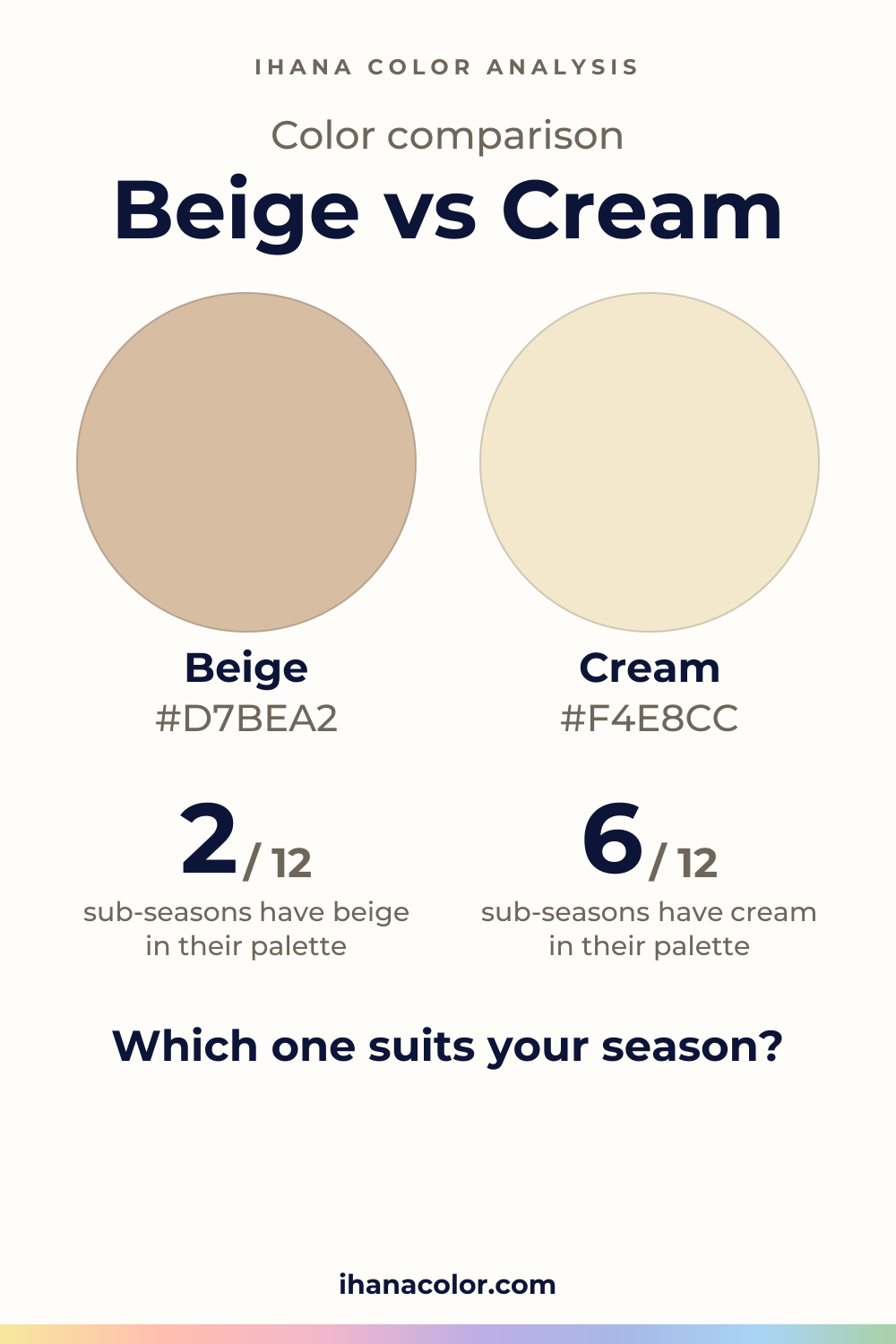
Keep it
The two colors side by side, ready to pin or to keep on your phone.
Download the imageKeep exploring
Colors that go with cream, and which cream is yours: five shades from Lemon Chiffon to Bone, the version each sub-season wears and the pairings to skip.
Ivory vs cream: both sit in the yellow range, yet they don’t feel the same. I show the difference on a face, then which one belongs to your sub-season.
Taupe vs beige: taupe is deeper and nearly neutral, beige is lighter with an orange lean. See which one belongs to your sub-season and how to test it.
Cream vs white: cream is a muted white that leans yellow, white has almost no hue. See which one belongs to your sub-season and how to test them at home.
The quiz shows you your likely season and a sub-season hint, with no sign-up. A first hint, not a verdict.
Full palette, capsule wardrobe, makeup, hair and a shopping list for each sub-season. Not on sale yet: join the waitlist.
Twelve sub-seasons instead of sixteen, the three things we look at, and why a quiz is only a first hint.
The free quiz shows you your likely season in two minutes. Then hold both colors up to your bare face, in daylight: a first hint, not a verdict.