
Black
#000000- Jet
- Onyx
- Eerie Black
- Raisin Black
Color comparison
You hold a black sweater up to the window. Then a charcoal one. On the hanger they look like twins. Under your chin, they don’t. One lets your face lead. The other takes over.
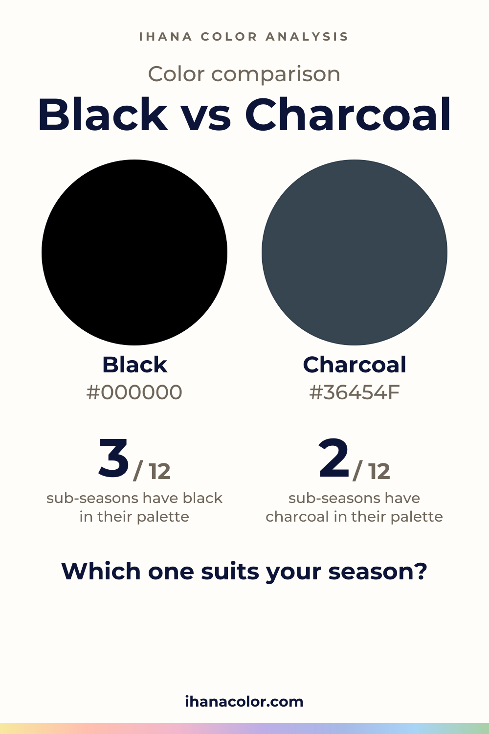
#000000#36454FSide by side
Charcoal is lighter, and the two are about as vivid as each other; Black has hardly any hue, Charcoal sits in the blue range.
Black is the deeper of the two. Black itself is very dark, nearly neutral, with no clear hue. It adds no color of its own.
The family has five shades: Black, Jet, Onyx, Eerie Black and Raisin Black. Jet and Onyx are the two that read dark rather than very dark, and Onyx is the lightest of the five. Black itself is the darkest.
All five stay nearly neutral. So the difference between them is depth, not color.
On a face, that depth is the point. Black sets a hard, clean edge between the fabric and your skin. That edge frames some faces and overpowers others, and the sections below show who is who.
Because it is one. Charcoal is dark rather than very dark, nearly neutral, and sits in the blue range. You may not name the blue, but you feel it next to warm skin.
Four shades make up the family: Charcoal, Gunmetal, Dark Slate Gray and Davy’s Gray. Gunmetal and Davy’s Gray have no clear hue. Dark Slate Gray is the muted one and leans blue-green. Davy’s Gray is the lightest of the four, Gunmetal the darkest.
So charcoal is a range, not a single point. Pick Davy’s Gray and you get a soft, light-handed dark. Pick Gunmetal and you’re close to black without quite arriving.
Start with what they share. Neither is vivid. Both are nearly neutral, so neither one brings a bright note to your face. If you came looking for a bolder choice, you’re comparing the wrong pair.
The gap is depth. Charcoal is lighter, and you see it at the neckline: the line between fabric and skin is softer, and a low-contrast face stays in front. Black draws that line sharply. A high-contrast face answers it. A gentler face doesn’t.
The second gap is hue. Black has hardly any. Charcoal leans blue, so it reads cooler and a little more like a color than black does. On a fabric, that lean shows in daylight, and it fades under a yellow bulb.
Look at that blue lean next to your skin. It tells you whether a charcoal sits quietly with you or pulls against you.
Four sub-seasons lean to charcoal rather than black: Light Summer, Cool Summer, Soft Summer and Warm Autumn. Soft Summer is the cleanest case. Charcoal lands on Grayed Navy in its palette, and black sits on its avoid list. The face is low in contrast and very soft, which points away from a heavy black.
Light Summer and Cool Summer are close, not in. Charcoal lines up with Soft Navy for the first and Navy for the second, which are neighbors in their palettes. Warm Autumn is close too, with Petrol Blue as the neighbor. Its black is on the avoid list, and the closest palette color is Chocolate.
Deep Winter takes both. Black lands on Black and charcoal on Slate Gray, both in the palette. Dark, saturated and high in contrast, it can carry the weight. Deep Autumn takes both only as neighbors: Espresso stands near black, Dark Petrol Blue near charcoal.
Black alone belongs to True Winter and Bright Winter, where it matches Black. Charcoal is not for them. The closest palette colors are Sapphire and Bright Violet, which are stand-ins, not matches. These faces are cool and high in contrast, and they hold black well.
Four sub-seasons take neither: Light Spring, Warm Spring, Bright Spring and Soft Autumn.
Take Soft Autumn. Black sits on its avoid list, and Soft Eggplant is the nearest palette color. For charcoal it’s Soft Petrol Blue. Both are stand-ins, not matches.
Test them one at a time, bare-faced, by a window; the color draping at home article has the setup. Watch your eyes and the shadows under them. The one that keeps your face first is yours.
Black has six partners: white, cream, camel, burgundy, emerald and light gray. White, cream and light gray set a lighter field beside it, and camel, burgundy and emerald add a color of their own.
Charcoal has no listed partners, so look for the quality instead. Since it isn’t vivid, give it one clearly lighter color next to your face. Check that its blue lean still agrees with your skin, not only with the sweater beside it.
If your sub-season takes neither, keep the dark neutral away from your neckline. Pants, a bag or a coat that opens on a lighter layer will do.
Which one suits you
Each color is checked against the palette of each sub-season, color by color. This is a first hint, not a verdict: see how it looks on your own face.
Neither is for you
Closest in your paletteLight Violet
Neither is for you
Closest in your paletteWarm Violet
Neither is for you
Closest in your paletteBright Navy
Charcoal is the one for you
Charcoal is the one for you
Charcoal is the one for you
Neither is for you
Closest in your paletteSoft Petrol Blue
Charcoal is the one for you
Both are close to your palette
Both work for you
Black is the one for you
Black is the one for you
Questions
No. Black is very dark with no clear hue. Charcoal is dark and leans blue. They share one thing: neither is vivid. They differ in depth and in that blue lean, and a face notices both at the neckline.
Black looks deeper, and charcoal is the lighter of the two. Neither one is vivid: both are nearly neutral, so color intensity won’t separate them. So if you want a more colorful dark, neither will give it to you. Reach for a deep color from your own palette instead.
Your sub-season points the way, and the home test settles it. The free color analysis quiz gives you a likely season and a sub-season hint to start from. It can’t see your skin react, so confirm with fabric.
In one outfit, yes, if both are in your palette: Deep Winter is the clear case. Elsewhere, wear the one you take near your face and keep the other for pants, a skirt or a coat you leave open.
Don’t trust a screen. Light, dye and fabric all move a dark color, so a swatch on a screen is a rough guide at best. Take the garment to a window. Charcoal shows its blue lean and a softer edge, while black stays flat and deep.
Keep it
The two colors side by side, ready to pin or to keep on your phone.
Download the imageKeep exploring
Colors that go with black, and why the black you wear depends on your sub-season. I cover its shades, how to wear it near your face and what to skip.
Black or brown? I show how they differ on a face and on a fabric, then which of the twelve sub-seasons wears black, brown, or neither of the two colors.
Navy vs black: the difference is hue, not depth. See which one belongs to your sub-season, how to test them at home and what to wear with each of them.
Charcoal vs gray: Charcoal leans blue and runs dark, gray sits in the middle. I show how they really differ on a face and which sub-seasons take which one.
The quiz shows you your likely season and a sub-season hint, with no sign-up. A first hint, not a verdict.
Full palette, capsule wardrobe, makeup, hair and a shopping list for each sub-season. Not on sale yet: join the waitlist.
Twelve sub-seasons instead of sixteen, the three things we look at, and why a quiz is only a first hint.
The free quiz shows you your likely season in two minutes. Then hold both colors up to your bare face, in daylight: a first hint, not a verdict.