
Fuchsia
#D4127C- French Fuchsia
- Fandango
- Soft Fuchsia
Color comparison
You hold a hot pink sweater up in the fitting room. The tag says fuchsia. The one beside it says magenta. You can’t see the gap.
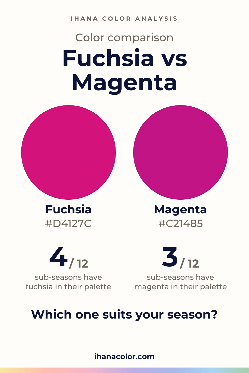
#D4127C#C21485Side by side
The two are about as light and as vivid as each other; both sit in the pink-red range.
On the web, “fuchsia” and “magenta” are one and the same color code (#FF00FF): a screen cannot tell the two names apart. The shades above are the ones the palettes of this site use for each name.
Fuchsia is a medium-depth pink with a lot of voltage. It isn’t pale and it isn’t dark. It sits in the middle and turns the intensity all the way up.
The page’s shades are Fuchsia, French Fuchsia, Soft Fuchsia and Fandango. French Fuchsia is the lightest and the most intense. Fandango is the deepest, and it is the only one that leans pink-purple instead of pink-red.
Don’t let the name Soft Fuchsia fool you. It is still vivid. It is simply the gentlest step in that family.
Near a face, a color this strong speaks before you do. If it suits you, your complexion looks lit instead of flushed and your eyes look clearer. If it doesn’t, the fabric arrives first and the person second.
Magenta lands in the same place: medium, vivid, pink-red. Its four shades are plain Magenta and three labeled versions of it. They are one family under different labels.
One labeled version is the lightest. Plain Magenta is the deepest, and also the most intense. The spread inside the family is small.
Here is something a screen won’t tell you. The web color standards give fuchsia and magenta one and the same code. A monitor cannot tell them apart. If a shop photo is your only evidence, you have almost none.
Not far, and less than you’d hope.
Lightness is the same. Intensity is the same. Hue is the same.
Both are strong pink-reds, and both ask the same thing of your face: enough presence to carry them.
What they share is what you’ll feel first. Neither one is a pastel, and neither is a quiet neutral. They are accents.
The one real shift is inside the fuchsia family: Fandango, which leans toward purple. If a fuchsia looks slightly plum next to your skin, that’s the direction it has taken.
Past that, the shades show no split, and I won’t guess how a seller uses each name on a dye or a fabric. Trust what is in your hand, in daylight, instead of the word on the label.
This is where the two names finally separate, and the answer comes from your sub-season.
Three take both: Bright Winter, True Winter and Deep Winter. Each is dark, saturated or very bright, with high contrast. A vivid pink-red has the strength to match that.
In Deep Winter both land on the Fuchsia in its palette. True Winter and Bright Winter have a Fuchsia and a Magenta of their own. For these three, choosing is about mood, not about right and wrong.
Two take fuchsia only. Light Summer is very light and soft, with low contrast. A neighbor of fuchsia, Light Raspberry, is in its palette, so fuchsia is close, not a match. Magenta is not for you there, and Light Raspberry is the stand-in.
Cool Summer is the cleaner case. Fuchsia is in its palette, matched with Raspberry. Magenta only has a neighbor: Raspberry again.
Seven take neither: Light Spring, Warm Spring, Bright Spring, Soft Summer, Soft Autumn, Warm Autumn and Deep Autumn. Their closest palette colors are stand-ins, not matches. Soft Summer gets Muted Raspberry, Soft Autumn gets Smoky Plum, and Warm Autumn gets Warm Eggplant.
The reasons come from the axes. Soft Summer and Soft Autumn are very soft, and a vivid color overpowers them. Warm Spring and Warm Autumn are very warm.
In my view, a stand-in is a better deal than a forced match. Wear the stand-in near your face and keep the fuchsia or magenta for a bag or a scarf you tie low.
One test is enough: bare face, daylight, one color at a time, with the setup in the article on color draping at home.
Neither color comes with listed partners, so look for qualities instead. Pick a partner that is quieter than the pink, with lower intensity, so the eye has somewhere to rest. Two vivid colors in one outfit compete and cancel each other.
Keep the pink in one place. A sweater, a lip or a scarf is a statement. A sweater, a lip and a scarf is a crowd.
If your sub-season is in the “neither” group, move the color down to a skirt, pants or shoes. Your own palette goes next to your face.
Which one suits you
Each color is checked against the palette of each sub-season, color by color. This is a first hint, not a verdict: see how it looks on your own face.
Neither is for you
Closest in your paletteWarm Candy Pink
Neither is for you
Closest in your paletteWarm Violet
Neither is for you
Closest in your paletteWatermelon Pink
Fuchsia is the one for you
Fuchsia is the one for you
Neither is for you
Closest in your paletteMuted Raspberry
Neither is for you
Closest in your paletteSmoky Plum
Neither is for you
Closest in your paletteWarm Eggplant
Neither is for you
Closest in your paletteDark Plum
Both work for you
Both work for you
Both work for you
Questions
Close to one. A screen can’t tell them apart, so only your own eyes can compare. Lay two pink fabrics side by side against your face and watch your skin. The real split is who wears them: three sub-seasons take both, and seven take neither.
Neither. Both sit at medium lightness and both are vivid.
Inside each family the steps are small: French Fuchsia is the lightest fuchsia, and plain Magenta is the most intense magenta. Side by side on your skin, you will struggle to see a gap.
The three Winters in the picks take both. Cool Summer takes fuchsia, and Light Summer comes close with it. If you don’t know yours yet, the free color analysis quiz asks ten questions, with no sign-up, and names a probable season with a nudge toward a sub-season. Then drape.
Yes, if you land in one of the three Winters that take both. Pick by mood. In other sub-seasons, wear one at most, and only if it passes the test at your face. Otherwise keep it low, in a skirt or shoes, and put a color from your palette near your face.
You mostly can’t, and a code won’t help. Light, dye and your screen all shift the color. Check it in daylight beside your face, and compare it with a second pink. If the two look alike on your skin, treat them as one.
Keep it
The two colors side by side, ready to pin or to keep on your phone.
Download the imageKeep exploring
Magenta vs pink: one is vivid, the other lighter and softer. I show how they differ on a face and which sub-seasons wear which, so you can choose yours.
The quiz shows you your likely season and a sub-season hint, with no sign-up. A first hint, not a verdict.
Full palette, capsule wardrobe, makeup, hair and a shopping list for each sub-season. Not on sale yet: join the waitlist.
Twelve sub-seasons instead of sixteen, the three things we look at, and why a quiz is only a first hint.
The free quiz shows you your likely season in two minutes. Then hold both colors up to your bare face, in daylight: a first hint, not a verdict.