
Magenta
#C21485- Magenta (Pantone)
- Magenta (Dye)
- Magenta (Crayola)
Color comparison
“Magenta is just a louder pink.” Near a face, pink stays quiet. Magenta takes the room. Whether you can carry that is another question.
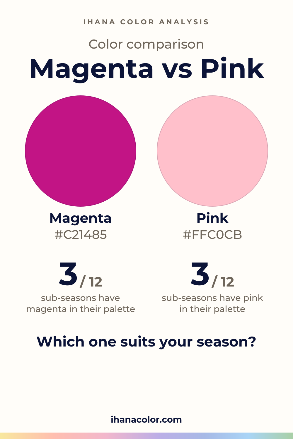
#C21485#FFC0CBSide by side
Pink is lighter, Magenta is more vivid; both sit in the pink-red range.
Magenta is the loud one. It’s medium in lightness. It’s vivid. It sits in the pink-red range.
Magenta has a few versions, and they barely differ. You only see the gap when you lay them side by side.
That sameness helps you. You’re not choosing between magentas. You’re deciding whether this much saturation belongs next to your skin.
A saturated color throws a lot of itself back onto the face. A low-contrast face can fade behind it. Strong contrast between hair, eyes and skin gives a vivid color more to answer back to.
Pink is where people get confused. The plain Pink is very light and muted. Baby Pink is just as light and muted, with a redder look.
Then the family changes character. Salmon Pink is light and medium in intensity. Hot Pink is light and vivid. Raspberry Pink is medium in lightness and vivid, the same weight as magenta.
So a pink can be soft or loud. The plain Pink is the soft end: very light and muted beside a face. If you love Hot Pink or Raspberry Pink, you’re closer to magenta than the word suggests.
Your sub-season answers it, and the answer follows its axes.
Pink only: Light Spring, Light Summer and Soft Summer. All three are low in contrast, so a quiet color keeps the face in front.
Light Summer is very light and soft: its pink is Powder Pink. Soft Summer is very soft and grayed, so its pink is Tea Rose. Light Spring wears Petal Pink.
Magenta only: Cool Summer, Deep Winter, True Winter and Bright Winter. The three Winters have high contrast (very high for Bright Winter), and their colors are saturated or very bright.
Deep Winter matches magenta with Fuchsia. True Winter and Bright Winter have Magenta itself in the palette. Cool Summer is only close: a neighbor of magenta, Raspberry, is in its palette.
Neither: five sub-seasons, Warm Spring, Bright Spring, Soft Autumn, Warm Autumn and Deep Autumn.
Magenta sits close to the avoid list of Warm Spring, Soft Autumn, Warm Autumn and Deep Autumn. What their palettes offer instead is a substitute, never a match: Smoky Plum for Soft Autumn, Warm Eggplant for Warm Autumn, Dark Plum for Deep Autumn. Warm Spring’s nearest pink is Salmon.
Check first: bare face, window light, one swatch of fabric against your neck, as laid out in color draping at home.
Pink has partners to lean on: white, light gray, navy, olive, camel and burgundy. Navy and olive give it weight. White and light gray keep it clean. Camel and burgundy are listed for it too, so try them beside a pink you love.
No partners are listed for magenta, so look for what it needs. It needs one thing to be loud, not three. Pair it with a calm color and let it sit alone, whether that is a scarf, a top or a lipstick.
If your sub-season takes neither, keep them lower down: pants, a bag, shoes.
Which one suits you
Each color is checked against the palette of each sub-season, color by color. This is a first hint, not a verdict: see how it looks on your own face.
Pink is the one for you
Neither is for you
Closest in your paletteSalmon
Neither is for you
Closest in your paletteFlamingo Pink
Pink is the one for you
Magenta is the one for you
Pink is the one for you
Neither is for you
Closest in your paletteFaded Peach
Neither is for you
Closest in your paletteWarm Eggplant
Neither is for you
Closest in your paletteDark Plum
Magenta is the one for you
Magenta is the one for you
Magenta is the one for you
Questions
Away from your face, yes. Keep magenta in pants or a bag, and put your pink next to your skin. Light Summer, for example, has Powder Pink in its palette, and its closest magenta-like color is Light Raspberry, a stand-in, not a match.
Don’t trust the screen alone. A code is only a reference, and your display settings shift it. Look for the vivid one: magenta stays saturated, while the plain pink looks pale and muted.
Your skin decides, and your sub-season points the way. If you don’t know yours, the free color analysis quiz names a likely season, plus a sub-season to check. It can’t watch your skin respond, so compare both colors against your face in window light.
If your sub-season allows it, yes, but try them one at a time first. They share a hue, while pink is lighter and muted and magenta is vivid. Pink has its own partners in the pink color guide.
Not exactly. Dye, fabric texture, the bulb overhead and your screen settings all change how a color looks. Judge it on the fabric itself, in daylight, before you decide it’s yours.
Keep it
The two colors side by side, ready to pin or to keep on your phone.
Download the imageKeep exploring
What colors go with pink? Here are the partners that work, the shades to choose from and the version each sub-season wears near the face, or away from it.
Fuchsia vs magenta: the two overlap heavily. I show what really separates them on a face and which sub-seasons wear fuchsia, magenta, both or neither.
The quiz shows you your likely season and a sub-season hint, with no sign-up. A first hint, not a verdict.
Full palette, capsule wardrobe, makeup, hair and a shopping list for each sub-season. Not on sale yet: join the waitlist.
Twelve sub-seasons instead of sixteen, the three things we look at, and why a quiz is only a first hint.
The free quiz shows you your likely season in two minutes. Then hold both colors up to your bare face, in daylight: a first hint, not a verdict.