
Teal
#008080- Dark Cyan
- Teal Blue
- Cadet Blue
- Pine Green
Color comparison
“Teal is just dark turquoise.” Close. Hold both near a face. The difference is depth. And it decides who wears which.
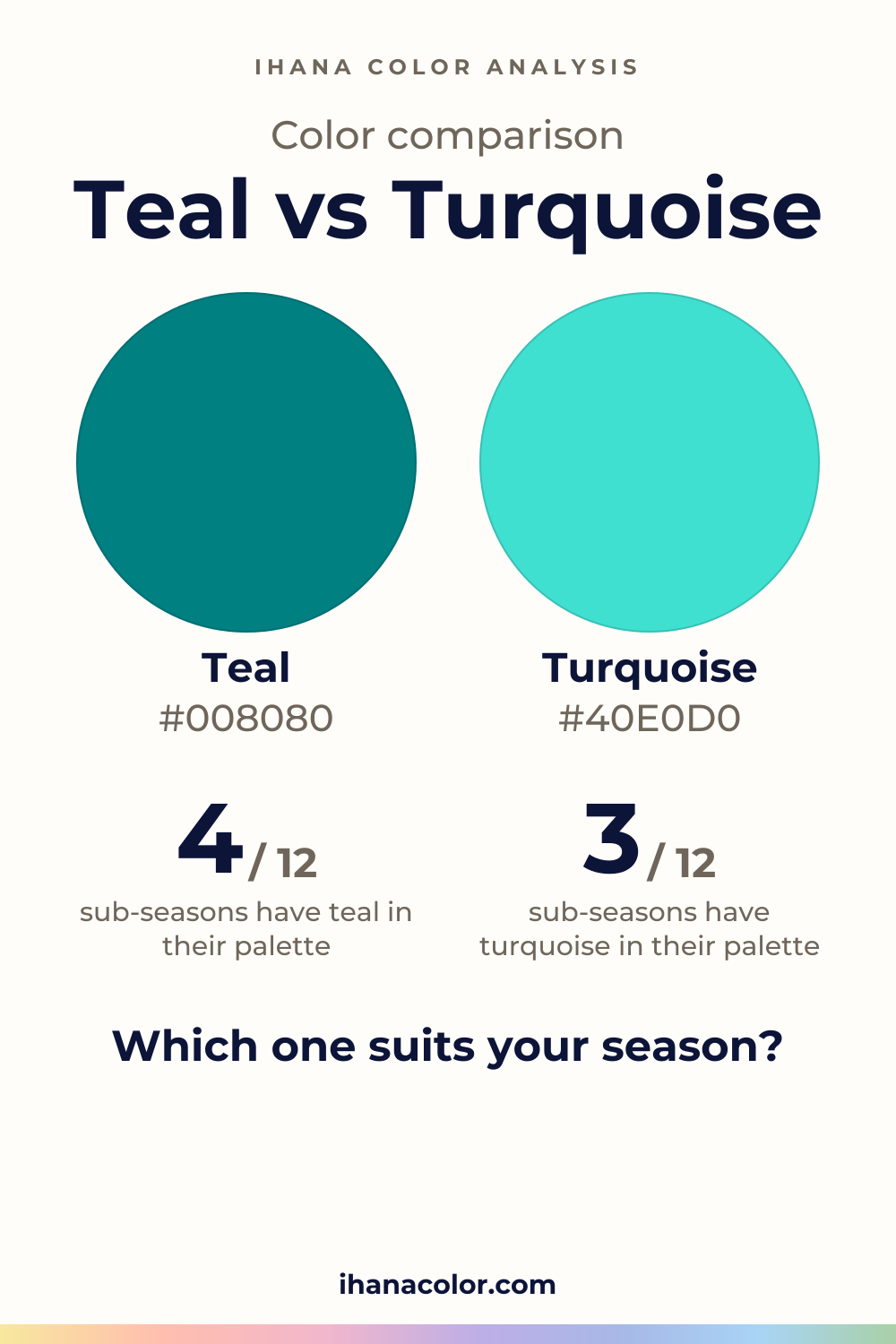
#008080#40E0D0Side by side
Turquoise is lighter, and the two are about as vivid as each other; both sit in the blue-green range.
Teal sits in the middle: medium lightness, medium intensity, and a hue that falls between blue and green. Its shades run from muted, blue-leaning ones like Teal Blue and Cadet Blue to richer blue-greens like Dark Cyan and Pine Green.
Near a face, teal is the deeper of the two, so it is the color you see next to the skin. On a fabric it looks steady.
If you want it quieter, go to the blue-leaning ends of the family. If you want it richer, move toward Dark Cyan.
Turquoise is lighter. Turquoise and Medium Turquoise are both light, with medium intensity and a blue-green hue. Turquoise is the lightest of its family and the most intense.
Warm Turquoise and Cool Turquoise sit one step deeper. Warm stays blue-green, Cool tips toward blue, and Cool is the least intense of the four.
Near a face, turquoise is the lighter color. On a fabric it looks fresh and open, where teal looks steady.
One does: lightness. Turquoise is lighter, and that is the whole gap.
Intensity is the same, and both sit in the blue-green range. If turquoise looks brighter to you, you’re probably reading its lightness. Look for a difference in vividness and you won’t find one.
Near a face, the deeper teal reads first. The lighter turquoise reads softer. Same hue, same intensity, different weight.
One caution. Both families have shades that lean toward blue (Teal Blue in one, Cool Turquoise in the other). Judge the piece in your hand, not the label on it.
Each of the twelve sub-seasons leans one way. My advice: read your sub-season by its axes, not by the name of the color.
Turquoise belongs to five. Light Spring has it in its palette, matched with Aqua. Warm Spring is matched with Warm Aqua, Bright Spring with Bright Aqua.
Their temperature and clarity differ. Light Spring is slightly warm and very light, Warm Spring very warm, Bright Spring very bright. Turquoise fits each of them. Light Summer and Bright Winter are only close: their neighbors in the palette are Seafoam Green and Bright Mint.
Teal belongs to seven. Warm Autumn has Teal itself. For Deep Winter and Deep Autumn, teal is matched with Deep Turquoise in their palettes: both are dark, with high contrast. Cool Summer’s teal is matched with Soft Spruce Green.
Teal is only close for Soft Summer (Grayed Spruce), Soft Autumn (Soft Petrol Blue) and True Winter (Cool Turquoise).
Where a color is not for you, the palette offers a stand-in, not a match. Teal is not for Light Spring, Light Summer or Bright Winter. Their closest colors are Light Turquoise, Light Denim Blue and Bright Turquoise. Turquoise is not for Soft Autumn, whose closest is Sage Green.
I’d rather you test than assume. Sit by a window with a bare face and hair tied back, then hold one color under your chin at a time; the setup is in color draping at home.
Teal has six partners. White and cream give it room. Camel and charcoal are the quiet neutrals.
Mustard and coral push against it, so let them be small. For the version of teal that belongs to each sub-season, see what goes with teal.
Turquoise has no listed partner, so look at the piece itself. Hold your neutral next to it in daylight and see whether the turquoise still reads clearly or gets lost.
Which one suits you
Each color is checked against the palette of each sub-season, color by color. This is a first hint, not a verdict: see how it looks on your own face.
Turquoise is the one for you
Turquoise is the one for you
Turquoise is the one for you
Turquoise is the one for you
Teal is the one for you
Teal is the one for you
Teal is the one for you
Teal is the one for you
Teal is the one for you
Teal is the one for you
Teal is the one for you
Turquoise is the one for you
Questions
No. They’re cousins in the same blue-green range, at about the same intensity. What separates them is depth, and that gap is why they land in different sub-seasons. Judge the piece in your hand, near your face, not the name on the label.
It depends on your sub-season. Five belong to turquoise: the three Springs, Light Summer and Bright Winter. Seven belong to teal: Cool Summer, Soft Summer, the Autumns, Deep Winter and True Winter. The free color analysis quiz gives you a likely season and a hint of your sub-season. It is a first hint, not a verdict.
Yes. If your sub-season lists one, see which one you want near your face. The other can sit lower down, in pants or a bag, away from your complexion. If you wear both together, test it near your face first.
Neither. The two read about as vivid as each other. A turquoise can look brighter simply because it is lighter. Within teal, Cadet Blue is muted and Dark Cyan is richer, so compare the exact piece you’re holding, not the name on the tag.
Don’t trust the screen alone. A color code is a reference, and a screen, a bulb or a dye can shift it. Compare the two side by side if you can, then hold the fabric in daylight before you buy.
Keep it
The two colors side by side, ready to pin or to keep on your phone.
Download the imageKeep exploring
Colors that go with teal, and which of its five shades belongs to your sub-season. I cover the shades, what to skip and how to wear teal near your face.
The quiz shows you your likely season and a sub-season hint, with no sign-up. A first hint, not a verdict.
Full palette, capsule wardrobe, makeup, hair and a shopping list for each sub-season. Not on sale yet: join the waitlist.
Twelve sub-seasons instead of sixteen, the three things we look at, and why a quiz is only a first hint.
The free quiz shows you your likely season in two minutes. Then hold both colors up to your bare face, in daylight: a first hint, not a verdict.