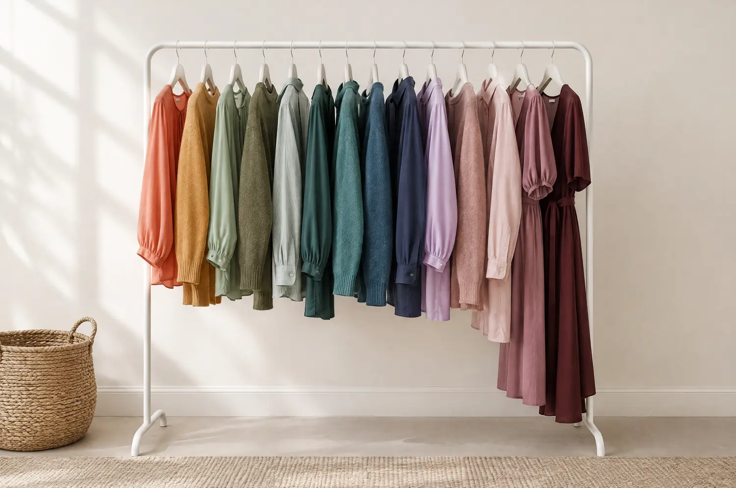
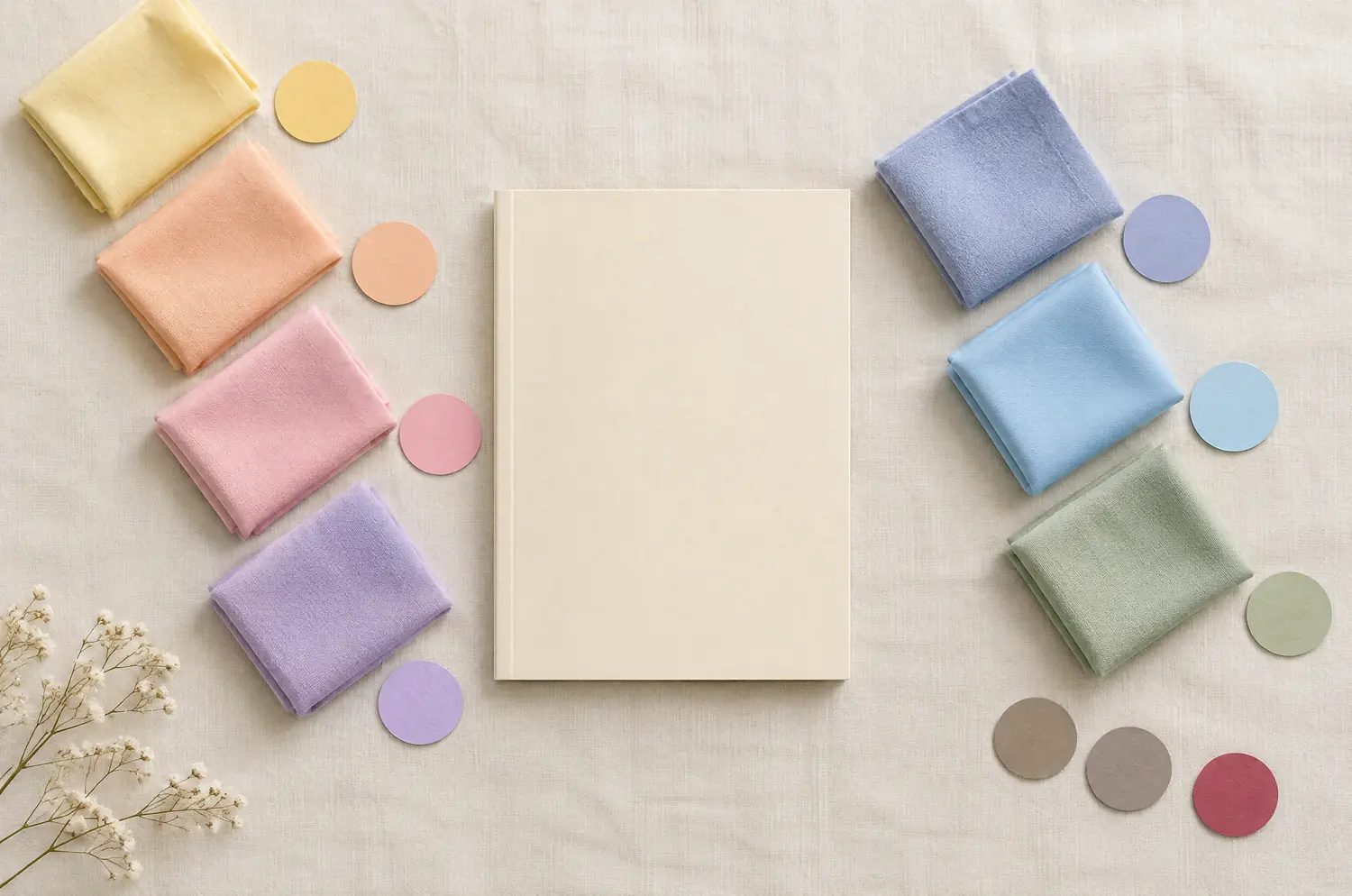
Once the colors are set, the heat gives you three questions.
First, the fabric. Summer palettes suit light, matte weaves. Cotton and washed linen work for Light Summer and Soft Summer. Cotton, crepe and denim work for Cool Summer.
Chiffon is an option for Light Summer. A shine can add glare near the face, so I’d choose matte for the tops you wear close to your eyes.
Second, the prints. Low-contrast palettes like quiet, blended patterns: watercolor, tiny florals, faded florals, tone-on-tone stripes. Cool Summer can take navy stripes and gray glen plaid. A bold, graphic print belongs more to a high-contrast face.
Third, contrast. Hot days push people toward one color head to toe. For Soft Summer and Light Summer, that’s a gift.
A Dove Gray top with Grayed Navy pants keeps your face as the focus. A Winter, whose contrast is higher, can go sharper: Pure White against Navy.
My advice: put your best colors in what touches your face, and be relaxed about the rest. A shirt in your shade matters more than the pants.
A tan can change how a light shade looks on you, so test your light neutral again in daylight once your skin has colored. My piece on colors for tan skin explains why the tan alone isn’t the answer.
Before every purchase, ask one question. Does this pair with at least two of my five colors? If not, leave it on the rack, however cheap or cool it feels in a heatwave.