
Burgundy
#800020- Claret
- Wine
- Cordovan
- Oxblood
Color comparison
Don’t sort burgundy and red by how dark they are. Sort them by how loud they are. One stays quiet. One calls across the room.
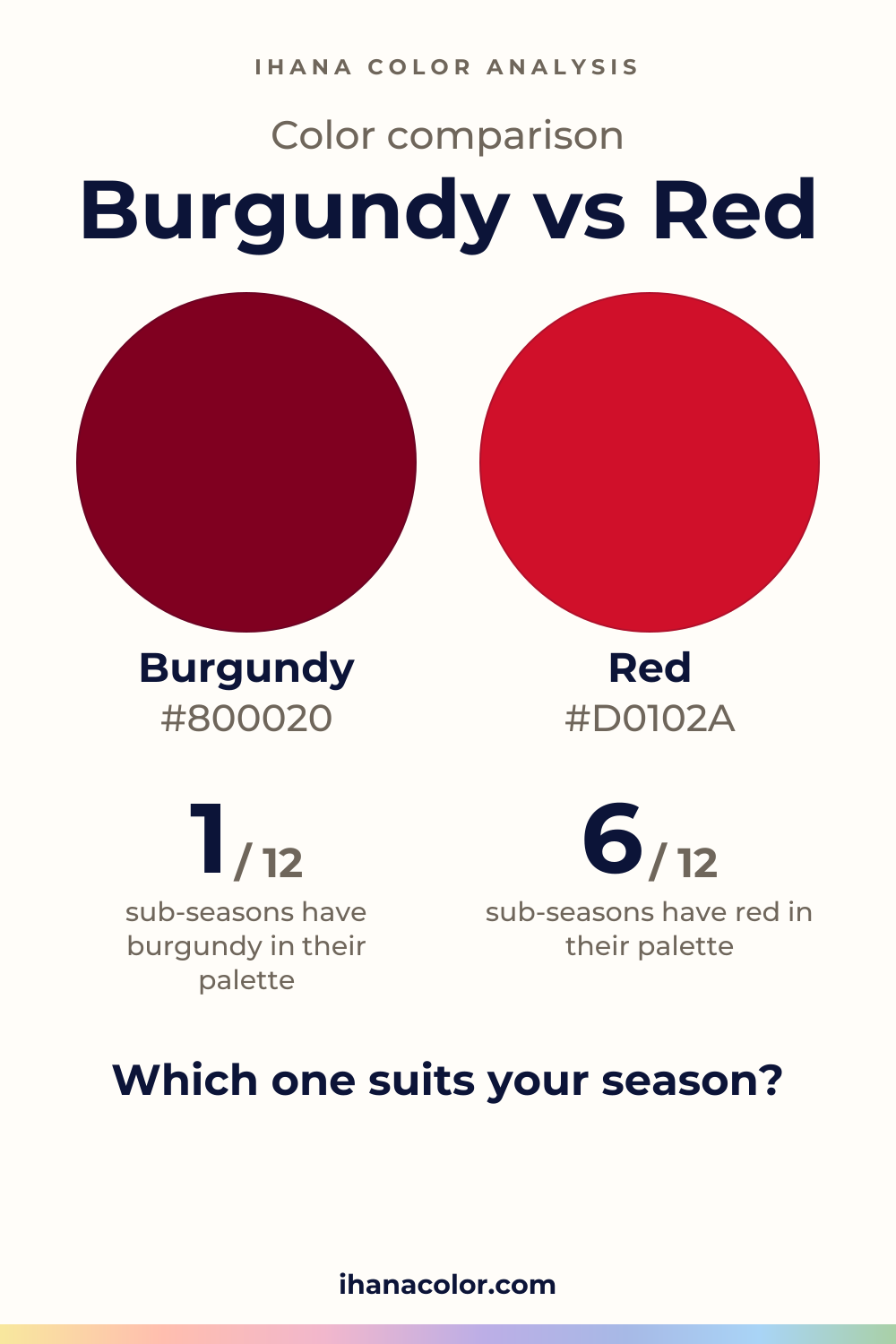
#800020#D0102ASide by side
Red is both lighter and more vivid; both sit in the red range.
Burgundy sits in the red range, dark in depth and medium in intensity. It doesn’t shout.
The family is wider than the name suggests. From light to dark: cordovan, wine, claret, burgundy, then oxblood, the only one read as very dark. Claret leans pink-red, a rosier cousin of the rest.
Near the skin, burgundy behaves like a deep neutral with a red heart. Your eyes don’t jump to the color, they rest on your face. That is why it works for people who want warmth without a spotlight.
It can also go heavy. Oxblood, the darkest shade, can read flat near the face.
Red is medium in lightness, vivid in intensity, and red in hue. Crimson and cardinal share that profile. Cherry Red is the one to watch: it is dark, like burgundy, but it is still vivid.
That detail matters. It means darkness alone can’t tell you which side a shade is on. A dark red that stays vivid is still a red.
Near a face, red takes the stage. The color arrives first, then you. On a face that can carry it, that gives the eyes and the mouth a lift. On a face that can’t, the garment gets noticed and the person doesn’t.
Fabric and light change both, so judge the real thing.
Two differences, and one thing they share.
Lightness first. Red is lighter, burgundy is dark. On a fabric, red carries across a room and burgundy absorbs the light. On a face, burgundy adds depth and a little weight, while red adds brightness.
Then intensity. Red is vivid, burgundy is medium.
A vivid color asks your face to answer back. A medium one asks only that your face stay calm.
What they share is the hue. Both are in the red range, so don’t look for a blue or a yellow difference between them. Nothing on this page points to one.
If you hold them side by side, the question isn’t which is prettier. Ask which one leaves you looking like yourself. Cherry Red and oxblood are a good pair to compare, since they are both dark.
This is where sub-seasons split, and the reasons are their axes.
Red only: six sub-seasons. Bright Winter is very bright with very high contrast, so red lands in its palette as Bright Red. Burgundy is not for it, and the nearest palette color, Bright Cherry, is a stand-in.
Deep Winter and True Winter are saturated and high in contrast, so their reds are Pure Red and Raspberry Red. Burgundy is only close for both, through Ruby and Carmine. Warm Spring, Bright Spring and Warm Autumn complete the six: Poppy Red is a neighbor for Warm Spring, Warm Cherry sits in Bright Spring’s palette and Tomato Red in Warm Autumn’s.
Burgundy only: one. Soft Summer is very soft and grayed with low contrast. Burgundy is close to its palette through Soft Burgundy. Red is not for it, and Muted Raspberry is the closest stand-in.
Both: Warm Burgundy and Tomato each belong to the palette of Deep Autumn, a dark, rich, high-contrast face that can answer a loud color and a quiet one. Cool Summer takes both only as neighbors of its palette: Soft Cool Burgundy for burgundy, Soft Cherry for red.
Neither: three. Light Spring and Light Summer are very light with low contrast. Soft Autumn is very soft and desaturated.
Light Spring’s closest palette color is Light Coral for both, and burgundy sits near a color it avoids. Light Summer’s is Light Raspberry for both. Soft Autumn’s is Soft Eggplant for burgundy and Light Terracotta for red. These are stand-ins, not matches.
If you don’t know your sub-season yet, the free color analysis quiz is ten questions with no sign-up. It points to a season you can then check with your own eyes.
Test at home with a bare face, daylight and one color held up at a time. Color draping at home walks you through the setup.
Burgundy has partners: cream, navy, olive, baby pink, camel and gray. Cream and baby pink put light between burgundy and your skin. Navy and olive keep it moody. Camel and gray keep it grounded.
Red works best with one quiet, plain neutral beside it and no second vivid color, because two strong colors compete.
If your sub-season takes neither, a stand-in from your palette does the job near your face. You can still wear burgundy or red lower down in an outfit, away from the neckline, if you love them.
Which one suits you
Each color is checked against the palette of each sub-season, color by color. This is a first hint, not a verdict: see how it looks on your own face.
Neither is for you
Closest in your paletteLight Coral
Red is the one for you
Red is the one for you
Neither is for you
Closest in your paletteLight Raspberry
Both are close to your palette
Burgundy is the one for you
Neither is for you
Closest in your paletteSoft Eggplant
Red is the one for you
Both work for you
Red is the one for you
Red is the one for you
Red is the one for you
Questions
Not quite. Both sit in the red range, but burgundy is also quieter. Red is lighter and vivid, so it draws the eye. Burgundy is dark and medium in intensity, so it frames your face instead of competing with it.
No. Cherry Red is dark but still vivid, so it stays a red. Burgundy shades, even the lightest, cordovan, are medium in intensity. Depth alone can’t sort them, so look at how loud the color is.
Yes, a couple. Deep Autumn finds room for each of them, and Cool Summer comes close with a neighbor of each. Six sub-seasons get red only and one gets burgundy only, so try them one at a time near your face and see which leaves your skin calm.
Cream, navy, olive, baby pink, camel and gray. Cream and baby pink lift it, navy and olive deepen it, camel and gray keep it grounded. Start with one of them and see how it sits.
Screens, room bulbs and dye all shift a shade, so trust the fabric in daylight over the display. Ask whether the color calls across the room or stays quiet: loud is red, quiet is burgundy. The color guides have other pairs to compare.
Keep it
The two colors side by side, ready to pin or to keep on your phone.
Download the imageKeep exploring
What colors go with burgundy? I sort its five shades, name the partners that work with it, and show which version belongs to each of the 12 sub-seasons.
Burgundy vs maroon: the gap is smaller than you think. I show how each reads on a face and a fabric, and which sub-seasons wear which, shade by shade.
Burgundy vs wine: two dark reds at the same depth, with burgundy a touch more vivid. I show how they differ on a face and which sub-seasons wear each.
The quiz shows you your likely season and a sub-season hint, with no sign-up. A first hint, not a verdict.
Full palette, capsule wardrobe, makeup, hair and a shopping list for each sub-season. Not on sale yet: join the waitlist.
Twelve sub-seasons instead of sixteen, the three things we look at, and why a quiz is only a first hint.
The free quiz shows you your likely season in two minutes. Then hold both colors up to your bare face, in daylight: a first hint, not a verdict.