
Burgundy
#800020- Claret
- Wine
- Cordovan
- Oxblood
Color comparison
“Burgundy and maroon are the same red.” Almost. Both are dark. Both are red. Both sit close. The gap is small, and that’s why the choice is less simple than it looks.
#800020#800000Side by side
The two are about as light and as vivid as each other; both sit in the red range.
Burgundy is a dark red with medium intensity. It isn’t loud. It sits in the shadows of red, where a color starts to feel like fabric rather than paint.
Its family runs from Cordovan, the lightest, through Wine and Claret to Burgundy itself, then Oxblood, the darkest and the only one listed as very dark. Claret is the one that leans pink-red. The others stay plainly red.
That range matters on a face. Oxblood is the deepest of them, and near the chin it can read as a shadow rather than a color. If burgundy has ever felt heavy on you, try a lighter family member before you give up on it.
Maroon is also a dark red. Its shades are Maroon, Dark Red, Barn Red and UP Maroon, and the first three are listed as vivid. UP Maroon is the exception, with medium intensity.
So maroon reads as the plainer, more direct red.
All four maroon shades sit in the red range, and none in the pink-red. That’s one place where burgundy has an edge. If you want a hint of pink in a dark red, claret is the only one of the nine shades that gives it.
Not far. Side by side, the difference won’t jump out at you.
On a face, it shows up in the finish. A vivid maroon near the skin asks for attention. A burgundy of medium intensity sits back and lets your features lead.
Whether that quiet helps you or flattens you, the color can’t tell you. Watch what your skin does, then read the sub-season picks below.
On a fabric, the gap shrinks further. Dye, weave and light change a dark red more than the name does. A maroon sweater in warm indoor light can pass for burgundy, and a burgundy one in flat daylight can look like maroon. Judge the piece in front of you, not the label on the tag.
Six of the twelve sub-seasons take neither. Two take burgundy alone. One takes both in its palette, and three take both as neighbors of the palette.
Cool Summer and Soft Summer are the burgundy-only pair. Cool Summer is very cool, with soft to medium intensity. Burgundy is close to its palette, matched with Soft Cool Burgundy. For maroon, Soft Cherry is the nearest stand-in, not a match.
Soft Summer is low in contrast and muted to the point of gray, so a vivid red overwhelms it. Burgundy is close, matched with Soft Burgundy. For maroon, the closest color there is also Soft Burgundy, a stand-in rather than a match, so test it before you commit.
Deep Autumn is the one that has both in its palette: Warm Burgundy for burgundy, Mahogany for maroon. It’s dark, rich and high in contrast, so it carries either one.
Deep Winter and True Winter have both as neighbors of the palette, not in it. For Deep Winter, burgundy is close to Ruby and maroon to Cherry Red. For True Winter, both are close to Carmine. Warm Autumn is the same: burgundy near Warm Eggplant, maroon near Rust.
For the six that take neither, the closest palette colors are Light Coral, Poppy Red, Warm Cherry, Light Raspberry, Soft Eggplant and Bright Cherry, depending on the sub-season. Those are the closest palette colors, a stand-in and not a match. If you’re one of these six, test the stand-in near your face, or wear a dark red away from it, in a skirt or pants.
Do one test at home: sit by a window with a bare face, hold each red under your chin, and watch what your skin does. The color draping setup walks through it.
Both reds take cream, gray, navy and olive. That’s four partners they share, so a wardrobe built on them works for either.
Burgundy adds baby pink and camel. Baby pink softens it into something almost romantic, and camel warms it. Maroon adds tan and white. White sharpens it, which suits a vivid red that can stand up to contrast.
If you don’t know your sub-season yet, take the free color analysis quiz: ten questions, no sign-up, and it ends on a likely season and a sub-season hint. A first hint, not a verdict. You can also browse the other color comparisons.
Which one suits you
Each color is checked against the palette of each sub-season, color by color. This is a first hint, not a verdict: see how it looks on your own face.
Neither is for you
Closest in your paletteLight Coral
Neither is for you
Closest in your paletteGolden Brown
Neither is for you
Closest in your paletteWarm Cherry
Neither is for you
Closest in your paletteLight Raspberry
Burgundy is the one for you
Burgundy is the one for you
Neither is for you
Closest in your paletteSoft Eggplant
Both are close to your palette
Both work for you
Both are close to your palette
Both are close to your palette
Neither is for you
Closest in your paletteBright Cherry
Questions
Because a dark red moves with the light. Dye, weave and a warm bulb can push a vivid red toward wine, and flat daylight can push a medium one toward a plainer red. The two sit close in depth and hue, so the garment tells you more than the label. Check it by a window.
A little. Maroon is the vivid one and burgundy sits at medium intensity, though UP Maroon is medium too. Near the face, a vivid red draws the eye first, while a medium one stays in the background. The gap is small, so a dye or a screen can blur it.
Only if your sub-season makes you. Deep Autumn has both in its palette, and Warm Autumn, Deep Winter and True Winter have both as neighbors. Cool Summer and Soft Summer lean to burgundy alone. Elsewhere the closest palette color is a stand-in, so test before you buy.
They share cream, gray, navy and olive. Burgundy also pairs with baby pink and camel. Maroon also pairs with tan and white. If a piece isn’t in those lists, try it near your face before you commit, and see whether your skin looks clearer or grayer.
Don’t trust the screen. A color code is only a reference, and light, dye and display settings change how a dark red looks. Compare the actual garments in daylight, one at a time under your chin. Choose the red that makes your skin look clearer.
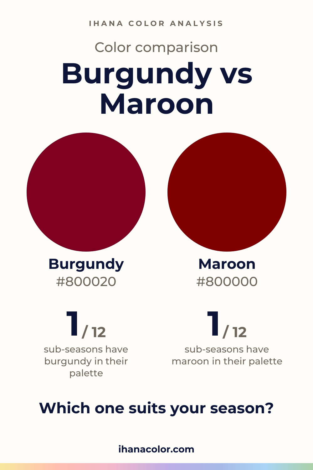
Keep it
The two colors side by side, ready to pin or to keep on your phone.
Download the imageKeep exploring
What colors go with burgundy? I sort its five shades, name the partners that work with it, and show which version belongs to each of the 12 sub-seasons.
What colors go with maroon? I name the partners, then show which version belongs to which sub-season, and what to do when maroon isn’t in your palette.
Burgundy vs red: the real difference is depth and intensity, not hue. Twelve sub-seasons sorted into burgundy, red, both or neither, with the reasons.
Burgundy vs wine: two dark reds at the same depth, with burgundy a touch more vivid. I show how they differ on a face and which sub-seasons wear each.
The quiz shows you your likely season and a sub-season hint, with no sign-up. A first hint, not a verdict.
Full palette, capsule wardrobe, makeup, hair and a shopping list for each sub-season. Not on sale yet: join the waitlist.
Twelve sub-seasons instead of sixteen, the three things we look at, and why a quiz is only a first hint.
The free quiz shows you your likely season in two minutes. Then hold both colors up to your bare face, in daylight: a first hint, not a verdict.