
At the office
Burnt Orange blazer, cream shirt, charcoal pants
Oranges and yellows · 3 shades
Which colors go with burnt orange? Lots. Whether burnt orange goes with you is the real question. Four sub-seasons say yes. One says almost. Seven say no.
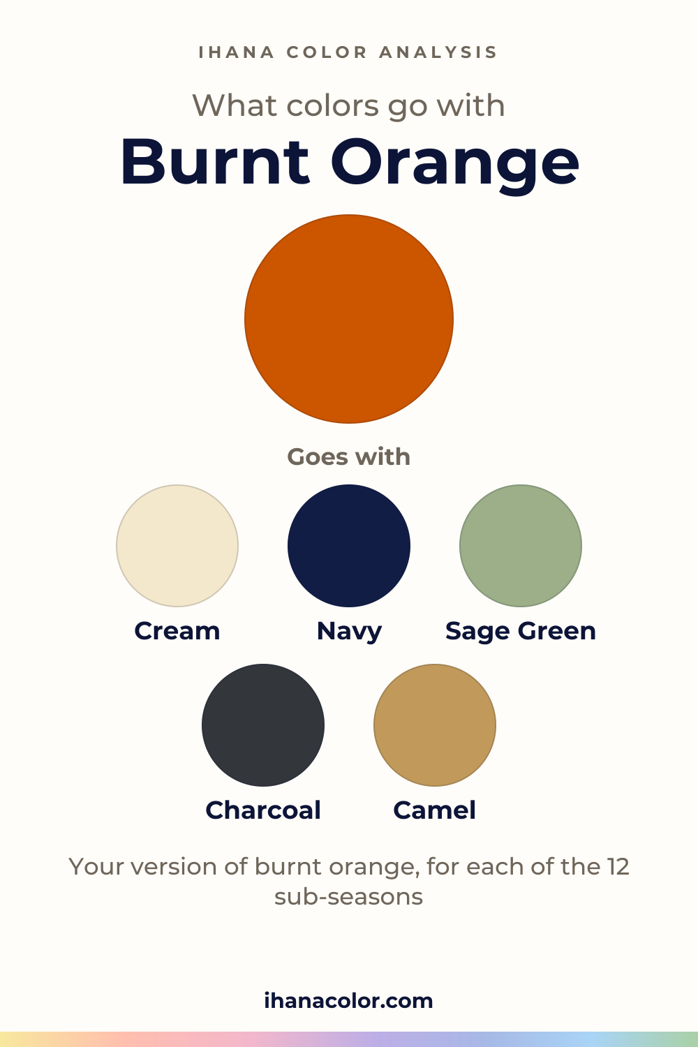
#CC5500#C46210#E07B2AFive colors that go with burnt orange
Always works
Each block has three colors: the color itself and two partners.
Burnt Orange + Cream + Navy
Burnt Orange + Sage Green + Charcoal
Burnt Orange + Camel + Teal
Outfits
Three ways to wear it, written as color blocks you can rebuild with what you own.
Burnt Orange blazer, cream shirt, charcoal pants
Burnt Orange cardigan, white T-shirt, denim blue jeans
Burnt Orange dress, olive jacket, gold heels
Neither. It’s a red-orange, the stretch of the color wheel where red hands over to orange. The family has three shades, and all three share that hue, a medium lightness and a vivid intensity.
What separates them is small. From lightest to darkest: Pumpkin, Alloy Orange, then Burnt Orange. From most to least intense: Burnt Orange, Pumpkin, Alloy Orange. All three sit at medium lightness. Within that, Pumpkin is the lightest and Burnt Orange the darkest, and Burnt Orange is also the most intense while Alloy Orange is the least.
Keep that small gap in mind. It comes back below.
A color name is not one code. Dye, fabric and the bulb above you can all push the same tag toward a browner or a brighter orange, so judge the piece in your hands, not the name.
Four sub-seasons hold it. Warm Autumn wears Pumpkin, matched with its own Pumpkin. It’s very warm, medium in depth and rich, so a vivid orange has room.
Deep Autumn is the only one that wears the deepest shade, Burnt Orange, matched with Spiced Orange. Its palette is dark and intense, which gives that shade the weight it needs.
Warm Spring and Bright Spring wear Pumpkin as well, matched with Bright Orange and Tangerine. Warm Spring is very warm and bright. Bright Spring is neutral to warm and very bright. Each palette has an orange of its own.
Soft Autumn gets only a neighbor: Light Terracotta, a little duller. Its palette is very soft and desaturated, and a vivid orange runs louder than it wants.
Seven are not for you. Five of them, the three Summers, Deep Winter and True Winter, have a color on their avoid list that sits right where burnt orange does: Orange, Bright Orange or Rust. Light Summer, Cool Summer and True Winter avoid Orange, Soft Summer avoids Bright Orange, and Deep Winter avoids Rust.
Light Spring and Bright Winter are not for you either, with no avoid-list color behind it. Light Spring is very light with low contrast, and a medium, vivid orange sits heavy on it. Bright Winter is neutral to cool with very high contrast, a different pull from a red-orange.
A vivid, medium-depth color talks first. So give your face something to stand on. A cream top or collar, or any lighter neutral, sits between the orange and your skin and lets you arrive before the color does.
Your version matters here, but all three shades are medium, so none is a light touch. Try yours with the cream and see whether the orange or your face arrives first.
The logic of every outfit is one neutral, one accent, and burnt orange is the accent. Build a fourth look from that: a burnt orange cardigan over a sage green top, with camel pants. Hold the top up at a window and watch what your face does, not what the fabric looks like.
Red first. Two strong colors in one outfit, and the eye jumps between them without settling.
Terracotta is the opposite trouble. It sits so close in tone that the two melt into one patch and the burnt orange loses its edge. The terracotta and burnt orange comparison puts the two side by side.
If you’re among the seven, don’t force a shade. Light Spring’s closest palette color is Light Camel, and Soft Summer’s is Rosy Cocoa. For Bright Winter, Deep Winter and True Winter it is a red: Bright Red, Pure Red and Raspberry Red.
Those are stand-ins, not matches, and for the avoid-list sub-seasons not a recommendation either. For Light Summer and Cool Summer, the palette holds nothing close enough to suggest.
My advice: if you love a burnt orange piece that isn’t yours, wear it low and away from your face, and put a color from your palette at the neckline.
Your sub-season
Your own version of burnt orange, the colors of your palette that go with it, or the color that stands in for it. Each answer is computed from the palette of the sub-season.
#C9A26BGoes with Light CamelIvoryPowder Blue
#E07B2AMatches your Bright OrangeGoes with it, in your paletteCreamGolden Ivory
#E07B2AMatches your TangerineGoes with it, in your paletteWarm Off-WhiteWarm Lemon Yellow
#A89A9EBurnt Orange sits close to Orange, one of the colors this sub-season avoids.
Goes with Rosy TaupeSoft NavyIcy Mint
#B5364FBurnt Orange sits close to Orange, one of the colors this sub-season avoids.
Goes with Soft CherrySoft WhiteCool Sky Blue
#8F7570Burnt Orange sits close to Bright Orange, one of the colors this sub-season avoids.
Goes with Rosy CocoaOff-WhitePebble Gray
#E07B2AClose to your Light TerracottaGoes with it, in your paletteCreamSoft Mustard
#E07B2AMatches your PumpkinGoes with it, in your paletteChocolateBrick
#CC5500Matches your Spiced OrangeGoes with it, in your paletteEspressoWarm Burgundy
#D0102ABurnt Orange sits close to Rust, one of the colors this sub-season avoids.
Goes with Pure RedPure WhiteDark Chocolate
#C8102EBurnt Orange sits close to Orange, one of the colors this sub-season avoids.
Goes with Raspberry RedPure WhiteIcy Pink
#E3172BGoes with Bright RedBlackLight Pearl Gray
Not sure which sub-season you are? The free quiz gives you a first hint in two minutes: a hint, not a verdict.
What to skip
Questions
Rarely. Red and burnt orange both raise their voice, so the outfit turns into an argument. Give red a look of its own, or let charcoal or cream stand between them.
Your sub-season sets it. Pumpkin for Warm Spring, Bright Spring and Warm Autumn, the deepest Burnt Orange for Deep Autumn, and a near-miss for Soft Autumn. Not sure where you land? The free quiz takes ten questions and points you toward a season and sub-season to check. Treat it as a starting guess.
Yes, as long as it stays away from your face. Keep it in the lower half of an outfit and let a color from your palette sit at the neckline. If you want something nearer your face, reach for the closest palette color for your sub-season, as a stand-in rather than a match.
No, but they’re close cousins. That closeness is why wearing both at once flattens the look. The terracotta and burnt orange comparison shows which sub-seasons take which. Choose one per outfit.
Close, but they aren’t the same. Warm Autumn wears Pumpkin, the lightest shade. Deep Autumn wears Burnt Orange itself, the deepest and most intense of the family, because its palette is dark enough to hold it. Both sit inside their palettes.
Keep exploring
Terracotta vs burnt orange: one is redder and softer, the other more orange and vivid. I show the difference on a face, and which sub-seasons take each.
Colors that go with orange, and which orange is really yours. I show you its four shades, what to skip and what changes from one sub-season to the next.
Colors that go with terracotta: cream, olive, sage green, navy and camel. I show you which version belongs to which sub-season, and what to skip with it.
Colors that go with mustard yellow, and the version that belongs to your sub-season. I explain what each shade does near your face and what to avoid.
The quiz shows you your likely season and a sub-season hint, with no sign-up. A first hint, not a verdict.
Full palette, capsule wardrobe, makeup, hair and a shopping list for each sub-season. Not on sale yet: join the waitlist.
Twelve sub-seasons instead of sixteen, the three things we look at, and why a quiz is only a first hint.
The free quiz shows you your likely season in two minutes. Then try the shades above against your bare face, in daylight: a first hint, not a verdict.