
At the office
Hot Pink blouse, navy blazer, light gray pants
Reds, pinks and purples · 4 shades
“Hot pink goes with nothing.” It goes with plenty. It just needs quiet company. And the version you pick matters as much as the company.
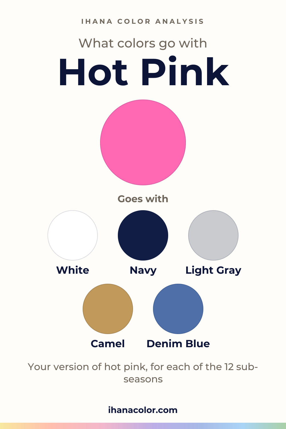
#FF69B4#FF1493#FF6FA3#FF5E7EFive colors that go with hot pink
Always works
Each block has three colors: the color itself and two partners.
Hot Pink + White + Navy
Hot Pink + Light Gray + Camel
Hot Pink + Denim Blue + Olive
Outfits
Three ways to wear it, written as color blocks you can rebuild with what you own.
Hot Pink blouse, navy blazer, light gray pants
Hot Pink T-shirt, denim blue jeans, white sneakers
Hot Pink dress, black jacket, silver clutch
Four shades live under this name. Flamingo Pink is the lightest and the gentlest. Hot Pink comes next, then Watermelon Pink. Shocking Pink closes the line. It’s the deepest and the loudest of the four.
Here lightness and intensity move together. The deeper the shade, the more volume it carries. On the color wheel all four sit in the pink-red range, between pink and red.
Don’t trust the tag alone. Dye, fabric and the bulb overhead each nudge the color, so the sweater in your hands may sit nearer Flamingo Pink or Shocking Pink than its label admits.
Six palettes hold a version of hot pink, and they sort into two groups.
Flamingo Pink is the version for Light Spring, Bright Spring, Light Summer and Cool Summer. Light Spring is very light and low in contrast, and its pink is matched with Warm Candy Pink. Light Summer is just as light, matched with Pale Strawberry.
Bright Spring is matched with Flamingo Pink itself, because very bright colors are its home. Cool Summer is matched with Pink, in a palette that runs soft to medium in intensity.
The Winters take Shocking Pink. True Winter is saturated and high in contrast, and its pink is matched with Bright Cool Pink. Bright Winter has very bright colors and very high contrast, so Shocking Pink is matched with Shocking Pink.
Deep Winter is the one in between. A neighbor of the color is in its palette: Fuchsia, close to Shocking Pink. Wear that shade and you’re nearly there.
Five say no. Warm Spring and Deep Autumn have nothing like it in their palettes.
Soft Summer, Soft Autumn and Warm Autumn go further: hot pink sits close to a fuchsia they avoid. Soft Summer avoids Electric Fuchsia. The other two avoid Fuchsia, and a vivid pink would talk over their quieter colors.
Put a pale layer between the pink and your face. White or light gray at the collar gives the eye a place to rest before it meets the color.
Choose the shade by the volume you want. Flamingo Pink near the face is friendly. Shocking Pink near the face is a statement, so give it a quieter neighbor.
Navy, camel, denim blue and olive do their best work lower down. They hold the pink steady without competing with it.
To build an outfit of your own, follow one rule: one neutral, one accent. Take a hot pink blouse with olive pants and white sneakers. The white keeps the look light, the olive carries the weight, and the pink gets the spotlight alone.
Red and orange are the two pairings to skip. Each is a strong color of its own, and next to hot pink they fight for the same attention. The eye bounces between them and lands on neither.
If your palette says no, you don’t have to give up the idea of a pink. Use the closest color your sub-season does own, and treat it as a stand-in, not a match.
Warm Spring has Coral, which goes with Cream and Golden Apricot. Soft Summer has Dusty Rose, with Grayed Navy and Soft Plum. Neither is a match for hot pink. Each borrows the mood and drops the voltage.
A color outside your palette can still live in your closet. Keep it away from the face: a bag, a belt, a pair of shoes. The loud shade then stays part of the outfit and out of your complexion.
Your sub-season
Your own version of hot pink, the colors of your palette that go with it, or the color that stands in for it. Each answer is computed from the palette of the sub-season.
#FF6FA3Matches your Warm Candy PinkGoes with it, in your paletteIvoryAqua
#FF6F52Goes with CoralCreamGolden Apricot
#FF6FA3Matches your Flamingo PinkGoes with it, in your paletteWarm Off-WhiteWarm Cherry
#FF6FA3Matches your Pale StrawberryGoes with it, in your paletteSoft WhitePale Turquoise
#FF6FA3Matches your PinkGoes with it, in your paletteNavyLight Plum
#C48A94Hot Pink sits close to Electric Fuchsia, one of the colors this sub-season avoids.
Goes with Dusty RoseGrayed NavySoft Plum
#C98F85Hot Pink sits close to Fuchsia, one of the colors this sub-season avoids.
Goes with Warm Dusty RoseCreamSmoky Plum
#E0623FHot Pink sits close to Fuchsia, one of the colors this sub-season avoids.
Goes with Burnt CoralChocolatePetrol Blue
#C0392BGoes with TomatoCreamTobacco
#FF1493Close to your FuchsiaGoes with it, in your palettePure WhiteCool Eggplant
#FF1493Matches your Bright Cool PinkGoes with it, in your paletteNavyIcy Mint
#FF1493Matches your Shocking PinkGoes with it, in your paletteBlackBright Mint
Not sure which sub-season you are? The free quiz gives you a first hint in two minutes: a hint, not a verdict.
What to skip
Questions
It follows your sub-season, and the verdicts above name the version for each one. Not sure of yours? Answer the free color analysis quiz and you get a likely season, plus a first nudge toward your sub-season. It’s a hint, not a verdict, so check the pink near your face.
Yes. Wear it away from your face: a skirt, a bag, shoes. Or reach for your stand-in, the nearest pink-ish color your palette owns. Your goal for the day counts too. Sometimes the color that does the job is the one you want to be seen in.
They overlap, and a tag won’t settle it. Fuchsia shows up on the avoid lists of Soft Autumn and Warm Autumn and in Deep Winter’s palette. The fuchsia vs hot pink guide sets the two side by side, sub-season by sub-season.
Depth and volume. Flamingo Pink is the lightest and least intense of the four shades. Shocking Pink is medium in lightness and very vivid. Both are pink-red, but they behave very differently near a face, which is why they belong to different sub-seasons.
Keep the rest calm. A hot pink T-shirt with denim blue jeans and white sneakers does it, because the denim and the white take the quiet roles. Swap the sneakers for light gray or camel pieces if you want a softer finish.
Keep exploring
Fuchsia vs hot pink: one is deeper, both are vivid, and your sub-season decides which belongs near your face. I sort the twelve and show how to test them.
What colors go with pink? Here are the partners that work, the shades to choose from and the version each sub-season wears near the face, or away from it.
What colors go with burgundy? I sort its five shades, name the partners that work with it, and show which version belongs to each of the 12 sub-seasons.
What colors go with maroon? I name the partners, then show which version belongs to which sub-season, and what to do when maroon isn’t in your palette.
The quiz shows you your likely season and a sub-season hint, with no sign-up. A first hint, not a verdict.
Full palette, capsule wardrobe, makeup, hair and a shopping list for each sub-season. Not on sale yet: join the waitlist.
Twelve sub-seasons instead of sixteen, the three things we look at, and why a quiz is only a first hint.
The free quiz shows you your likely season in two minutes. Then try the shades above against your bare face, in daylight: a first hint, not a verdict.