
Fuchsia
#D4127C- French Fuchsia
- Fandango
- Soft Fuchsia
Color comparison
Fuchsia or hot pink: is there a real difference? Less than the tags suggest. The gap is one step of depth, and it counts for little next to the question of who wears which.
#D4127C#FF69B4Side by side
Hot Pink is lighter, and the two are about as vivid as each other; both sit in the pink-red range.
Fuchsia sits at medium lightness with the intensity pushed to the top. The family is four shades, Fandango, Soft Fuchsia, French Fuchsia and plain Fuchsia, all medium in lightness and all vivid.
Three lean pink-red. Fandango leans pink-purple and is the deepest of the four. French Fuchsia takes both records, the lightest and the strongest. Soft Fuchsia comes last for intensity, yet it’s still vivid, so don’t read the name as a pastel.
Near the face, a vivid medium pink has weight. Look at your chin and the skin under your eyes: the color should sit behind your features, not in front of them.
Hot pink takes the same vivid pink-red and lifts it a step. Its shades are Hot Pink, Flamingo Pink, Watermelon Pink and Shocking Pink. Three are light and vivid, and Flamingo Pink is the lightest.
Shocking Pink breaks the pattern. It is medium in lightness and the only very vivid shade, so it is the most intense of the four, with Watermelon Pink next. All four lean pink-red.
Because it is lighter, hot pink throws more brightness up under the chin than fuchsia does. Check whether that light shows on your skin or only on the fabric.
Lightness is the one gap. Fuchsia is medium, hot pink is light. On a fabric, fuchsia reads fuller and hot pink reads more lifted.
Everything else matches. Both are vivid. Both sit in the pink-red range.
So if you’re hunting for a difference in hue or strength, stop. It isn’t there.
Two shades blur the line. Shocking Pink is medium like fuchsia, and more intense than any fuchsia. Fandango leans toward purple, the only shade on the page that does.
So when two pinks look alike in a shop, ask one question: which one is deeper? It settles the shop question. Your sub-season settles the rest.
Two sub-seasons take fuchsia only. Deep Winter is dark, saturated and high in contrast, and Fuchsia is in its palette. Hot pink is not for you there, and Fuchsia is the stand-in. True Winter also has Fuchsia, while hot pink is only close, a neighbor of Bright Cool Pink.
Two take hot pink only. Bright Spring is very bright, and Hot Pink is in its palette, matched with Flamingo Pink. Fuchsia is not for you, and Watermelon Pink is the stand-in. Light Spring is lighter and gentler: hot pink is close, a neighbor of Warm Candy Pink.
Two take both. Cool Summer has Fuchsia matched with Raspberry and Hot Pink matched with Pink. Bright Winter wears both outright, and its Bright Candy Pink is the match for hot pink.
Light Summer is the in-between case: it holds only neighbors of the two pinks, Light Raspberry and Pale Strawberry.
Five take neither pink: Warm Spring, Deep Autumn, Soft Summer, Warm Autumn and Soft Autumn. Each has a stand-in, not a match. Warm Spring turns to Warm Violet for both pinks, and Deep Autumn to Tomato for both. Soft Summer uses Muted Raspberry in place of fuchsia and Heather Rose in place of hot pink.
The reason is in the axes. Low intensity rules out Soft Summer and Soft Autumn, because a vivid pink has little in common with them. Warm Spring and Warm Autumn are the very warm palettes, and for both pinks they get stand-ins only. Deep Autumn even avoids Cool Fuchsia, which sits close to fuchsia.
One gesture settles most of it: a bare face by a window, one pink at a time, set up as in the article on color draping at home.
Hot pink has six listed partners: white, navy, light gray, camel, denim blue and olive. Choose one and let the pink be the only loud piece in the outfit.
Fuchsia has none listed, so look for a quality instead: a partner that stays out of the pink’s way, muted and plain, never a second bright.
My advice for the “neither” group: keep the stand-in nearest your skin and let the pink be a belt or a pair of shoes.
Which one suits you
Each color is checked against the palette of each sub-season, color by color. This is a first hint, not a verdict: see how it looks on your own face.
Hot Pink is the one for you
Neither is for you
Closest in your paletteWarm Violet
Hot Pink is the one for you
Both are close to your palette
Both work for you
Neither is for you
Closest in your paletteMuted Raspberry
Neither is for you
Closest in your paletteSmoky Plum
Neither is for you
Closest in your paletteWarm Eggplant
Neither is for you
Closest in your paletteTomato
Fuchsia is the one for you
Fuchsia is the one for you
Both work for you
Questions
Nearly. Both are vivid pink-reds, so hue and intensity don’t separate them. The gap is depth: fuchsia is medium, hot pink is light.
Shocking Pink, a hot pink shade, is also medium, which is where the two blur. Past that, the real difference is which sub-seasons take which.
Hot pink is the lighter one. On the main shades, neither is more vivid. Inside the hot pink family, Shocking Pink is the most intense shade on this page. Fandango is the deepest fuchsia, and Flamingo Pink is the lightest hot pink.
Check the groups above. If you don’t know your sub-season yet, the free color analysis quiz takes ten questions, needs no sign-up, and points to a likely season and a sub-season to check. Treat that as a lead to test with fabric at your face, not a ruling.
Yes, in Cool Summer and Bright Winter, which take both. Light Summer takes both as neighbors of its palette. Everywhere else, pick the one your sub-season gives you, or wear the other low, away from your face.
Hex codes are only references here. Dye batches, bulbs and screens all shift a pink. Hold both fabrics at your face by a window and ask which looks deeper. That one is likelier the fuchsia, unless it’s a Shocking Pink.
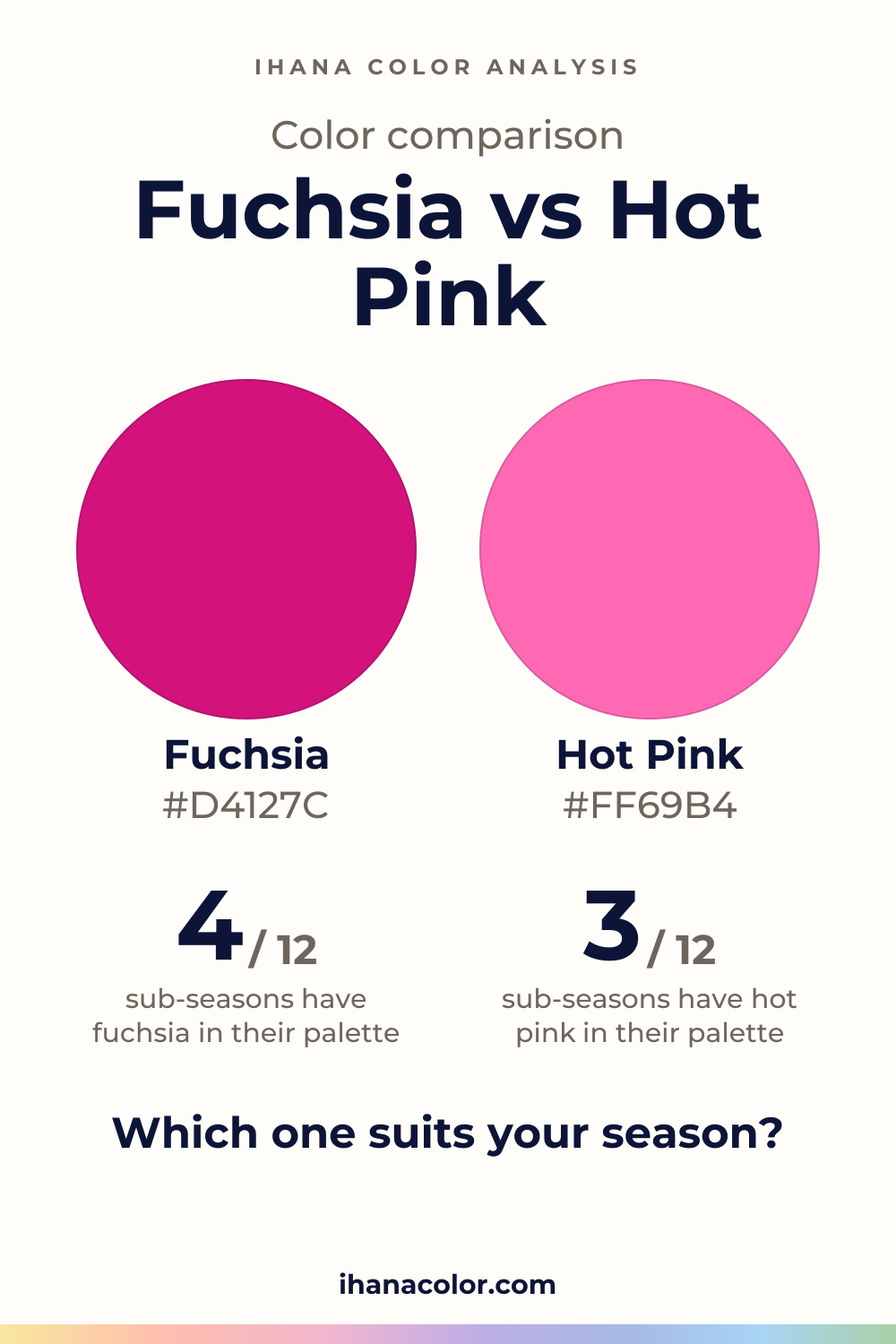
Keep it
The two colors side by side, ready to pin or to keep on your phone.
Download the imageKeep exploring
What colors go with hot pink? I name five partners, then show which version belongs to which sub-season, and what to wear when hot pink just isn’t yours.
Fuchsia vs magenta: the two overlap heavily. I show what really separates them on a face and which sub-seasons wear fuchsia, magenta, both or neither.
The quiz shows you your likely season and a sub-season hint, with no sign-up. A first hint, not a verdict.
Full palette, capsule wardrobe, makeup, hair and a shopping list for each sub-season. Not on sale yet: join the waitlist.
Twelve sub-seasons instead of sixteen, the three things we look at, and why a quiz is only a first hint.
The free quiz shows you your likely season in two minutes. Then hold both colors up to your bare face, in daylight: a first hint, not a verdict.