
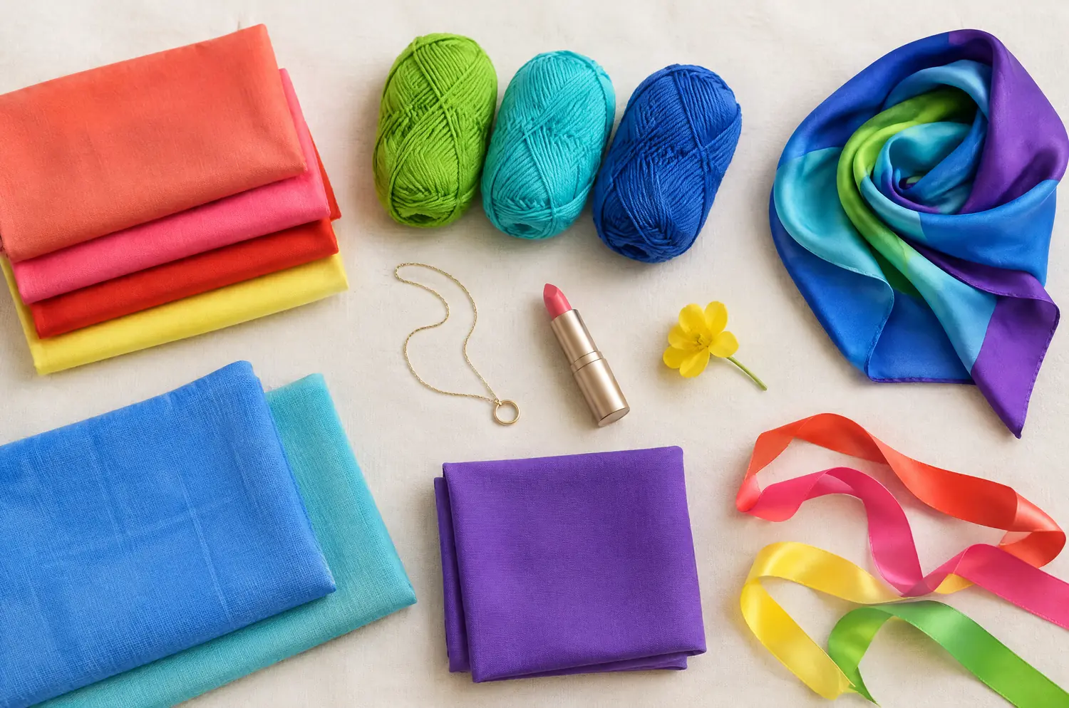
Compare · two sub-seasons
Bright Spring vs Deep Autumn: Two Differences That Matter
“They’re both warm and high contrast, so it’s the same palette.” It isn’t. One runs on brightness. The other runs on weight.
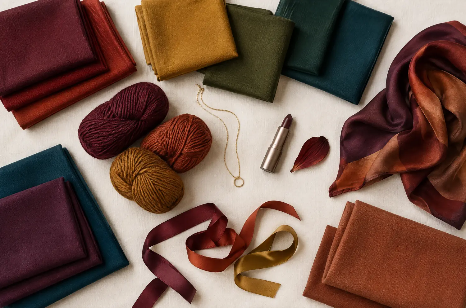
Side by side
Bright Spring and Deep Autumn palettes
Same scale, same page: look at the swatches before you read the differences.
- Bright Coral
#FF5A4D - Watermelon Pink
#FF5E7E - Tomato Red
#F02D1F - Tangerine
#FF7A00 - Warm Lemon Yellow
#FFE033 - Lime Green
#9BD81E - Light Emerald
#00B26B - Bright Aqua
#2ED3C6 - Turquoise
#00B5C8 - Azure Blue
#1E90FF - Bright Royal Blue
#1F5FD1 - Bright Violet
#7A3FD1
Neutrals
- Warm Off-White
- Light Gray
- Bright Navy
- Camel
Colors to avoid
- Grayed Beige
- Dusty Rose
- Dull Khaki
- Taupe
- Warm Burgundy
#6E1A24 - Brick Red
#9E2B1F - Tomato
#C0392B - Spiced Orange
#C65A1E - Rust
#A44A1F - Dark Mustard
#B8860B - Dark Olive
#4B5320 - Spruce Green
#1E4D3A - Deep Turquoise
#0E6E6A - Dark Petrol Blue
#0F4C5C - Eggplant
#4A2040 - Dark Terracotta
#A14A2E
Neutrals
- Cream
- Dark Khaki
- Chocolate
- Espresso
Colors to avoid
- Baby Pink
- Sky Blue
- Pearl Gray
- Cool Fuchsia
The four axes
2 axes differ, the rest is shared
Temperature, lightness, intensity and contrast: the gauge shows where each one sits, the table says it in words.
The two sub-seasons
- Temperature
- 12SameNeutral to warm
- Lightness
- 12Differs1 Medium2 Dark
- Intensity
- 12Differs1 Very bright2 Rich and intense
- Contrast
- 12SameHigh
Line by line
| What is compared | Bright Spring | Deep Autumn |
|---|---|---|
| Temperature | Neutral to warm | Neutral to warm |
| LightnessDiffers | Medium | Dark |
| IntensityDiffers | Very bright | Rich and intense |
| Contrast | High | High |
| Signature color | Bright Coral | Warm Burgundy |
| Neutrals | Warm Off-White, Light Gray, Bright Navy, Camel | Cream, Dark Khaki, Chocolate, Espresso |
| Metals | Bright yellow gold, graphic pieces, vivid stones. | Yellow gold, bronze, dark copper. Garnet, dark amber. |
| Lips | Tomato red, bright coral, watermelon pink. You can pull off a bold lip. | Brick, warm burgundy, warm plum, dark tomato red. |
| Hair color | Crisp, shiny colors: clear golden blonde, bright warm brown, brown with golden tones. Avoid ashy effects. | Chocolate brown, dark brown with mahogany or coppery tones, deep auburn. |
What does Bright Spring look like when the color does the talking?
Bright Spring leads with intensity. The color has to be pure.
Bright Coral, Turquoise, Watermelon Pink. Colors at full strength, with no haze in them.
The temperature is neutral to warm, so a base of warmth stays under all that brilliance. The depth is medium: neither pale nor dark. Nothing here is whispered, and nothing is heavy.
On a face, the signs are easy to spot. Your eyes are very defined, and people often notice them first. “Safe” colors, the beiges, the dusty roses, make you disappear.
You can put a light color and a dark one in the same outfit, say Bright Navy with Bright Coral, and the face still holds.
Deep Autumn: why does dark color give you radiance instead of dimming you?
Deep Autumn leads with depth. The color needs weight.
Warm Burgundy, Spruce Green, Rust, Eggplant. The temperature is neutral to warm, like Bright Spring, and the base stays warm under the darkness. The intensity is rich rather than sparkling.
Here is the sign to watch. A dark color doesn’t darken you, it lights you up. A pastel does the opposite and leaves you looking bland.
Coloring like this is often dark and intense, eyes and hair alike. Black works better on you than on the other Autumns, though Chocolate flatters you more. That’s a deep palette that keeps its warmth.
Two differences separate them: lightness first, then intensity
Two axes differ. Two are shared. Let’s clear the shared ones first, so you don’t waste time on them.
Temperature is neutral to warm for both. Contrast is high for both. So a warm-or-cool question won’t settle this pair, and neither will the sharpness of your features.
Now the two that matter. Lightness, also called depth, is medium for Bright Spring and dark for Deep Autumn. On a Deep Autumn, a dark color settles into the face and frames it. On a Bright Spring, the color itself should be the star, with dark shades as support.
Intensity, also called clarity, is very bright against rich and intense. Both are strong. Bright Spring’s color is pure and saturated, almost tropical. Deep Autumn’s is dense and warm all the way down.
The two can show up at once. Look at them one after the other, not together.
The two-color test. In daylight, with no makeup, hold a piece of fabric in each of these two colors up to your face. Rest your eyes between the two and redo it another day. If the same color keeps winning, you have a direction: a first hint, not a verdict.
Bright Coral or Warm Burgundy: what is your face telling you?
Set things up as in color draping at home, and keep your eyes on this pair only.
Hold Bright Coral, then Warm Burgundy, near your face. One color at a time.
Start with lightness. Does Warm Burgundy settle in so that your face stays the first thing you see? That points to Deep Autumn. Does it feel heavy? Depth may not be your lead.
Then intensity. Does Bright Coral make your eyes and skin look lit up? That points to Bright Spring. Does it feel loud? Clarity may not be your lead.
Then check your features. Do your eyes stand out, or do they blur?
Redo it another day, in the same light. If the same side keeps winning, you have a direction.
What if you sit between Bright Spring and Deep Autumn?
It happens. Neither is the other’s neighbor in the method. Bright Spring has Bright Winter beside it, and Deep Autumn has Deep Winter. If a result tips toward one of those, read Bright Spring vs Bright Winter or Deep Autumn vs Deep Winter.
Ask what you can’t lose: brightness or depth?
If a pure, vivid color makes you sit up and a dark one feels heavy, lean Bright Spring. If a dark, rich color settles you and a vivid one feels loud, lean Deep Autumn.
Neither palette can stand in for the other. Only your face can settle it. The free color analysis quiz gives you a likely season and a sub-season hint, and a screen can’t show your skin changing next to a fabric, so go back to the drape.
Metals, lips and hair: where do they agree and split?
Metals bring them together. Bright Spring points to bright yellow gold and graphic pieces. Deep Autumn points to yellow gold, bronze and dark copper. If gold flatters you, that’s a shared sign, not an answer.
Lips split them. Bright Spring can pull off a bold lip in Tomato Red or Watermelon Pink. Deep Autumn goes darker: brick, plum, a dark tomato red.
Hair follows the same split. Bright Spring’s line is crisp and shiny, a clear golden blonde or a bright warm brown. Deep Autumn’s is deeper: chocolate, a brown with a mahogany glow, deep auburn. Take both as directions, not rules.
Keep exploring
More on these two sub-seasons
Palette Bright Spring color palette
The most dazzling season: pure, saturated, almost electric colors.
Compare Bright Spring vs Bright Winter
Bright Spring vs Bright Winter: same brilliance, but warmth and contrast split them. Here is what each looks like on a face and how to decide between them.
Compare Bright Spring vs Soft Autumn
Bright Spring vs Soft Autumn: they share warmth and depth, but not intensity or contrast. See what that looks like on a face and how to settle it at home.
Compare Bright Spring vs Soft Summer
Bright Spring vs Soft Summer: three differences set them apart, temperature, intensity and contrast. See what each looks like on a face and how to decide.
Compare Bright Spring vs Warm Autumn
Bright Spring vs Warm Autumn: three differences, temperature, intensity and contrast, and how to test it with Bright Coral and Rust held near your face.
Compare Light Spring vs Bright Spring
Light Spring vs Bright Spring: all four axes differ. I show what each difference looks like on a face and how to settle it with a simple drape test at home.
Questions
Bright Spring or Deep Autumn: your questions
How can I tell if I’m a Dark Autumn or a Bright Spring?
Look at what your face needs most. If dark, rich color gives you radiance and pastels look bland, think Deep Autumn (also called Dark Autumn). If vivid, clean color wakes you up and muted shades make you disappear, think Bright Spring. Compare one pair of colors, then redo it another day.
Does dark hair mean Deep Autumn?
No. Dark hair turns up often in Deep Autumn, but it isn’t the test. Cover it, then judge how your skin and your eyes answer each color. The strands only add to the picture, dyed or natural.
Which colors should each one skip?
Bright Spring skips muted, grayed shades such as Grayed Beige and Dusty Rose, because they blur the sharpness of the face. Deep Autumn skips pale or cool ones such as Baby Pink and Sky Blue, because they lack weight. One palette fears haze, the other fears lightness.
My quiz says Bright Spring, but Warm Burgundy flatters me. Now what?
Repeat the drape on another day, in the same light. The quiz works from your answers, while the drape shows how your skin reacts. If the two keep disagreeing, read the signs on both season pages and see which one sounds like you.
Can a Bright Spring wear dark colors?
Yes, in the right place. Bright Navy sits in Bright Spring’s neutrals, and a light color beside a dark one holds up in an outfit. What stays constant is the purity of the color. For a Deep Autumn, darkness is the point, and weight comes before sparkle.
Bright Spring or Deep Autumn? Check it.
The free quiz shows you your likely season in two minutes. Then run the two-color test on your own bare face, in daylight: a first hint, not a verdict.