
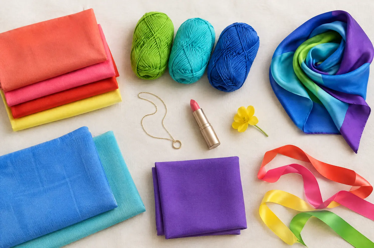
Compare · two sub-seasons
Bright Spring vs Warm Autumn: The Real Differences
A tomato-red scarf in one hand, a mustard sweater in the other. Your quiz said Bright Spring. Your closet keeps saying Warm Autumn.
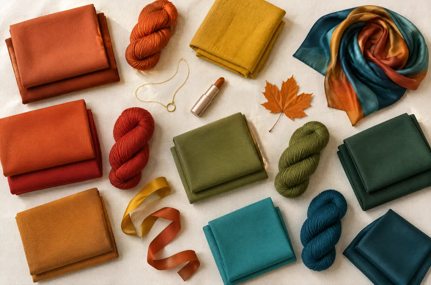
Side by side
Bright Spring and Warm Autumn palettes
Same scale, same page: look at the swatches before you read the differences.
- Bright Coral
#FF5A4D - Watermelon Pink
#FF5E7E - Tomato Red
#F02D1F - Tangerine
#FF7A00 - Warm Lemon Yellow
#FFE033 - Lime Green
#9BD81E - Light Emerald
#00B26B - Bright Aqua
#2ED3C6 - Turquoise
#00B5C8 - Azure Blue
#1E90FF - Bright Royal Blue
#1F5FD1 - Bright Violet
#7A3FD1
Neutrals
- Warm Off-White
- Light Gray
- Bright Navy
- Camel
Colors to avoid
- Grayed Beige
- Dusty Rose
- Dull Khaki
- Taupe
- Terracotta
#C1502E - Rust
#A8451F - Burnt Orange
#D2691E - Burnt Coral
#E0623F - Tomato Red
#C8321F - Mustard
#D4A017 - Ochre
#C9862B - Olive Green
#6B7A2A - Moss Green
#4F6B3A - Warm Forest Green
#2F5D3A - Warm Turquoise
#2A8C82 - Petrol Blue
#1F5F6B
Neutrals
- Cream
- Camel
- Khaki
- Chocolate
Colors to avoid
- Black
- Fuchsia
- Cool Gray
- Glacier Blue
The four axes
3 axes differ, the rest is shared
Temperature, lightness, intensity and contrast: the gauge shows where each one sits, the table says it in words.
The two sub-seasons
- Temperature
- 12Differs1 Neutral to warm2 Very warm
- Lightness
- 12SameMedium
- Intensity
- 12Differs1 Very bright2 Rich, slightly muted
- Contrast
- 12Differs1 High2 Moderate
Line by line
| What is compared | Bright Spring | Warm Autumn |
|---|---|---|
| TemperatureDiffers | Neutral to warm | Very warm |
| Lightness | Medium | Medium |
| IntensityDiffers | Very bright | Rich, slightly muted |
| ContrastDiffers | High | Moderate |
| Signature color | Bright Coral | Rust |
| Neutrals | Warm Off-White, Light Gray, Bright Navy, Camel | Cream, Camel, Khaki, Chocolate |
| Metals | Bright yellow gold, graphic pieces, vivid stones. | Yellow gold, copper, bronze, brass. Amber, tiger’s eye, turquoise. |
| Lips | Tomato red, bright coral, watermelon pink. You can pull off a bold lip. | Terracotta, brick, tomato red, burnt coral. |
| Hair color | Crisp, shiny colors: clear golden blonde, bright warm brown, brown with golden tones. Avoid ashy effects. | Red, coppery, auburn, golden brown, dark honey. Warm tones were made for you. |
Bright Spring is the clear, almost tropical one
Picture a bright flower against turquoise water.
Intensity leads. The colors are pure and saturated, the temperature sits neutral to warm, and the depth is medium. Contrast is high, so hair, eyes and skin stand apart from each other. The eyes are often the first thing people notice.
Bright Coral is the signature. Watermelon Pink, Turquoise and Light Emerald show how far the palette is from anything earthy.
That is why “safe” shades fail here. Grayed Beige, Taupe and Dusty Rose don’t flatter quietly. They blur the sharpness of your face. If you come alive in a bright red or a turquoise and fade in beige, start with the Bright Spring page.
Warm Autumn asks for heat first and clarity second
The temperature is very warm. Depth is medium. The color is rich but slightly muted: full enough to feel generous, with a little earth in it. Contrast is moderate, so nothing in the face competes with anything else.
Rust is the signature, with Terracotta, Mustard and Olive Green around it and Petrol Blue as the one blue note. Mustard and rust are tricky shades on many faces. Here they look right.
What dims you is just as clear. Fuchsia, Cool Gray and Glacier Blue bring out redness and gray out the complexion. Black is on its avoid list too, and the metals line points to yellow gold, copper and bronze rather than silver. The full palette is on the Warm Autumn page.
Three differences, and which one the eye reads first
Intensity comes first. It is the gap you see before you can name it.
Bright Spring looks like color switched on. Warm Autumn looks like color with the volume set to rich. Hold Bright Coral near a Warm Autumn face and watch whether the color talks louder than you do. Hold Rust near a Bright Spring face and watch whether the sparkle goes quiet.
Temperature comes second. Bright Spring has a warm base, but it is neutral to warm, and the heat arrives after the brilliance. Warm Autumn is very warm, so golden shades feel like home and cool pinks or bluish grays feel like a draft.
Contrast comes third. Bright Spring is high, and it can carry light against dark within one outfit, like Bright Navy beside Bright Coral. Warm Autumn is moderate and prefers tones that melt into each other, like Cream, Rust and Camel.
That makes three differences.
One thing is shared: medium depth. Neither palette asks you to go very light or very dark, so don’t hunt for a difference there. Tomato Red and Camel appear in both palettes, in slightly different versions, so test them on your own face. Yellow gold is the metal both point to.
The two-color test. In daylight, with no makeup, hold a piece of fabric in each of these two colors up to your face. Rest your eyes between the two and redo it another day. If the same color keeps winning, you have a direction: a first hint, not a verdict.
Held under your chin, does Bright Coral or Rust stay with you?
For the setup, follow the guide to color draping at home. Here, only this pair matters.
Hold Bright Coral first, then Rust. Then step back and watch the face as a whole.
With Bright Coral, watch your eyes and your features. Do they look more defined, or does the color arrive before you do?
With Rust, watch your skin. Does it warm up, or do your features blur? A yellow or gray cast tells you that color isn’t helping. Check it again before you decide.
Do it again on another day. If the same side keeps winning, you have a direction. It isn’t a final ruling, and a second pair of eyes helps.
What if both palettes seem to work on you?
Begin with what leads. Does your face want color at full volume, or warmth that settles in? Your answer points to the palette to test first.
These two sit apart in the method. Bright Spring’s closest neighbor is Bright Winter, and Warm Autumn’s is Warm Spring. If you’re torn, Warm Spring is worth a look too: it shares the Spring family with one and the warmth with the other. Read Warm Spring against Bright Spring and Warm Spring against Warm Autumn.
If one palette has to borrow from the other, do it with care. Both palettes hold a turquoise: Turquoise for Bright Spring, Warm Turquoise for Warm Autumn. Try the other one near your face and watch your skin before you trust it. Skip the shades the other side avoids: Dusty Rose and Taupe for one, Fuchsia and Cool Gray for the other.
Each palette has its own hair direction: clear golden blonde or bright warm brown for Bright Spring, red, copper or auburn for Warm Autumn. Keep your hair covered during the test, since hair alone decides nothing.
A quiz or an app can’t watch your skin react to a color. Use the ten-question quiz to see which of the two to test first, nothing more. If Warm Autumn is the one you keep reaching for, the outfits page shows how to build around it.
Keep exploring
More on these two sub-seasons
Palette Bright Spring color palette
The most dazzling season: pure, saturated, almost electric colors.
Compare Bright Spring vs Bright Winter
Bright Spring vs Bright Winter: same brilliance, but warmth and contrast split them. Here is what each looks like on a face and how to decide between them.
Compare Bright Spring vs Deep Autumn
Bright Spring vs Deep Autumn: two differences matter, two things are shared, and a drape test with Bright Coral and Warm Burgundy settles where you land.
Compare Bright Spring vs Soft Autumn
Bright Spring vs Soft Autumn: they share warmth and depth, but not intensity or contrast. See what that looks like on a face and how to settle it at home.
Compare Bright Spring vs Soft Summer
Bright Spring vs Soft Summer: three differences set them apart, temperature, intensity and contrast. See what each looks like on a face and how to decide.
Compare Light Spring vs Bright Spring
Light Spring vs Bright Spring: all four axes differ. I show what each difference looks like on a face and how to settle it with a simple drape test at home.
Questions
Bright Spring or Warm Autumn: your questions
How can I tell Bright Spring from Warm Autumn at a glance?
Look at how loud the color is. Bright Spring wears saturated, clear shades like Turquoise and Watermelon Pink. Warm Autumn wears rich, earthy ones like Rust and Olive Green. Then check contrast: sharp and defined points to Bright Spring, soft and blended to Warm Autumn.
Can I be both Bright Spring and Warm Autumn?
You can sit between them, but you are still one sub-season. Medium depth is shared, so the answer sits in temperature, intensity and contrast. Test them against each other, and look at Warm Spring as a possible bridge before you settle.
Does red or auburn hair mean Warm Autumn?
No. Red hair is a clue, and Bright Spring can also have warm, golden hair. Gray hair doesn’t decide either. What counts is how your skin and eyes react to colors held near your face, with your hair covered.
Which metals suit each one?
Bright Spring does well with bright, graphic yellow gold and vivid stones. Warm Autumn adds copper, bronze and brass, with amber or tiger’s eye. Treat that as a direction. Hold the metal near your face to confirm.
What if my quiz points to one and my home test to the other?
Treat both as hints. A quiz can’t watch your skin react, and a single home attempt can mislead. Try again on a different day, in daylight, then read the two season pages and see which one describes your face.
Bright Spring or Warm Autumn? Check it.
The free quiz shows you your likely season in two minutes. Then run the two-color test on your own bare face, in daylight: a first hint, not a verdict.