
Compare · two Winters
Bright Winter vs Deep Winter: What Really Sets Them Apart
Bright Winter or Deep Winter? Both are cool. Both are crisp. Both carry high contrast. It sounds like splitting hairs, and it isn’t: three things move between them, and one stays put.
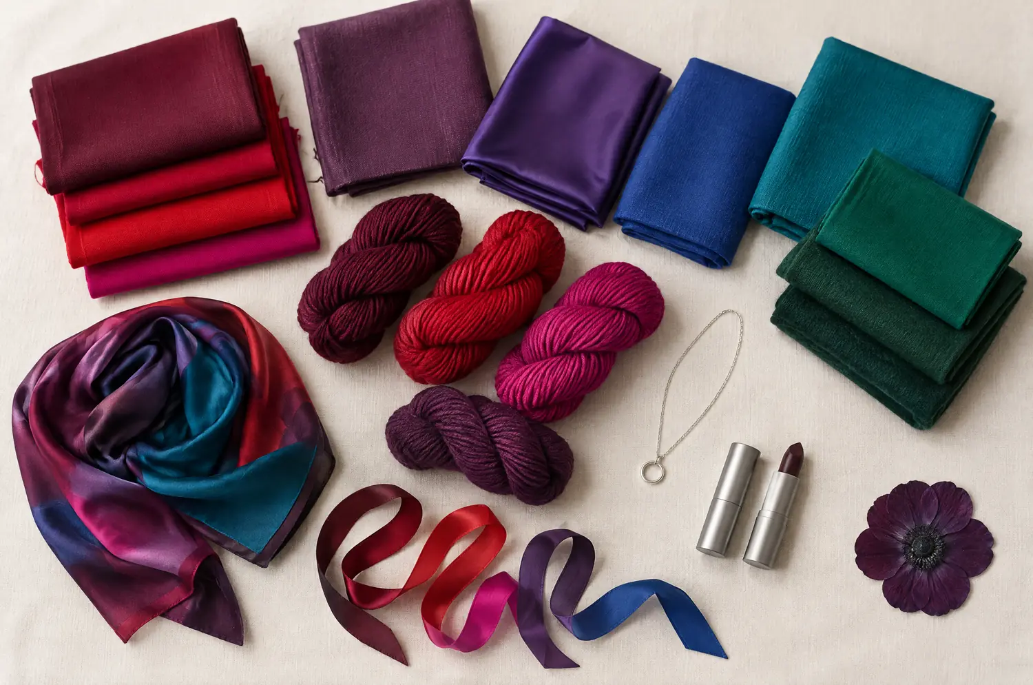
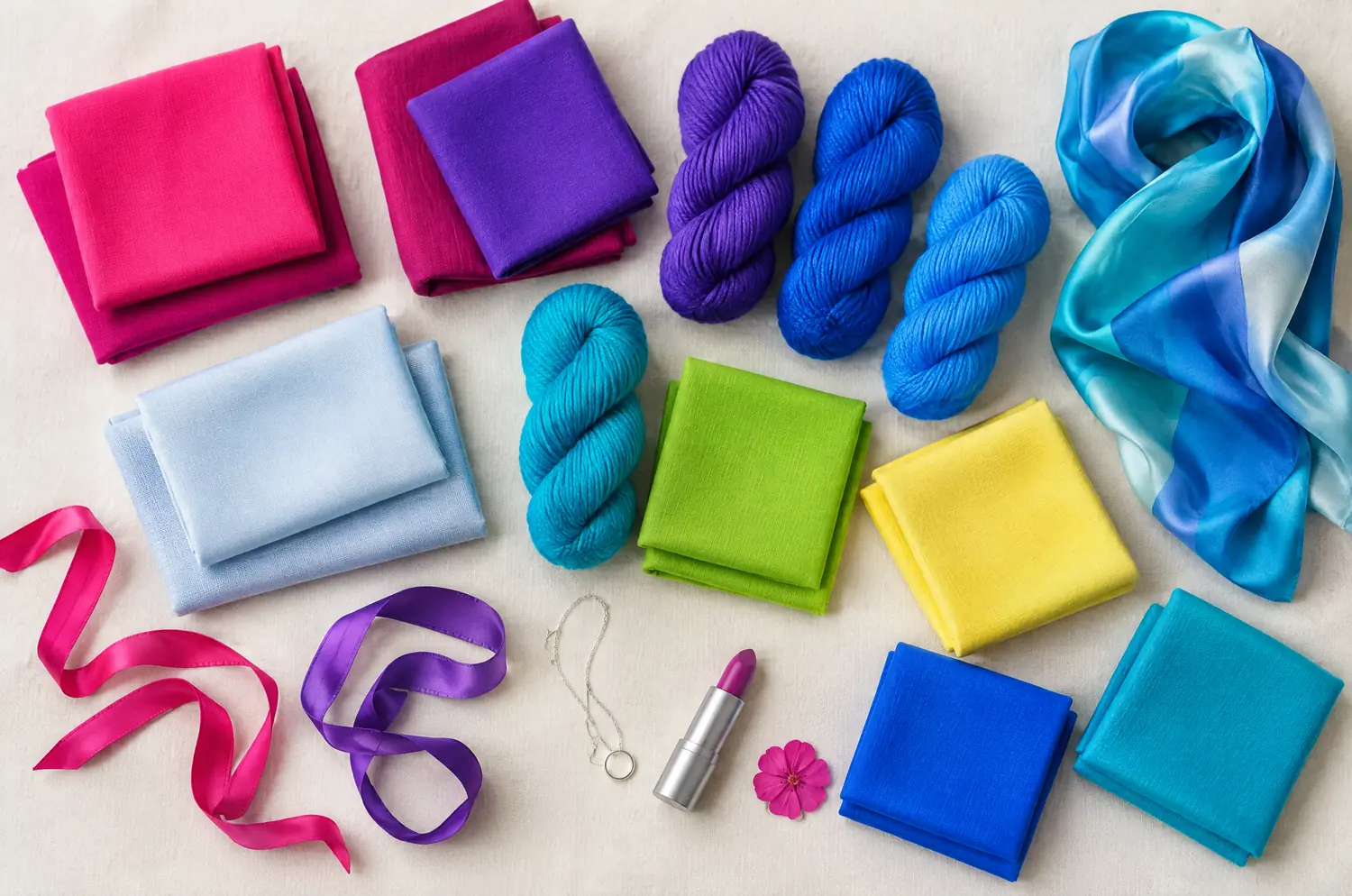
Side by side
Bright Winter and Deep Winter palettes
Same scale, same page: look at the swatches before you read the differences.
- Shocking Pink
#FF1493 - Fuchsia
#E0119D - Magenta
#C2108F - Bright Red
#E3172B - Bright Violet
#6A1FE0 - Electric Blue
#0A4BFF - Azure Blue
#1A8CFF - Bright Turquoise
#00B8D9 - Bright Emerald
#00A86B - Acid Apple Green
#7ED321 - Lemon Yellow
#FFF046 - Glacier Blue
#CFE6F5
Neutrals
- Black
- Pure White
- Silver Gray
- Navy
Colors to avoid
- Grayed Beige
- Dusty Rose
- Khaki
- Dull Mustard
- Cool Burgundy
#5C0F2E - Cherry Red
#B0102E - Pure Red
#D0102A - Raspberry Pink
#C81E5A - Fuchsia
#C2187A - Plum
#5E1F4F - Deep Violet
#4B1F6F - Royal Blue
#1F3FA8 - Midnight Blue
#14213D - Deep Turquoise
#007C89 - Emerald
#00704A - Cool Spruce Green
#0B4F3F
Neutrals
- Black
- Charcoal
- Navy
- Pure White
Colors to avoid
- Golden Beige
- Rust
- Mustard
- Peach
The four axes
3 axes differ, the rest is shared
Temperature, lightness, intensity and contrast: the gauge shows where each one sits, the table says it in words.
The two sub-seasons
- Temperature
- 12SameNeutral to cool
- Lightness
- 12Differs1 Medium2 Dark
- Intensity
- 12Differs1 Very bright2 Saturated
- Contrast
- 12Differs1 Very high2 High
Line by line
| What is compared | Bright Winter | Deep Winter |
|---|---|---|
| Temperature | Neutral to cool | Neutral to cool |
| LightnessDiffers | Medium | Dark |
| IntensityDiffers | Very bright | Saturated |
| ContrastDiffers | Very high | High |
| Signature color | Fuchsia | Cool Burgundy |
| Neutrals | Black, Pure White, Silver Gray, Navy | Black, Charcoal, Navy, Pure White |
| Metals | Shiny silver, platinum, graphic pieces, brilliant stones. | Silver, platinum, white gold. Onyx, garnet, sapphire. |
| Lips | Fuchsia, bright pink, clear red. A bold, radiant lip is your best asset. | Burgundy, cherry, plum, deep red. A dark lip comes naturally to you. |
| Hair color | Crisp, shiny colors: cool brown, black, or a very light, cool blonde. Avoid blended, golden effects. | Cool dark brown, black, very dark brown. Avoid golden or coppery tones. |
What makes Bright Winter so electric?
Intensity leads here. The base is neutral to cool, the depth sits in the middle, and the contrast between hair, eyes and skin is very high.
That’s why Shocking Pink, Electric Blue and Bright Emerald look natural on this face. Fuchsia is the signature. Black and Pure White work as a frame: black looks beautiful when a dazzling color sits beside it.
Here is what goes wrong. Grayed Beige, Dusty Rose and Dull Mustard are too muted. They put out the brilliance, and you see the garment before the person.
What does Deep Winter ask of a color?
Weight. Deep Winter (also called Dark Winter) leads with depth. It’s the same neutral-to-cool base, but the colors are dark and saturated, and the contrast is high.
Cool Burgundy is the signature. Plum, Midnight Blue and Emerald are in the palette too. Black suits you even near the face.
The pitfalls run the other way. Light, powdery colors leave you looking pale. Rust, Mustard and Peach turn your skin yellow.
Where do Bright Winter and Deep Winter part ways?
Three axes differ. Start with the two leading traits, then contrast.
Intensity is the first thing to check. Bright Winter is very bright, Deep Winter is saturated. Very bright means the color itself glows. Saturated means it’s rich and full. On a Bright Winter, a muted color is the one to watch for.
Then lightness. Bright Winter sits at medium depth, Deep Winter at dark. For a Bright Winter, bright beats dark: dark alone isn’t the goal. For a Deep Winter, light, powdery colors leave you pale.
Contrast comes last. It’s very high for Bright Winter and high for Deep Winter. Both keep a strong gap between hair, eyes and skin, and Bright Winter’s is the higher of the two.
Temperature is the axis they share. Both are neutral to cool, so don’t look for a difference there. There isn’t one.
The two-color test. In daylight, with no makeup, hold a piece of fabric in each of these two colors up to your face. Rest your eyes between the two and redo it another day. If the same color keeps winning, you have a direction: a first hint, not a verdict.
Fuchsia against Cool Burgundy: what are you watching for?
Set up as in color draping at home. A window, a bare face, hair covered. Then take the two colors one at a time, and don’t rush it.
One note before you start: both palettes list a Fuchsia, in two different shades. The one in this duel is Bright Winter’s. Fuchsia first, then. Does your face light up, or does the color seem to talk louder than you? Look at your eyes and the edges of your features.
Now Cool Burgundy, the Deep Winter one. Does your face settle and look rested, or does it sink into the fabric?
If Fuchsia lights you up while Cool Burgundy feels heavy, lean Bright Winter. If Cool Burgundy gives your face its outline while Fuchsia feels loud, lean Deep Winter. Then switch the order and go again. If the same side keeps winning, you have a direction. If the two trade rounds, read the next section.
What if you sit between Bright Winter and Deep Winter?
Start with the leading trait. Ask which you notice first on your own face: the brilliance of your eyes and the sharpness of your features, or the darkness and weight of the whole picture. That answer is your lead.
These two aren’t neighbors in the method. Bright Winter borders Bright Spring and Deep Winter borders Deep Autumn. Staying between these two keeps you inside Winter. You’re moving along the family, not crossing a season.
Black and Pure White are neutrals in both palettes, so they won’t help you choose. For anything else, each palette keeps its own shades: the swatches above put them side by side.
An app or a quiz reads your answers or a photo, not your skin reacting to a color, and the gap between these two lives in that reaction. The free color analysis quiz gives you a likely season and a sub-season hint. Then do the drape test for the rest. Reading the pages for Bright Winter and Deep Winter side by side helps too.
Which clues won’t settle it?
Black won’t, as the two sections above showed. It works on both.
Metals won’t. Both lean toward silver and platinum. Deep Winter adds white gold, and Bright Winter likes shiny, graphic pieces.
Hair won’t. Bright Winter’s line runs from a very light, cool blonde to cool brown and black. Deep Winter’s stays dark: cool dark brown, black or very dark brown. Neither is a rule.
Lips can nudge you, nothing more. Bright Winter’s lip is Fuchsia, a bright pink or a clear red, bold and radiant. Deep Winter’s is burgundy, cherry or plum, and a dark lip comes naturally.
Keep exploring
More on these two sub-seasons
Palette Bright Winter color palette
The most dazzling Winter: electric colors and maximum contrast.
Compare Bright Spring vs Bright Winter
Bright Spring vs Bright Winter: same brilliance, but warmth and contrast split them. Here is what each looks like on a face and how to decide between them.
Compare Bright Winter vs True Winter
Bright Winter vs True Winter: all four axes differ, so the answer is on your face. Here is what each difference looks like and a quick test to settle it.
Compare Cool Summer vs Bright Winter
Cool Summer vs Bright Winter: the three differences that matter, what each looks like on your face, and a drape test with Raspberry and Fuchsia to settle it.
Compare Soft Summer vs Bright Winter
Soft Summer vs Bright Winter share temperature and depth. Only two things split them: intensity and contrast. Here is what that looks like on your face.
Palette Deep Winter color palette
The darkest Winter: deep, crisp, very intense colors.
Questions
Bright Winter or Deep Winter: your questions
Which is it for me, Bright Winter or Deep Winter?
Look at what your face does with a very bright color next to a very dark one. If brilliance wins, think Bright Winter. If weight wins, think Deep Winter. A window and a bare face are all you need.
Can I be between Bright Winter and Deep Winter?
Yes, you can read between the two. Let your leading trait, intensity or depth, set your main palette. Compare the colors the two palettes share by name first, then test the rest one color at a time, in daylight.
Is Bright Winter silver or gold?
The metals line for Bright Winter points to shiny silver and platinum, with graphic pieces and brilliant stones. Gold isn’t in it. That’s a direction, not a law: hold a piece along your jaw in daylight and see whether it sharpens your eyes or flattens your skin.
Does dark hair mean I am a Deep Winter?
No. Dark hair turns up in both. Bright Winter’s hair line includes cool brown and black, and Deep Winter’s runs dark too, so your hair can’t pick between them. Cover it, then see how your skin and your eyes answer Fuchsia and Cool Burgundy.
The quiz says Bright Winter, but Cool Burgundy looks better on me. Now what?
Take the quiz as one voice and the fabric as another. Repeat the comparison on another day, in daylight. If Cool Burgundy wins again, ask what leads in your coloring: brilliance or weight. That leading trait tells you which palette to explore first.
Which colors should each one avoid?
Bright Winter avoids anything muted: Grayed Beige, Dusty Rose, Khaki and Dull Mustard dim the brilliance. Deep Winter avoids what is too warm or too light: Golden Beige, Rust, Mustard and Peach turn the skin yellow and take away the crisp definition. Away from your face, they’re fine.
Bright Winter or Deep Winter? Check it.
The free quiz shows you your likely season in two minutes. Then run the two-color test on your own bare face, in daylight: a first hint, not a verdict.