
Compare · two sub-seasons
Cool Summer vs Bright Winter: The Real Differences
Hold a raspberry top under your chin, then a fuchsia one. One of them lets your face settle. The other makes it switch on. Which is which?
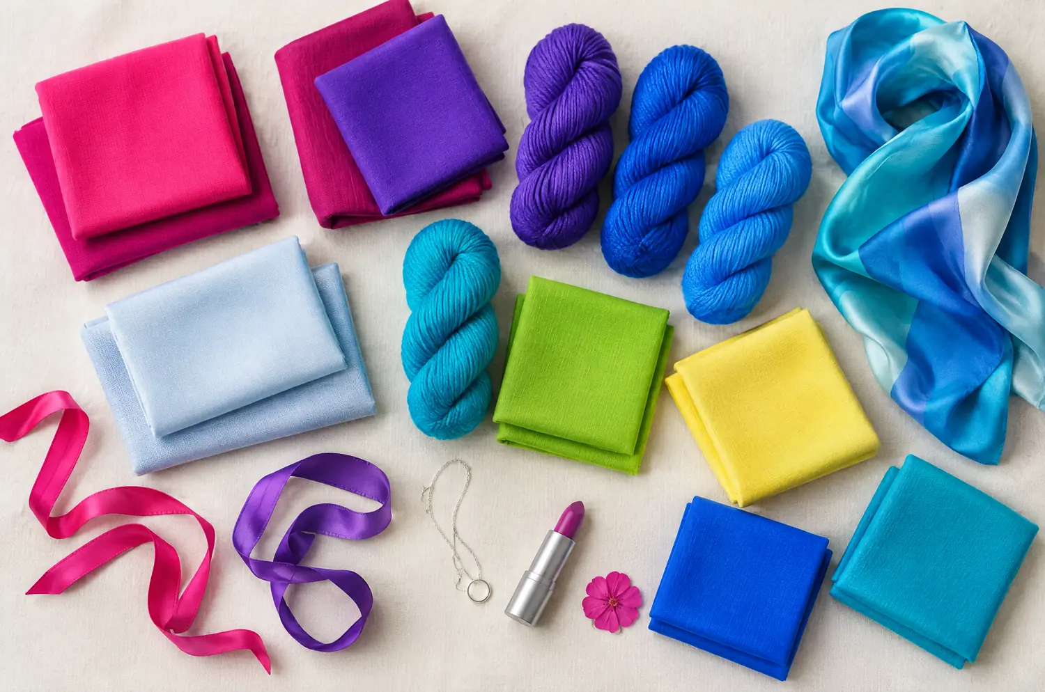
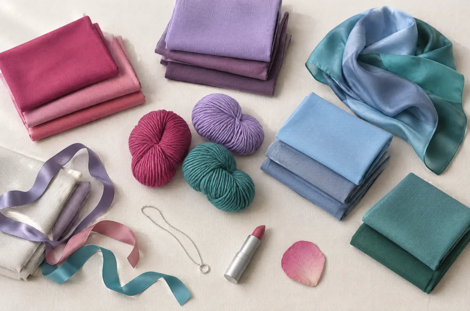
Side by side
Cool Summer and Bright Winter palettes
Same scale, same page: look at the swatches before you read the differences.
- Raspberry
#C73866 - Pink
#E57BA2 - Cool Watermelon
#E0607E - Soft Cherry
#B5364F - Mauve
#A777B8 - Light Plum
#8E5A8E - Cool Lavender
#9E8FD1 - Cool Sky Blue
#8FBDE3 - Denim Blue
#4F6FA8 - Gray Blue
#7C93B5 - Cool Turquoise
#4FA8A8 - Soft Spruce Green
#3F7F73
Neutrals
- Soft White
- Medium Gray
- Cool Taupe
- Navy
Colors to avoid
- Orange
- Golden Yellow
- Terracotta
- Black
- Shocking Pink
#FF1493 - Fuchsia
#E0119D - Magenta
#C2108F - Bright Red
#E3172B - Bright Violet
#6A1FE0 - Electric Blue
#0A4BFF - Azure Blue
#1A8CFF - Bright Turquoise
#00B8D9 - Bright Emerald
#00A86B - Acid Apple Green
#7ED321 - Lemon Yellow
#FFF046 - Glacier Blue
#CFE6F5
Neutrals
- Black
- Pure White
- Silver Gray
- Navy
Colors to avoid
- Grayed Beige
- Dusty Rose
- Khaki
- Dull Mustard
The four axes
3 axes differ, the rest is shared
Temperature, lightness, intensity and contrast: the gauge shows where each one sits, the table says it in words.
The two sub-seasons
- Temperature
- 12Differs1 Very cool2 Neutral to cool
- Lightness
- 12SameMedium
- Intensity
- 12Differs1 Soft to medium2 Very bright
- Contrast
- 12Differs1 Moderate2 Very high
Line by line
| What is compared | Cool Summer | Bright Winter |
|---|---|---|
| TemperatureDiffers | Very cool | Neutral to cool |
| Lightness | Medium | Medium |
| IntensityDiffers | Soft to medium | Very bright |
| ContrastDiffers | Moderate | Very high |
| Signature color | Raspberry | Fuchsia |
| Neutrals | Soft White, Medium Gray, Cool Taupe, Navy | Black, Pure White, Silver Gray, Navy |
| Metals | Silver, white gold, platinum. Gray pearls, amethyst, aquamarine. | Shiny silver, platinum, graphic pieces, brilliant stones. |
| Lips | Raspberry, blue-toned pink, soft cherry. Your red is a cool red. | Fuchsia, bright pink, clear red. A bold, radiant lip is your best asset. |
| Hair color | Ash tones: ash blonde, ash brown, cool brown. Gray or white hair looks naturally good on you. | Crisp, shiny colors: cool brown, black, or a very light, cool blonde. Avoid blended, golden effects. |
Why does Cool Summer feel cool and soft before anything else?
Coolness leads. In Cool Summer blue runs through everything: the pinks, the lavenders, the blues. It’s not a pale palette. It’s a calm one.
Raspberry is the signature. The palette also holds Pink, Mauve and Cool Sky Blue. The neutrals are Soft White, Medium Gray and Navy.
The colors are fresh, never loud. Contrast is moderate, so your eyes, skin and hair sit fairly close together. Your features show, and nothing in the palette shouts. Quiet blues. Soft pinks. Nothing that raises its voice.
What makes Bright Winter so vivid?
Intensity leads. Bright Winter is electric, crisp color on a cool base. It’s the louder palette of the pair.
Fuchsia is the signature. The palette also holds Shocking Pink, Electric Blue, Bright Emerald and Lemon Yellow. The neutrals are Black, Pure White, Silver Gray and Navy.
Think bright red, hot pink, electric blue: colors that arrive before you do. The face often has defined eyes and strong contrast, and it can carry that volume. Beiges, khakis and dusty roses dim you.
Black works, as long as a dazzling color sits beside it.
Three axes differ and one doesn’t: which is which?
Intensity, contrast and temperature differ. Lightness is shared. Take the two leading traits first, then the rest.
Temperature is very cool against neutral to cool. Both lean cool, so the difference is how far. It shows mostly in what goes wrong: an orange-leaning color muddies a Cool Summer complexion.
Intensity, also called clarity, is how pure or how softened a color is. Cool Summer is soft to medium, Bright Winter very bright. A clear, saturated color and a softened one pull a face in different directions. You’ll see which way yours goes.
Contrast is moderate against very high. On a Bright Winter the gap between eyes, skin and hair is striking, so black and white feel natural. A Cool Summer reads more blended, so Navy and Medium Gray do the structural work.
Lightness is the one thing they share: both sit at medium. So don’t go looking for a lighter one or a darker one. That difference isn’t there.
The two-color test. In daylight, with no makeup, hold a piece of fabric in each of these two colors up to your face. Rest your eyes between the two and redo it another day. If the same color keeps winning, you have a direction: a first hint, not a verdict.
What do Raspberry and Fuchsia show on your face?
Follow color draping at home for the setup. For this pair, the questions are narrower.
Drape Raspberry, then Fuchsia. Hold still, look at your eyes first, and ask one question per axis.
- Intensity: does the Fuchsia sit apart from you, or does the Raspberry look faded?
- Contrast: do your eyes and features sharpen, or do they blur?
- Temperature: does your skin turn yellow or gray next to either one?
If Raspberry wins, your face welcomes a bluish color that stays calm, and your features are clear without being outlined. That points to Cool Summer.
If Fuchsia wins, your eyes jump, your skin looks clean and the color feels like it belongs to you. That points to Bright Winter.
If both look good, look at the intensity question again. It’s the one that separates these two best, because temperature is close and lightness is shared.
Repeat the drape on another day. A color that stays on top both days has told you something. A single round proves little.
Torn between Cool Summer and Bright Winter? Start with what leads
Ask yourself which pulls harder on you: coolness and softness, or brilliance.
These two sit apart in the method. What they share is a cool lean and medium lightness. The splitting point is intensity. Neither palette is a quick stand-in for the other, so test on your face rather than on a screen. A quiz can’t settle it either: it never sees your skin respond to a color.
You can also compare each of them with a closer sister. Cool Summer vs True Winter covers the very cool Winter. Bright Spring vs Bright Winter covers the other bright neighbor.
The free color analysis quiz gives you a likely season and a sub-season hint. For this pair, confirm the hint with fabric.
Keep exploring
More on these two sub-seasons
Palette Cool Summer color palette
Cool made gentle: blues, pinks and raspberries without any harshness.
Outfits Cool Summer outfits and capsule wardrobe
Cool Summer outfits built on eight pieces: navy, gray, raspberry and soft white, how to wear them, and what to do with orange and black. Start with navy.
Compare Cool Summer vs Deep Winter
Cool Summer vs Deep Winter: all four axes differ. I show what each difference looks like on a face and how a quick drape test settles the question for you.
Compare Cool Summer vs Light Summer
Cool Summer vs Light Summer: all four axes differ, so the answer is on your face. Here is what each difference looks like and how to settle it at home.
Compare Cool Summer vs Soft Autumn
Cool Summer vs Soft Autumn: three differences that matter, what each looks like on a face, and a quick drape test to settle it, even if you sit between.
Compare Cool Summer vs Soft Summer
Cool Summer vs Soft Summer comes down to three differences: coolness, softness and contrast. Here is how they look on a face and how to settle it at home.
Questions
Cool Summer or Bright Winter: your questions
How can I tell Cool Summer from Bright Winter without a pro?
Compare how a vivid color feels next to your face. Bright Winter looks clearer and sharper in saturated shades like Fuchsia or Electric Blue. Cool Summer looks calmer in bluish, softened ones like Raspberry or Denim Blue. Watch whether your eyes sharpen or blur, since contrast is the second signal.
Could I fall halfway between Cool Summer and Bright Winter?
Yes. You can react well to both, since they share a cool base and medium lightness. Ask which axis gives way first: if softened colors start to look flat, move toward Bright Winter. If bright ones feel like too much, move toward Cool Summer.
Does my hair color or gray hair decide?
No. A season is read on your skin and your eyes, with the hair covered, so dyed or natural hair doesn’t change it. Put a scarf over yours when you test, and watch what each color does to your skin and your eyes. Gray or white hair looks naturally good on a Cool Summer, but it doesn’t place you.
Can Cool Summer wear black?
Black is on Cool Summer’s avoid list as too harsh, and Navy takes its place as the dark neutral. For Bright Winter, black is a core neutral, and it looks best next to a dazzling color. So the same black coat can be a miss on one and a hit on the other.
The quiz says one season and my drape says the other. Now what?
Treat both as leads. The quiz answers from what you tell it, while the fabric answers from your skin. If they disagree, you may sit near the border between the two. Repeat the drape on another day and answer the intensity question first.
What does each one steer clear of?
Cool Summer steers away from warm or harsh colors: Orange, Golden Yellow, Terracotta and Black clash with its cool undertone. Bright Winter steers away from muted ones: Grayed Beige, Dusty Rose, Khaki and Dull Mustard dim its brilliance. Neither is a ban, and any of these can live in your closet, away from your face.
Cool Summer or Bright Winter? Check it.
The free quiz shows you your likely season in two minutes. Then run the two-color test on your own bare face, in daylight: a first hint, not a verdict.