
At the office
Charcoal blazer, red blouse, light gray pants
Reds, pinks and purples · 4 shades
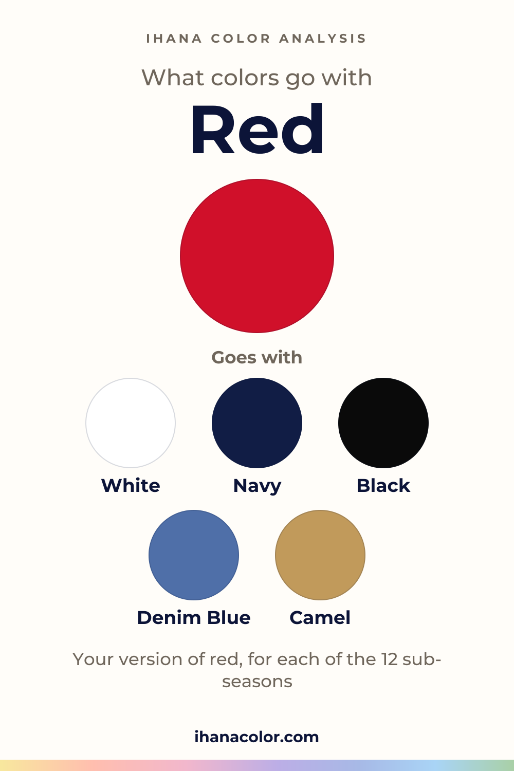
What colors go with red? Plenty. Nobody argues about that. Which red is the real question, because the twelve sub-seasons don’t wear the same one.
#D0102A#DC143C#C51E3A#B0102EFive colors that go with red
Always works
Each block has three colors: the color itself and two partners.
Red + White + Navy
Red + Black + Denim Blue
Red + Camel + Light Gray
Outfits
Three ways to wear it, written as color blocks you can rebuild with what you own.
Charcoal blazer, red blouse, light gray pants
Red sweater, denim blue jeans, white sneakers
Red dress, camel coat, black heels
Four names, one family. All four are vivid, and all four sit on the red of the color wheel itself, so none of them drifts toward another hue. What separates them is depth and punch.
Crimson is the lightest of the four. Red comes next, then Cardinal, then Cherry Red, the darkest. By intensity the order shifts: Red is the most intense, followed by Crimson, Cardinal and Cherry Red. That makes Cherry Red the quietest of the four, deep and less loud, while Red is the one that fills a room.
A color name is not one code. Fabric, dye and the light in the room all move a red, so a tag that says crimson can read closer to cardinal once it’s on your shoulders.
Seven palettes hold a red of their own, and even when the version repeats, the palette color it is matched with changes. Deep Winter is saturated and high in contrast, and it wears Red itself, matched with Pure Red. True Winter is medium to dark and saturated, and it takes the deepest of the family, Cherry Red, matched with Carmine. Bright Winter is very bright and wears Cardinal, matched with Bright Cherry.
Bright Spring is just as bright, yet it wears Crimson, the lightest of the four, matched with Warm Cherry. Cool Summer wears Cardinal, matched with Soft Cherry. Warm Autumn and Deep Autumn both wear Red, matched with Tomato Red and Tomato.
Warm Spring is close. A neighbor of red, Poppy Red, sits in its palette, a touch off the pure shade.
The four left out are Light Spring, Light Summer, Soft Summer and Soft Autumn. Their palettes run very light or very soft, and a vivid red outruns both. Contrast and intensity decide here, more than anything else.
Red is vivid in all four of its shades, so it speaks first. Your job is to decide who gets to speak second.
Near the face, choose the quietest version your palette allows. Cherry Red sits calmer under the chin than Red or Crimson. Then put a lighter partner between the red and your skin, such as a white tee under a red cardigan or a light gray scarf. Stand by a window, hold the red up, and watch whether your face brightens or the red wins.
Away from the face, red can go loud. The logic of the outfits above is one neutral and one red accent. Everything else stays quiet.
To build your own, pick the neutral first. A camel coat, a red sweater and light gray pants work. So do navy pants, a red knit and white sneakers. In my view, one red piece per outfit is plenty.
Two pairings to skip. Orange asks for the same attention red does, and neither backs down. Maroon sits so close in tone that the two blur into one muddy block. If you can’t tell them apart in a shop, the page on red versus maroon sorts it out.
For the four palettes without a red, the closest color stands in. It is a stand-in, not a match.
Light Spring’s stand-in is Light Coral, and Soft Summer’s is Muted Raspberry. One is lighter, the other more muted, and both turn the volume down. Soft Autumn gets Smoky Plum. The cards show the rest.
A red that isn’t in your palette isn’t forbidden. Wear it as a skirt, a bag or a belt, far enough from the face that it can’t pull your skin along with it.
Your sub-season
Your own version of red, the colors of your palette that go with it, or the color that stands in for it. Each answer is computed from the palette of the sub-season.
#FF8F7AGoes with Light CoralIvoryMint
#D0102AClose to your Poppy RedGoes with it, in your paletteCreamGolden Apricot
#DC143CMatches your Warm CherryGoes with it, in your paletteWarm Off-WhiteTangerine
#D9577EGoes with Light RaspberrySoft WhitePale Turquoise
#C51E3AMatches your Soft CherryGoes with it, in your paletteSoft WhiteCool Sky Blue
#A85068Goes with Muted RaspberryOff-WhiteVerdigris
#7D5A66Goes with Smoky PlumCreamTea Green
#D0102AMatches your Tomato RedGoes with it, in your paletteCreamOchre
#D0102AMatches your TomatoGoes with it, in your paletteCreamTobacco
#D0102AMatches your Pure RedGoes with it, in your palettePure WhiteDark Chocolate
#B0102EMatches your CarmineGoes with it, in your palettePure WhiteIcy Pink
#C51E3AMatches your Bright CherryGoes with it, in your palettePure WhiteLight Pearl Gray
Not sure which sub-season you are? The free quiz gives you a first hint in two minutes: a hint, not a verdict.
What to skip
Questions
Yes, but the white changes. Deep Winter, True Winter and Bright Winter pair their red with Pure White. Warm Spring, Warm Autumn and Deep Autumn pair theirs with Cream. White between red and your face keeps the skin in front.
Find your sub-season in the list above and read its card. If you don’t know it yet, the free ten-question quiz gives you a starting guess at your season and sub-season, not a verdict. Then test the red near your face.
Yes. If your card shows a stand-in, that is what to wear up close. The red you love can go on pants or shoes instead, where your face isn’t reading it. Hold the stand-in up and go by what your skin does, not by the label.
Close, not identical. Both are vivid, but crimson is the lighter of the two and red is the more intense. Bright Spring wears Crimson, while Deep Winter wears Red. To compare reds that lean differently, see warm red versus cool red.
Yes. Black is one of red’s partners, and red keeps its punch against it. Give black the base and keep red as the accent. Neither of the two pairings to skip involves black. In the evening outfit, black heels do the quiet work while the red dress speaks. Only your sub-season changes which red you reach for.
Keep exploring
Red vs maroon: red is lighter, maroon is darker, and both are equally vivid. See which one your sub-season wears and how to test them at home by a window.
Burgundy vs red: the real difference is depth and intensity, not hue. Twelve sub-seasons sorted into burgundy, red, both or neither, with the reasons.
What colors go with pink? Here are the partners that work, the shades to choose from and the version each sub-season wears near the face, or away from it.
What colors go with burgundy? I sort its five shades, name the partners that work with it, and show which version belongs to each of the 12 sub-seasons.
What colors go with maroon? I name the partners, then show which version belongs to which sub-season, and what to do when maroon isn’t in your palette.
The quiz shows you your likely season and a sub-season hint, with no sign-up. A first hint, not a verdict.
Full palette, capsule wardrobe, makeup, hair and a shopping list for each sub-season. Not on sale yet: join the waitlist.
Twelve sub-seasons instead of sixteen, the three things we look at, and why a quiz is only a first hint.
The free quiz shows you your likely season in two minutes. Then try the shades above against your bare face, in daylight: a first hint, not a verdict.