
Red
#D0102A- Crimson
- Cardinal
- Cherry Red
Color comparison
“Maroon is a quieter red.” Not by intensity. Both are vivid. What changes on a face is how dark the red is.
#D0102A#800000Side by side
Red is lighter, and the two are about as vivid as each other; both sit in the red range.
Red, Crimson and Cardinal share one profile: medium in lightness, vivid in intensity, red in hue. From light to dark you get Crimson, Red, Cardinal, then Cherry Red. By intensity, Red leads and Cherry Red comes last.
Cherry Red deserves a second look. It’s dark, so you might file it with maroon. But it’s still vivid, and vivid is what the eye reads first.
Near a face, a red like this arrives before you do. It can give the eyes and the mouth a lift, or it can take over the whole picture. That depends on your face, not on the dye, and the sections below sort out whose face is whose.
Maroon, Dark Red and Barn Red are all dark, vivid and red. UP Maroon is dark too, but its intensity is medium, which makes it the calmest of the four. From light to dark: Dark Red, UP Maroon, Maroon, Barn Red.
The name sounds hushed. The main shades aren’t: they’re as vivid as red. The darkness is real. The hush isn’t.
On a fabric, a dark vivid red takes light in instead of throwing it back. Near the chin it adds depth and a little weight to the face. If you want that effect in a smaller dose, UP Maroon is the shade to look for.
The gap is lightness. Red is medium, maroon is dark. That’s the one difference you can measure.
On a face, red brightens and maroon deepens. Red lifts the area around it. Maroon pulls things in and asks your skin to hold its own against a heavier color. On a fabric, red catches the light and maroon swallows it.
Now the overlap, so you don’t hunt for a difference that isn’t there. Both are vivid. Both sit in the red range. Nothing points to a bluer maroon or a yellower red.
Cherry Red is where the two meet. Dark like maroon, vivid like red, it can pass for either on a swatch. Judge it on the garment, because dye, weave and room light move a dark red more than its name does.
Red is the pick for seven sub-seasons. Maroon is the pick for none. Deep Autumn alone has both in its palette, and four have neither.
Bright Winter runs at the top of the scale for brightness and contrast, and Bright Red is in its palette. Maroon is not for it. The closest it gets is Bright Cherry, a substitute.
Deep Winter is dark, saturated and high in contrast. Pure Red is in its palette, and maroon is only close, through Cherry Red. Warm Autumn and True Winter have the same shape: Tomato Red and Raspberry Red for red, and Rust and Carmine as the neighbors of maroon.
Deep Autumn is the one with both: Tomato for red, Mahogany for maroon. Its face is deep enough to carry the weight of maroon and rich enough to take the red.
Bright Spring, Warm Spring and Cool Summer complete the red-only group, with Warm Cherry in the palette and Poppy Red and Soft Cherry as neighbors.
Neither: Light Spring and Light Summer are very light with low contrast, Soft Summer and Soft Autumn very soft. Light Spring’s nearest is Light Coral, Light Summer’s is Light Raspberry. Soft Summer gets Muted Raspberry for red and Soft Burgundy for maroon. Soft Autumn gets Light Terracotta and Chestnut. All of these are substitutes, not matches.
Not sure which group is yours? Ten questions, no sign-up: the free color analysis quiz names a probable season and a first hint of your sub-season, never a verdict. Your skin near the color settles it.
Which one suits you
Each color is checked against the palette of each sub-season, color by color. This is a first hint, not a verdict: see how it looks on your own face.
Neither is for you
Closest in your paletteLight Coral
Red is the one for you
Red is the one for you
Neither is for you
Closest in your paletteLight Raspberry
Red is the one for you
Neither is for you
Closest in your paletteMuted Raspberry
Neither is for you
Closest in your paletteChestnut
Red is the one for you
Both work for you
Red is the one for you
Red is the one for you
Red is the one for you
Questions
No, though they share a hue. Both sit in the red range and both are vivid. The difference is depth: red is medium in lightness and maroon is dark. That one gap changes how much weight the color puts next to your skin, so hold each one up before you decide.
Red is lighter. Neither is more vivid, because Maroon, Dark Red and Barn Red are as vivid as Red. Only UP Maroon drops to medium intensity. If maroon feels calmer to you, that comes from its darkness, not from less color.
It depends on your sub-season. Red is the pick for seven, Deep Autumn has both, four have neither, and none leans to maroon alone. Start with your group, then hold the color against your jaw and see which way your skin goes.
Yes, in different places. Deep Autumn has both in its palette. For everyone else, put one at the neckline and the other lower down, in pants, a skirt or a bag. Two strong reds compete when they sit side by side, so give each its own piece.
Display settings, room light and dye all move a dark red, and a code on a screen only points in a direction. Compare the real garments by a window, one at a time. Dark leans maroon, medium leans red. The color guides have other pairs to compare.
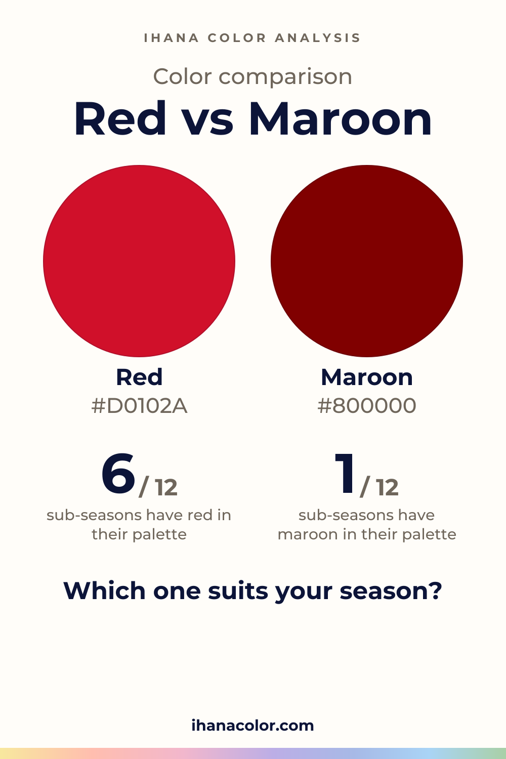
Keep it
The two colors side by side, ready to pin or to keep on your phone.
Download the imageKeep exploring
What colors go with red? White, navy and black are easy. The red itself changes with your sub-season, and here is how to find the version that is yours.
What colors go with maroon? I name the partners, then show which version belongs to which sub-season, and what to do when maroon isn’t in your palette.
Burgundy vs maroon: the gap is smaller than you think. I show how each reads on a face and a fabric, and which sub-seasons wear which, shade by shade.
Burgundy vs red: the real difference is depth and intensity, not hue. Twelve sub-seasons sorted into burgundy, red, both or neither, with the reasons.
The quiz shows you your likely season and a sub-season hint, with no sign-up. A first hint, not a verdict.
Full palette, capsule wardrobe, makeup, hair and a shopping list for each sub-season. Not on sale yet: join the waitlist.
Twelve sub-seasons instead of sixteen, the three things we look at, and why a quiz is only a first hint.
The free quiz shows you your likely season in two minutes. Then hold both colors up to your bare face, in daylight: a first hint, not a verdict.