
Compare · two Springs
Warm Spring vs Bright Spring: The Four Differences That Matter
People say: “Both are bright, warm Springs. It’s the same palette.” Look at a face and the two part ways. One warms. The other sharpens.
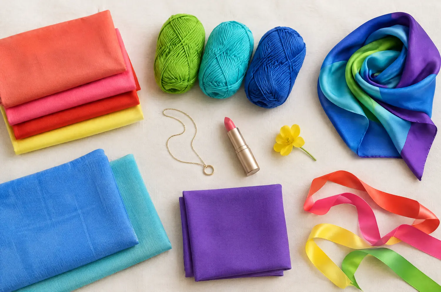
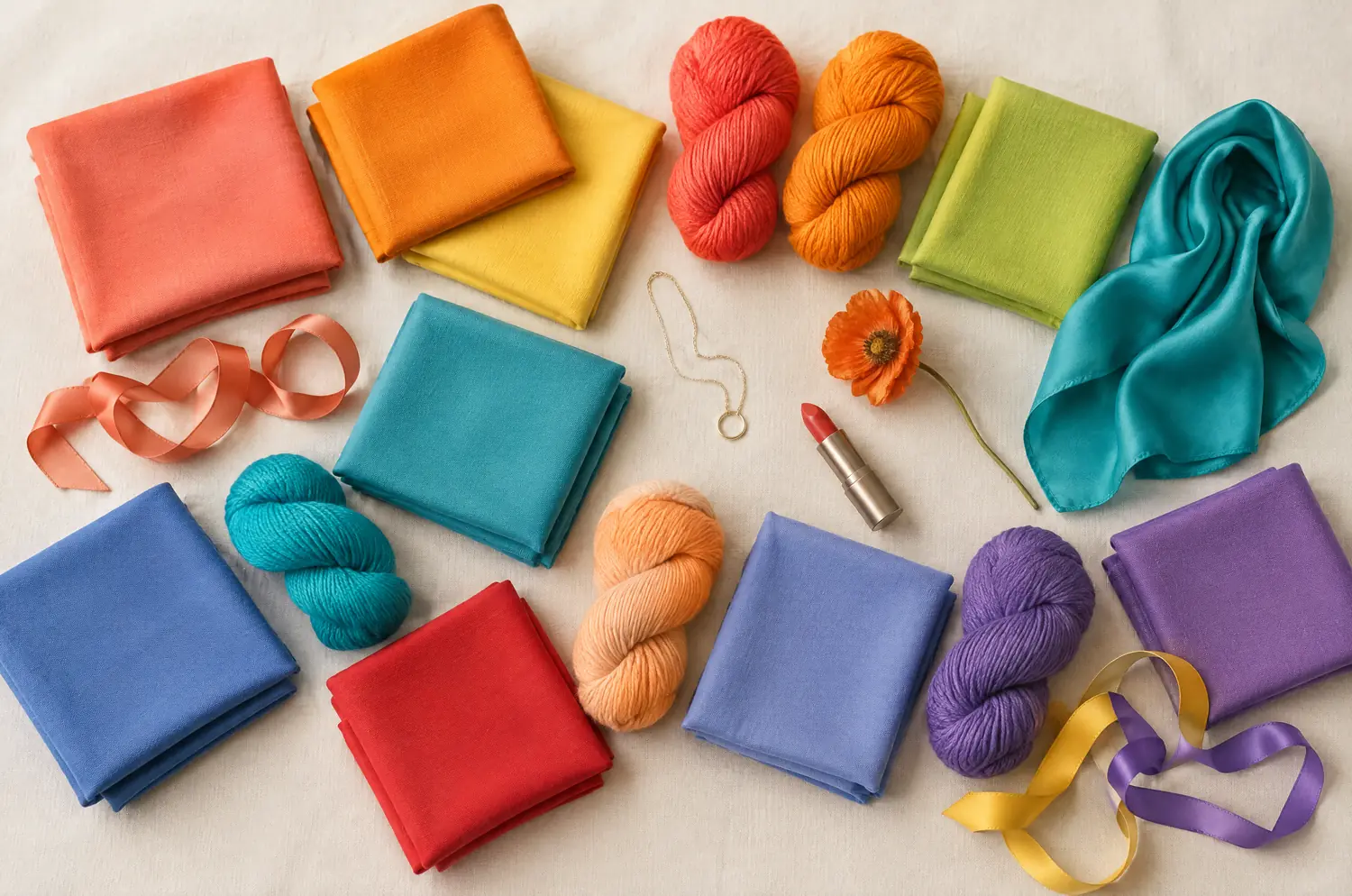
Side by side
Warm Spring and Bright Spring palettes
Same scale, same page: look at the swatches before you read the differences.
- Coral
#FF6F52 - Bright Orange
#FF8C1A - Sunshine Yellow
#FFD23F - Meadow Green
#5DB84C - Pear Green
#B5D334 - Warm Turquoise
#1FB7A6 - Lagoon Blue
#2E9CCA - Poppy Red
#E8382F - Salmon
#FF8E72 - Bright Peach
#FFAB6B - Warm Periwinkle
#6D7FD9 - Warm Violet
#8A5FBF
Neutrals
- Cream
- Camel
- Golden Brown
- Light Khaki
Colors to avoid
- Black
- Cool Fuchsia
- Blue Gray
- Optic White
- Bright Coral
#FF5A4D - Watermelon Pink
#FF5E7E - Tomato Red
#F02D1F - Tangerine
#FF7A00 - Warm Lemon Yellow
#FFE033 - Lime Green
#9BD81E - Light Emerald
#00B26B - Bright Aqua
#2ED3C6 - Turquoise
#00B5C8 - Azure Blue
#1E90FF - Bright Royal Blue
#1F5FD1 - Bright Violet
#7A3FD1
Neutrals
- Warm Off-White
- Light Gray
- Bright Navy
- Camel
Colors to avoid
- Grayed Beige
- Dusty Rose
- Dull Khaki
- Taupe
The four axes
All four axes differ, none is shared
Temperature, lightness, intensity and contrast: the gauge shows where each one sits, the table says it in words.
The two sub-seasons
- Temperature
- 12Differs1 Very warm2 Neutral to warm
- Lightness
- 12Differs1 Medium to light2 Medium
- Intensity
- 12Differs1 Bright2 Very bright
- Contrast
- 12Differs1 Moderate2 High
Line by line
| What is compared | Warm Spring | Bright Spring |
|---|---|---|
| TemperatureDiffers | Very warm | Neutral to warm |
| LightnessDiffers | Medium to light | Medium |
| IntensityDiffers | Bright | Very bright |
| ContrastDiffers | Moderate | High |
| Signature color | Coral | Bright Coral |
| Neutrals | Cream, Camel, Golden Brown, Light Khaki | Warm Off-White, Light Gray, Bright Navy, Camel |
| Metals | Yellow gold, golden brass, cream pearls. Turquoise and coral. | Bright yellow gold, graphic pieces, vivid stones. |
| Lips | Coral, poppy red, rich peach. Orange-leaning reds are your reds. | Tomato red, bright coral, watermelon pink. You can pull off a bold lip. |
| Hair color | Golden blonde, honey, light copper, golden brown. Always keep warm tones. | Crisp, shiny colors: clear golden blonde, bright warm brown, brown with golden tones. Avoid ashy effects. |
Warm Spring is golden first, and everything else follows
Warm Spring is very warm. That’s the trait that leads. Depth sits at medium to light, intensity is bright, and contrast is moderate.
In plain words, your face looks best in colors that carry sunshine. Coral is the signature. Salmon, Bright Peach and Sunshine Yellow sit in the same golden family. Meadow Green and Warm Turquoise keep the palette fresh.
The signs are easy to read. The metals line points to yellow gold rather than silver. Reach for a soft orange or a coral and your face warms up at once. Cool pinks and bluish grays leave you looking dull.
Bright Spring starts with intensity, and warmth comes second
Bright Spring is the sub-season where color has to be pure. Temperature is neutral to warm, depth is medium, intensity is very bright, and contrast is high.
Warmth is still there, but it isn’t what leads. What leads is clarity: a Tomato Red, a Turquoise, a Watermelon Pink worn at full strength. Your eyes are often very defined, and people notice them first.
The pitfalls are the opposite of Warm Spring’s. Grayed Beige, Dusty Rose, Dull Khaki and Taupe fall short on brilliance and soften the edge of your face. Those “safe” colors make you disappear.
How do the four differences show on a face?
The two share a season, yet not one axis is the same. Start with the two leading traits, warmth and intensity, then take the other two.
Temperature is very warm for Warm Spring and neutral to warm for Bright Spring. A Warm Spring often has natural golden, coppery or honey tones, so a cool color brings out the yellow in the skin instead of a golden glow. A Bright Spring keeps a base of warmth, but warmth isn’t the lead.
Intensity is bright against very bright. Warm Spring’s colors are golden, cheerful and clear. Bright Spring’s are pure and saturated, almost tropical.
Contrast is moderate against high. That’s the gap between your hair, eyes and skin. Unlike the other Springs, Bright Spring can handle light and dark within one outfit, with Bright Navy beside Bright Coral.
Lightness is medium to light against medium. The two sit close together, and it’s still a difference.
What they share matters too. Both are Springs. Camel is in both neutral lists, in the same shade. Yellow gold shows up in both metals lines. And both hair lines use golden tones. Don’t go looking for a difference there.
What do Coral and Bright Coral show when you hold them up?
For the setup, follow color draping at home. Then give this pair your full attention.
Take two solid fabrics, a Coral and a Bright Coral. Hold one under your chin, then the other. Look at three things.
First, your skin. Which color leaves it looking more even and rested? That’s the warmth question.
Second, your features. Under which color do your eyes and brows stand out, and under which do they blur? That’s the intensity and contrast question.
Third, the weight of the color. Does your face stay in front, or does the color take over?
If Coral is the one that suits you and Bright Coral feels like too much, lean Warm Spring. If Bright Coral sharpens your eyes and lips, lean Bright Spring. Run it again on another day. If the same side keeps winning, you have a direction.
The two-color test. In daylight, with no makeup, hold a piece of fabric in each of these two colors up to your face. Rest your eyes between the two and redo it another day. If the same color keeps winning, you have a direction: a first hint, not a verdict.
What if you sit between Warm Spring and Bright Spring?
It happens, and it makes sense. The two aren’t neighbors in the method. Warm Spring sits next to Warm Autumn, and Bright Spring next to Bright Winter. If your results lean toward one of those neighbors, read Warm Spring against Warm Autumn or Bright Spring against Bright Winter.
Look for your leading trait. If a grayed color blurs your face, think intensity. If a cool color brings out the yellow in your skin, think warmth.
The free color analysis quiz gives you a likely season and a sub-season hint. Then go back to the fabrics. An app reads a photo, and a photo can’t show your skin changing as a fabric comes close. If Light Spring also tempts you, Light Spring against Bright Spring sets those two apart.
Keep exploring
More on these two sub-seasons
Palette Warm Spring color palette
Sunshine in your skin: golden, cheerful, clear colors.
Compare Cool Summer vs Warm Spring
Cool Summer vs Warm Spring comes down to three differences you can see on a face. I show what each looks like and how a two-color test gives you a direction.
Compare Light Spring vs Warm Spring
Light Spring vs Warm Spring: all four axes differ. Here is what each difference looks like on your face and how a quick drape test settles it at home.
Compare Soft Summer vs Warm Spring
Soft Summer vs Warm Spring: all four axes differ, so the two palettes rarely overlap. See what each looks like on a face and how to settle it with one test.
Compare Warm Spring vs Soft Autumn
Warm Spring vs Soft Autumn: both are golden, yet all four axes differ. I show what each gap looks like on a face and how to settle it with two simple colors.
Compare Warm Spring vs Warm Autumn
Warm Spring vs Warm Autumn share their warmth. Two things set them apart: lightness and intensity. Here is what that looks like on a face, and how to decide.
Questions
Warm Spring or Bright Spring: your questions
Is clear Spring the same as warm Spring?
No. Clear Spring is another name for Bright Spring, and True Spring is another name for Warm Spring. They are two different sub-seasons. One leads with warmth, the other with intensity, and all four axes differ between them.
How do I tell Warm Spring from Bright Spring quickly?
Hold a Coral and a Bright Coral to your bare face, one at a time, by a window. If Coral gives you a golden glow, lean Warm Spring. If Bright Coral sharpens your eyes and your features, lean Bright Spring. One round is only a hint, so repeat it another day.
Which metals suit each one?
Yellow gold sits in both lines. Warm Spring’s adds golden brass, cream pearls, turquoise and coral. Bright Spring’s adds graphic pieces and vivid stones. Take it as a direction, not a rule: hold each metal near your face in daylight and see what your skin does.
Can I be somewhere between the two?
Yes, you can read as a mix at first. Ask which loss hurts more, warmth or sharpness, and let that set your main palette. Then test one color from the other palette at a time, in daylight, and keep an eye on your skin.
What if the quiz points one way and the fabric the other?
Treat them as two voices. The quiz works from your answers, and the fabric shows what your skin does. Repeat the drape on another day in daylight, then read the two season pages side by side to see which description sounds like you.
Which colors should each one avoid?
Warm Spring avoids what is too cool: Black, Cool Fuchsia, Blue Gray and Optic White bring out the yellow in the skin instead of a golden glow. Bright Spring avoids what is too muted: Grayed Beige, Dusty Rose, Dull Khaki and Taupe blur the sharpness of the face. Away from your face, they’re fine.
Warm Spring or Bright Spring? Check it.
The free quiz shows you your likely season in two minutes. Then run the two-color test on your own bare face, in daylight: a first hint, not a verdict.