
Compare · two sub-seasons
Cool Summer vs Soft Autumn: The Real Differences
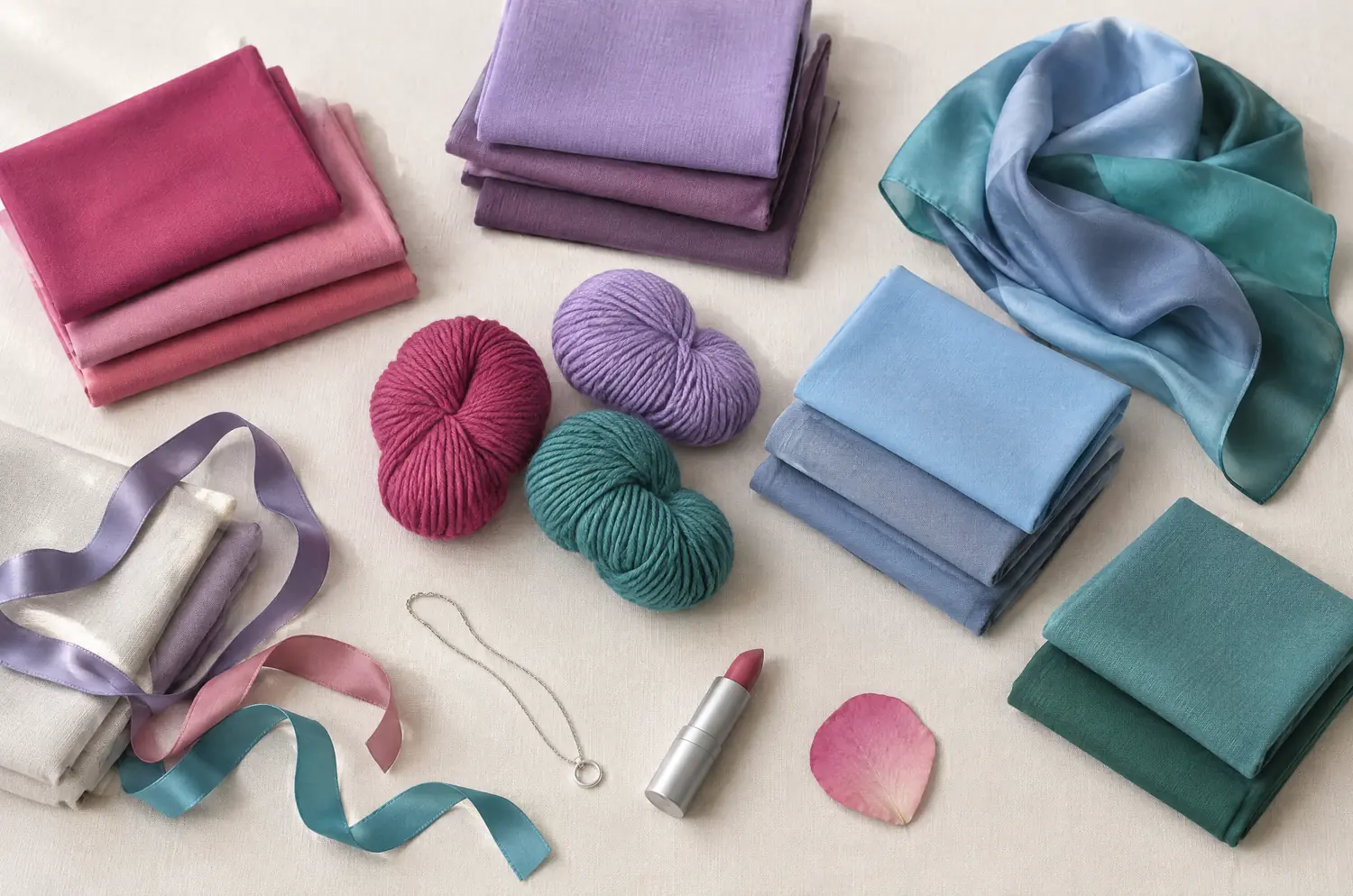
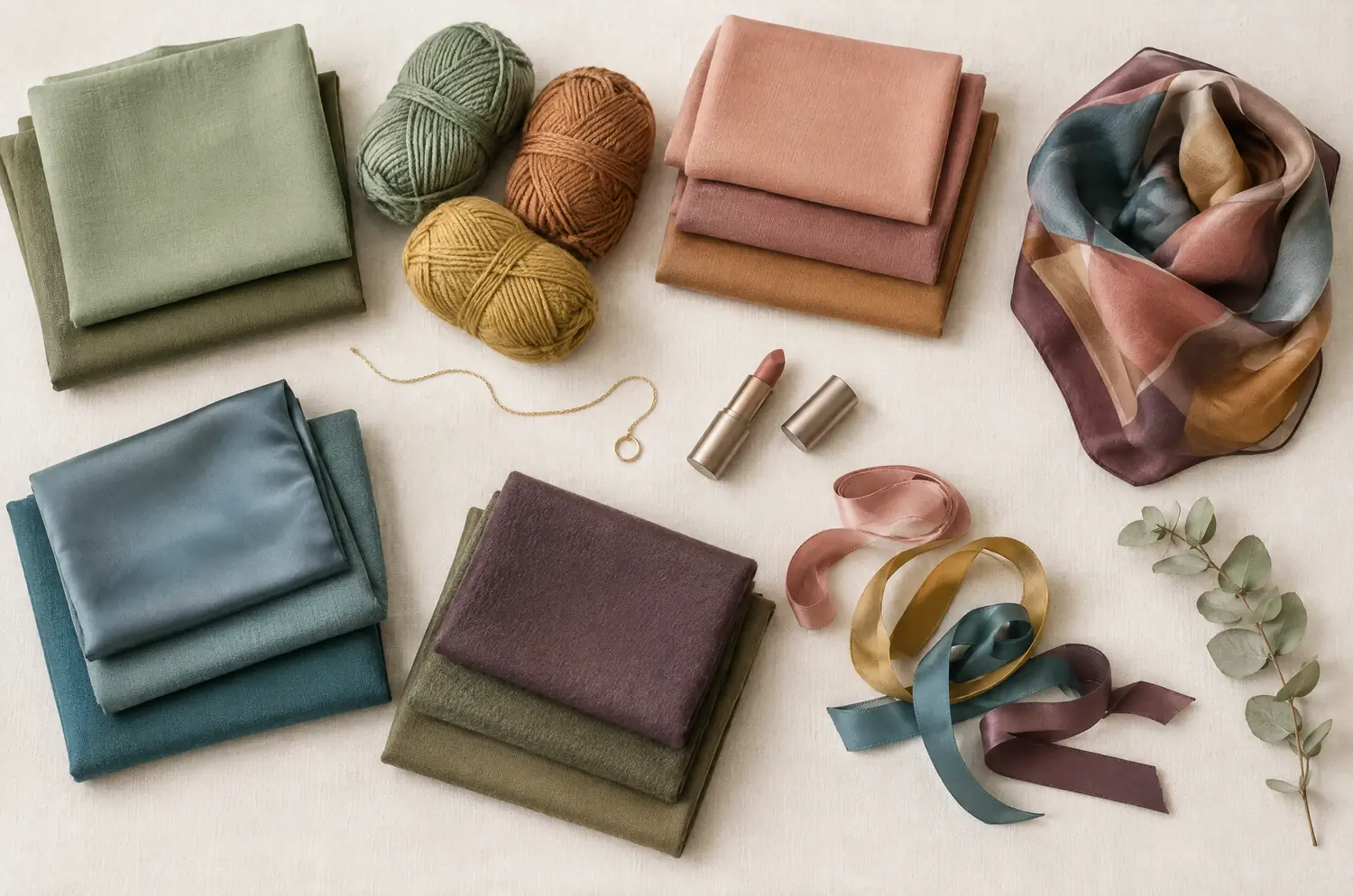
On a swatch card, both look dusty and gentle. On a face, one leans cool and pink. The other keeps a golden base.
Side by side
Cool Summer and Soft Autumn palettes
Same scale, same page: look at the swatches before you read the differences.
- Raspberry
#C73866 - Pink
#E57BA2 - Cool Watermelon
#E0607E - Soft Cherry
#B5364F - Mauve
#A777B8 - Light Plum
#8E5A8E - Cool Lavender
#9E8FD1 - Cool Sky Blue
#8FBDE3 - Denim Blue
#4F6FA8 - Gray Blue
#7C93B5 - Cool Turquoise
#4FA8A8 - Soft Spruce Green
#3F7F73
Neutrals
- Soft White
- Medium Gray
- Cool Taupe
- Navy
Colors to avoid
- Orange
- Golden Yellow
- Terracotta
- Black
- Sage Green
#9CAF88 - Soft Olive
#8A8B5C - Khaki
#7C7A4F - Light Terracotta
#C9805E - Soft Salmon
#E0A084 - Warm Dusty Rose
#C98F85 - Caramel
#B98654 - Soft Mustard
#C9A552 - Rosy Beige
#D8B9A2 - Soft Petrol Blue
#4F7C82 - Grayed Teal
#5E8A8E - Soft Eggplant
#6E4A5A
Neutrals
- Cream
- Sand Beige
- Warm Taupe
- Chestnut
Colors to avoid
- Black
- Optic White
- Fuchsia
- Electric Blue
The four axes
3 axes differ, the rest is shared
Temperature, lightness, intensity and contrast: the gauge shows where each one sits, the table says it in words.
The two sub-seasons
- Temperature
- 12Differs1 Very cool2 Neutral to warm
- Lightness
- 12SameMedium
- Intensity
- 12Differs1 Soft to medium2 Very soft, desaturated
- Contrast
- 12Differs1 Moderate2 Low to moderate
Line by line
| What is compared | Cool Summer | Soft Autumn |
|---|---|---|
| TemperatureDiffers | Very cool | Neutral to warm |
| Lightness | Medium | Medium |
| IntensityDiffers | Soft to medium | Very soft, desaturated |
| ContrastDiffers | Moderate | Low to moderate |
| Signature color | Raspberry | Light Terracotta |
| Neutrals | Soft White, Medium Gray, Cool Taupe, Navy | Cream, Sand Beige, Warm Taupe, Chestnut |
| Metals | Silver, white gold, platinum. Gray pearls, amethyst, aquamarine. | Matte gold, rose gold, soft copper, brushed brass. |
| Lips | Raspberry, blue-toned pink, soft cherry. Your red is a cool red. | Rosy peach, apricot, soft caramel, warm rosewood. |
| Hair color | Ash tones: ash blonde, ash brown, cool brown. Gray or white hair looks naturally good on you. | Golden light brown, honey dark blonde, melted caramel. Warm tones, but never fiery. |
What do you see first on a Cool Summer face?
Coolness. Everything else in Cool Summer follows from it.
The temperature is very cool, the lightness medium, the intensity soft to medium and the contrast moderate. Nothing’s loud, but nothing’s washed out either.
The signature is Raspberry. Next to it sit Cool Lavender, Denim Blue and Gray Blue, with Navy as the anchor. Think of an overcast English garden: old roses, lavender, blue-green leaves.
Warm shades are the trap here. Orange and Golden Yellow muddy the complexion, and Terracotta pulls the same way. Black is too harsh, so navy does its job instead.
What do you see first on a Soft Autumn face?
Softness. The warmth is real, but it comes through a filter.
Soft Autumn is neutral to warm, medium in lightness, very soft and desaturated, with low to moderate contrast. The colors blend into each other the way your hair, eyes and skin do.
Light Terracotta leads, and around it you find Sage Green, Caramel and Soft Mustard. Cream and Sand Beige carry the neutrals. Picture dry fields, sage leaves and a clay pot warmed by the afternoon sun.
The sharp shades are the ones to skip. Fuchsia and Electric Blue break the blend, optic white dims you, and black looks harsh.
Cool Summer against Soft Autumn: what do the three differences look like?
Temperature comes first, because the eye reads it before anything else.
Cool Summer is very cool, Soft Autumn is neutral to warm. On a Cool Summer, blue-based colors clear the skin, while golden ones can leave it looking muddy. On a Soft Autumn, the golden base stays, and a cool, icy pink can turn the face ashen.
Intensity comes second. Cool Summer sits at soft to medium, Soft Autumn at very soft and desaturated. So Soft Autumn needs the haze left in every color. A clear, bright color can make a Soft Autumn look costumed. On a Cool Summer, try Raspberry and watch your skin.
Contrast is the smallest gap: moderate against low to moderate. Treat contrast as a clue, not a decider.
What they share is lightness. Both sit in the middle, so don’t go looking for a difference there. Neither palette’s pale, and neither’s dark. You won’t find the answer there.
The two-color test. In daylight, with no makeup, hold a piece of fabric in each of these two colors up to your face. Rest your eyes between the two and redo it another day. If the same color keeps winning, you have a direction: a first hint, not a verdict.
Raspberry or Light Terracotta: what should you watch for?
The setup (daylight, bare face, hair covered) is in the color draping at home article. Here, only this pair matters.
Hold Raspberry under your chin. Then Light Terracotta. One at a time, with a pause for your eyes between them.
Ask three questions about each.
Does the skin turn yellow, or does it go gray? Watch for sallow patches near Raspberry, and for a flat, ashen look near Light Terracotta. Whichever one does that is the color to set aside.
Does the color look loud, or faded? If a color arrives before your face does, it’s too loud for the softer palette. If it looks flat and tired, it may be too gentle for the cooler one.
Do your features stand out, or do they blur? Eyes and lips that sharpen point to moderate contrast. Features that melt together nicely point to the softer side.
If the same color keeps coming out ahead, you have a direction. Repeat it on another day, in a different top, before you decide.
What if you sit between Cool Summer and Soft Autumn?
Nothing links these two directly. Cool Summer’s neighbor is True Winter, and Soft Autumn’s is Soft Summer.
So when both seem to fit, start with the lead. Ask whether the cool temperature or the softness is the stronger thing in your coloring.
If you lean cool, a Soft Summer may sit between your two results. It shares the softness of Soft Autumn and the Summer family of Cool Summer. These two pages help you check that:
Both palettes hold blue-greens and plums, so it’s tempting to swap them. Soft Petrol Blue and Grayed Teal belong to Soft Autumn, Cool Turquoise and Soft Spruce Green to Cool Summer. A Soft Autumn can test Soft Eggplant as a quiet cousin of Light Plum. Nothing crosses until your skin agrees.
The free quiz is a fair place to start, but it can’t watch your skin react to a color. In my view, that reaction is where the answer lives.
Silver or matte gold: what do lips and hair add?
Metals point a direction, nothing more. Cool Summer leans toward silver and white gold, Soft Autumn toward matte gold and rose gold. Hold each near your bare face, and let the drape confirm it.
Lips split along the same line: a cool red for one, a rosy peach for the other. The Cool Summer makeup page and the Soft Autumn makeup page cover each in detail.
Hair is the weakest clue. Ash tones suit Cool Summer, golden light browns suit Soft Autumn, but the skin decides. Judge it with the hair covered.
Keep exploring
More on these two sub-seasons
Palette Cool Summer color palette
Cool made gentle: blues, pinks and raspberries without any harshness.
Outfits Cool Summer outfits and capsule wardrobe
Cool Summer outfits built on eight pieces: navy, gray, raspberry and soft white, how to wear them, and what to do with orange and black. Start with navy.
Compare Cool Summer vs Bright Winter
Cool Summer vs Bright Winter: the three differences that matter, what each looks like on your face, and a drape test with Raspberry and Fuchsia to settle it.
Compare Cool Summer vs Deep Winter
Cool Summer vs Deep Winter: all four axes differ. I show what each difference looks like on a face and how a quick drape test settles the question for you.
Compare Cool Summer vs Light Summer
Cool Summer vs Light Summer: all four axes differ, so the answer is on your face. Here is what each difference looks like and how to settle it at home.
Compare Cool Summer vs Soft Summer
Cool Summer vs Soft Summer comes down to three differences: coolness, softness and contrast. Here is how they look on a face and how to settle it at home.
Questions
Cool Summer or Soft Autumn: your questions
What is the quickest way to separate Cool Summer and Soft Autumn?
Start with temperature. Hold a cool raspberry and a warm terracotta near your bare face, in daylight. Watch which one makes your skin look clearer and which one makes it look sallow or gray. If both seem acceptable, look at intensity: Soft Autumn needs the haziest, most blended version of each color.
Can I be a bit of both?
You can fall in between, yes. The two aren’t neighbors, so an in-between result often means Soft Summer is closer to your coloring than either. Let the leading trait guide you: coolness for Cool Summer, softness for Soft Autumn. Then compare your results over a few days.
Is a Soft Autumn gold or silver?
Soft Autumn points to matte gold and rose gold, Cool Summer to silver and white gold. To check, hold a chain of each against your bare neck and see which one leaves your skin looking even.
Can a Soft Autumn wear purple?
Yes, in the right family. Soft Eggplant and Smoky Plum are in its palette, and bright or icy purples break the blend.
Cool Summer has its own purples, Mauve and Light Plum. Hold each one near your face and watch your skin.
The quiz and the fabrics disagree. Which one counts?
Trust what you see on your skin. A quiz asks about your hair, eyes and habits, and it can’t see how a color lands on your face. Repeat the drape test on another day, with your hair covered, and see whether the result holds.
Cool Summer or Soft Autumn? Check it.
The free quiz shows you your likely season in two minutes. Then run the two-color test on your own bare face, in daylight: a first hint, not a verdict.