
Compare · two Summers
Cool Summer vs Light Summer: The Four Real Differences
“Both are Summers, so it’s one palette.” Hold two colors up to your face, and it stops being true.
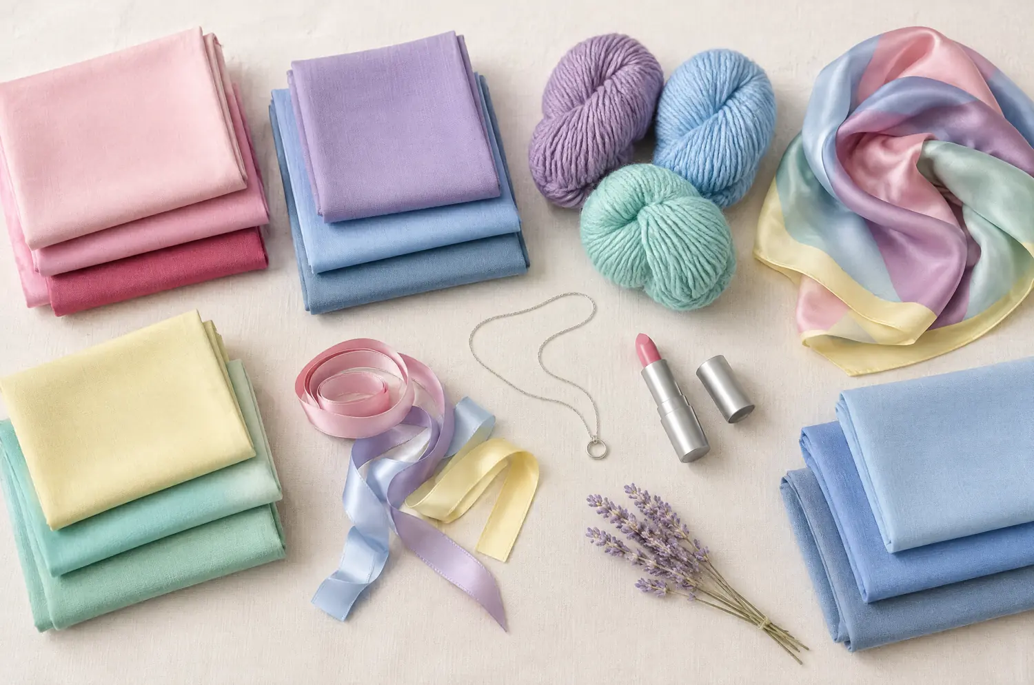
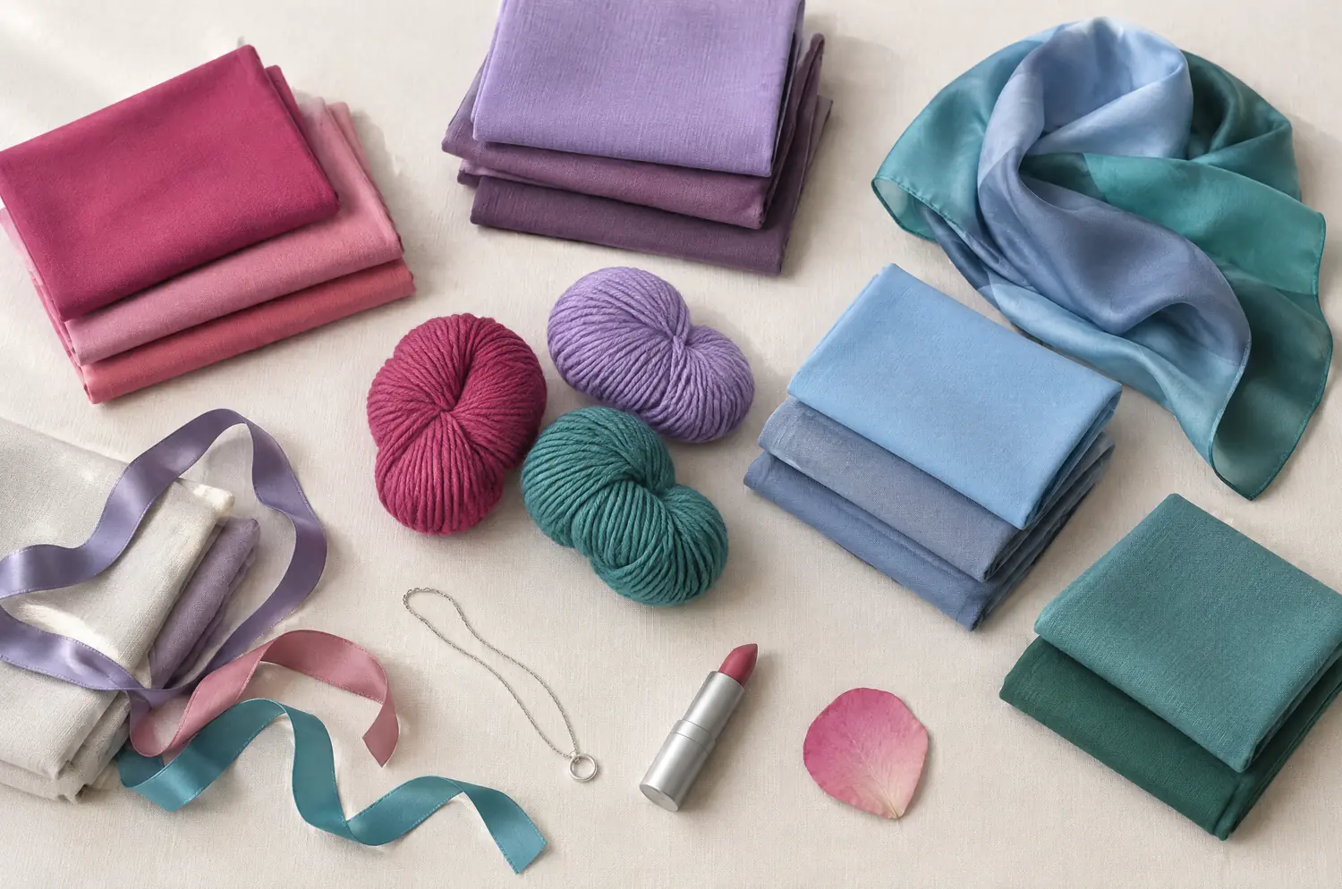
Side by side
Cool Summer and Light Summer palettes
Same scale, same page: look at the swatches before you read the differences.
- Raspberry
#C73866 - Pink
#E57BA2 - Cool Watermelon
#E0607E - Soft Cherry
#B5364F - Mauve
#A777B8 - Light Plum
#8E5A8E - Cool Lavender
#9E8FD1 - Cool Sky Blue
#8FBDE3 - Denim Blue
#4F6FA8 - Gray Blue
#7C93B5 - Cool Turquoise
#4FA8A8 - Soft Spruce Green
#3F7F73
Neutrals
- Soft White
- Medium Gray
- Cool Taupe
- Navy
Colors to avoid
- Orange
- Golden Yellow
- Terracotta
- Black
- Powder Pink
#F4C2D0 - Sugar Pink
#F29CB8 - Light Raspberry
#D9577E - Lavender
#C3B3E6 - Mauve
#B48CC8 - Sky Blue
#A9CFEF - Periwinkle
#8FA6E0 - Light Denim Blue
#7F9CC9 - Pale Aqua
#A6DCD9 - Seafoam Green
#8FCFBF - Cool Mint
#B5E2CF - Pale Lemon
#F6EFA6
Neutrals
- Soft White
- Pearl Gray
- Rosy Taupe
- Soft Navy
Colors to avoid
- Black
- Orange
- Mustard
- Warm Brown
The four axes
All four axes differ, none is shared
Temperature, lightness, intensity and contrast: the gauge shows where each one sits, the table says it in words.
The two sub-seasons
- Temperature
- 12Differs1 Very cool2 Slightly cool
- Lightness
- 12Differs1 Medium2 Very light
- Intensity
- 12Differs1 Soft to medium2 Soft
- Contrast
- 12Differs1 Moderate2 Low
Line by line
| What is compared | Cool Summer | Light Summer |
|---|---|---|
| TemperatureDiffers | Very cool | Slightly cool |
| LightnessDiffers | Medium | Very light |
| IntensityDiffers | Soft to medium | Soft |
| ContrastDiffers | Moderate | Low |
| Signature color | Raspberry | Powder Pink |
| Neutrals | Soft White, Medium Gray, Cool Taupe, Navy | Soft White, Pearl Gray, Rosy Taupe, Soft Navy |
| Metals | Silver, white gold, platinum. Gray pearls, amethyst, aquamarine. | Silver, white gold, very pale rose gold. Pearls, moonstone. |
| Lips | Raspberry, blue-toned pink, soft cherry. Your red is a cool red. | Fresh pink, light raspberry, rosewood. Sheer formulas. |
| Hair color | Ash tones: ash blonde, ash brown, cool brown. Gray or white hair looks naturally good on you. | Light ash blonde, beige blonde, cool light brown. Avoid strong golden or coppery tones. |
Cool Summer reads as cool first, then soft
It starts with the cool tone. Depth is medium. Intensity is a notch soft. Contrast is moderate. Your features show, but nothing is sharp, and nothing shouts.
Think Raspberry, Pink and Denim Blue. Bluish, fresh and a little restrained, like a pink scarf on a gray morning.
Silver suits you better than gold. Gold can fight a cool undertone, the tone under the surface of your skin. And navy does what black can’t: it holds the look without the harshness.
Warmth is what breaks it. Terracotta, Golden Yellow and orange muddy your complexion.
Every shade of the palette is on the Cool Summer page.
Light Summer is the same family, turned pale and powdery
Light Summer starts from lightness. Depth is very light, intensity soft, contrast low. Skin, eyes and hair stay close to each other in tone, and your colors follow them.
Powder Pink, Lavender, Sky Blue and Seafoam Green are its kind of color. Pale, cool, a little powdery, like a misty morning.
The pitfall here is weight as much as warmth. Black looks harsh. So does dark brown. And orange or mustard? They turn your skin yellow and bring out your dark circles.
You’ll find the whole palette on the Light Summer page.
What do the four differences look like on a face?
Start with the two leading traits, then the other two.
Temperature. Very cool for Cool Summer, only slightly cool for Light Summer. Both sit on the cool side. So the difference isn’t which way, it’s how far.
Lightness. Cool Summer sits at medium depth, Light Summer is very light. On a Light Summer, watch whether a medium-depth color takes over the face.
Contrast. Moderate for Cool Summer, low for Light Summer. Ask yourself whether your eyes, brows and hair stand out from your skin, or melt into it. That’s your contrast.
Intensity. Soft to medium against soft. Cool Summer’s colors have a little more presence. Light Summer’s stay gentle. Neither is loud.
What they share is the Summer family. Both avoid black and orange. Both lean toward silver and white gold. Don’t look for a difference there.
Which holds your face better, Raspberry or Powder Pink?
The setup is in the guide to color draping at home: daylight, a bare face, one fabric at a time. Here’s what to watch for with this pair.
Hold Raspberry first. Does your face come alive, with the eyes brighter and the lips more defined? Or does the color take over and the face fade behind it?
Then Powder Pink. Does your skin look rested and even? Or does it look washed out, with your features blurring?
If Raspberry flatters and Powder Pink fades you, you’re leaning Cool Summer. If Powder Pink flatters and Raspberry feels heavy, you’re leaning Light Summer.
Repeat it another day. If the same color wins both times, note it: that is your direction. One round proves nothing.
The two-color test. In daylight, with no makeup, hold a piece of fabric in each of these two colors up to your face. Rest your eyes between the two and redo it another day. If the same color keeps winning, you have a direction: a first hint, not a verdict.
What if you sit between the two?
Cool Summer and Light Summer don’t sit next to each other in the method. Each has another sub-season closer by: True Winter for Cool Summer, Light Spring for Light Summer.
So when your results split, ask whether you sit between these two, or between one of them and its own neighbor. The comparisons with True Winter and Light Spring can help.
Start with the leading trait. If cool and bluish colors do the most for you, even when they’re fairly deep, look at Cool Summer. If lightness does the most, and anything dark feels heavy, look at Light Summer. You’re looking for a direction, not chasing a score.
The shared names are the place to compare. Soft White and Mauve appear in both palettes, each in its own shade, and so does a navy: Navy for Cool Summer, Soft Navy for Light Summer. Hold the two versions of the same name against your face, one after the other. That tells you more than any list can.
An app or a filter reads a photograph, and a photograph cannot show how your skin answers a color. The free color analysis quiz is a fair place to start: ten questions that point to a likely season, then the drape does the rest.
Keep exploring
More on these two sub-seasons
Palette Cool Summer color palette
Cool made gentle: blues, pinks and raspberries without any harshness.
Outfits Cool Summer outfits and capsule wardrobe
Cool Summer outfits built on eight pieces: navy, gray, raspberry and soft white, how to wear them, and what to do with orange and black. Start with navy.
Compare Cool Summer vs Bright Winter
Cool Summer vs Bright Winter: the three differences that matter, what each looks like on your face, and a drape test with Raspberry and Fuchsia to settle it.
Compare Cool Summer vs Deep Winter
Cool Summer vs Deep Winter: all four axes differ. I show what each difference looks like on a face and how a quick drape test settles the question for you.
Compare Cool Summer vs Soft Autumn
Cool Summer vs Soft Autumn: three differences that matter, what each looks like on a face, and a quick drape test to settle it, even if you sit between.
Compare Cool Summer vs Soft Summer
Cool Summer vs Soft Summer comes down to three differences: coolness, softness and contrast. Here is how they look on a face and how to settle it at home.
Questions
Cool Summer or Light Summer: your questions
Which am I, Cool Summer or Light Summer?
Ask which word fits your coloring better: cool or pale. If bluish shades like Raspberry do more for you than pastels, lean Cool Summer. If soft pastels brighten you and deeper tones take over, lean Light Summer. Then confirm with a drape in daylight.
Can I be between Cool Summer and Light Summer?
Yes, you can sit between two sub-seasons. Say which trait you notice more in your own face, coolness or lightness, and test the colors that sit at the edge of each palette. If neither wins, the section above says where to look next.
Does my hair color decide between them?
No. A season is read on your skin and your eyes, with the hair covered, so hair color never decides it alone. Dyed or natural, hair only sits beside your face and has to agree with the palette.
Which colors do Cool Summer and Light Summer share?
They share families, not identical shades: a Soft White and a Mauve appear in both, and so does a navy, as Navy in one palette and Soft Navy in the other. Both also avoid black and orange. Silver and white gold work in each. Everything else is a matter of how pale, how soft and how cool you want it.
My quiz says one and my drape says the other. Which counts?
Give the drape a second day, in daylight, before you decide anything. The quiz only reads what you tell it, while the drape shows your skin reacting. If they still disagree, read both season pages side by side.
Can an app or an AI tell me which one I am?
It can offer a first hint from a photo, and that is all it should be. This pair needs fabric against bare skin in daylight, which a screen cannot give you. Use the hint to choose what to test, then test it.
Cool Summer or Light Summer? Check it.
The free quiz shows you your likely season in two minutes. Then run the two-color test on your own bare face, in daylight: a first hint, not a verdict.