
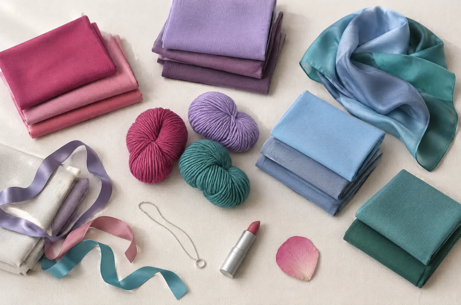
Compare · two sub-seasons
Cool Summer vs Warm Spring: Three Differences You Can See
“They both look fresh, so they must be close.” They aren’t. In a photo, maybe. Next to your face, one pulls blue and the other pulls gold.
Side by side
Cool Summer and Warm Spring palettes
Same scale, same page: look at the swatches before you read the differences.
- Raspberry
#C73866 - Pink
#E57BA2 - Cool Watermelon
#E0607E - Soft Cherry
#B5364F - Mauve
#A777B8 - Light Plum
#8E5A8E - Cool Lavender
#9E8FD1 - Cool Sky Blue
#8FBDE3 - Denim Blue
#4F6FA8 - Gray Blue
#7C93B5 - Cool Turquoise
#4FA8A8 - Soft Spruce Green
#3F7F73
Neutrals
- Soft White
- Medium Gray
- Cool Taupe
- Navy
Colors to avoid
- Orange
- Golden Yellow
- Terracotta
- Black
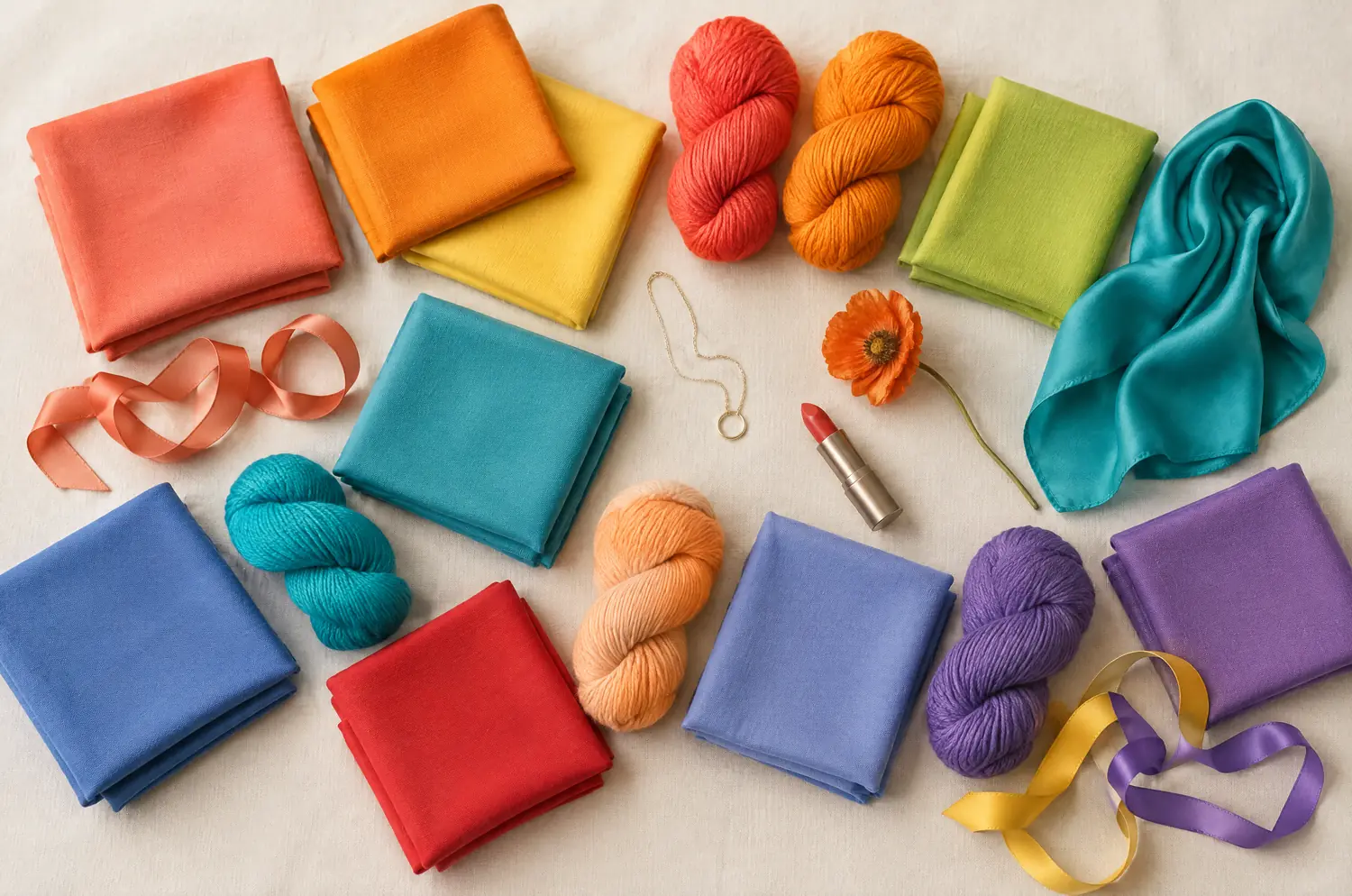
- Coral
#FF6F52 - Bright Orange
#FF8C1A - Sunshine Yellow
#FFD23F - Meadow Green
#5DB84C - Pear Green
#B5D334 - Warm Turquoise
#1FB7A6 - Lagoon Blue
#2E9CCA - Poppy Red
#E8382F - Salmon
#FF8E72 - Bright Peach
#FFAB6B - Warm Periwinkle
#6D7FD9 - Warm Violet
#8A5FBF
Neutrals
- Cream
- Camel
- Golden Brown
- Light Khaki
Colors to avoid
- Black
- Cool Fuchsia
- Blue Gray
- Optic White
The four axes
3 axes differ, the rest is shared
Temperature, lightness, intensity and contrast: the gauge shows where each one sits, the table says it in words.
The two sub-seasons
- Temperature
- 12Differs1 Very cool2 Very warm
- Lightness
- 12Differs1 Medium2 Medium to light
- Intensity
- 12Differs1 Soft to medium2 Bright
- Contrast
- 12SameModerate
Line by line
| What is compared | Cool Summer | Warm Spring |
|---|---|---|
| TemperatureDiffers | Very cool | Very warm |
| LightnessDiffers | Medium | Medium to light |
| IntensityDiffers | Soft to medium | Bright |
| Contrast | Moderate | Moderate |
| Signature color | Raspberry | Coral |
| Neutrals | Soft White, Medium Gray, Cool Taupe, Navy | Cream, Camel, Golden Brown, Light Khaki |
| Metals | Silver, white gold, platinum. Gray pearls, amethyst, aquamarine. | Yellow gold, golden brass, cream pearls. Turquoise and coral. |
| Lips | Raspberry, blue-toned pink, soft cherry. Your red is a cool red. | Coral, poppy red, rich peach. Orange-leaning reds are your reds. |
| Hair color | Ash tones: ash blonde, ash brown, cool brown. Gray or white hair looks naturally good on you. | Golden blonde, honey, light copper, golden brown. Always keep warm tones. |
Cool Summer: what happens when everything leans blue?
Cool Summer , also known as True Summer, starts from one fact: it’s very cool. The rest of the palette is built on that.
Depth sits in the middle, intensity is soft to medium and contrast is moderate. The colors read bluish and quiet. Raspberry, Cool Lavender and Gray Blue are the kind of colors it carries well. Think of an English garden under an overcast sky.
Silver sits better against your skin than gold does. Navy frames your face where black would harden it.
Orange-leaning colors are the trap. They muddy a Cool Summer complexion fast.
Warm Spring: why does everything in it look sun-warmed?
Warm Spring (also called True Spring) leads with warmth. Its temperature is very warm, its depth medium to light, its intensity bright, its contrast moderate.
Picture a market in high summer: citrus, sunflowers, new leaves. Coral, Sunshine Yellow and Warm Turquoise carry that feeling, and Meadow Green adds a fresh, leafy note.
Yellow gold is your metal. Coral or a soft orange tends to warm the face up quickly.
Cool pinks and bluish grays go the other way. They can leave your skin looking dull, with the yellow showing.
The two-color test. In daylight, with no makeup, hold a piece of fabric in each of these two colors up to your face. Rest your eyes between the two and redo it another day. If the same color keeps winning, you have a direction: a first hint, not a verdict.
Raspberry against Coral: does your skin warm up or go flat?
The setup (daylight, bare face, hair covered, one fabric at a time) is in color draping at home. Here is what to look for with this pair.
Hold Raspberry, then Coral, in solid fabric. Start with temperature: does your skin go yellow, or gray? Under Raspberry, watch for yellow showing in the skin. Under Coral, watch for a murky, heavy look. The better color leaves your skin clear and your eyes brighter.
Then intensity. Does the color look loud, or do you look faded next to it? If Coral seems to talk over you, lean cool. If Raspberry looks like a pleasant color that has nothing to do with you, lean warm.
Last, lightness. Does your face disappear into the fabric, or does the color take over? That one is a tiebreaker, not a judge.
Repeat it on a few separate tries, resting your eyes in between. If Raspberry comes out ahead every time, lean Cool Summer. If Coral does, lean Warm Spring. That is a direction, not a ruling.
What if Cool Summer and Warm Spring both seem to fit you?
These two aren’t neighbors in the method. Cool Summer borders True Winter, and Warm Spring borders Warm Autumn, so each one sits on the far side from the other. When both Raspberry and Coral seem fine, the face may be asking for something in between. Read Soft Summer against Warm Spring, Light Spring against Warm Spring or Cool Summer against Soft Summer.
Lead with temperature. Which hurts more: orange-leaning colors that muddy you, or cool pinks that dull you? Silver or yellow gold against your skin gives a second opinion.
Can one palette borrow from the other? Only a little. Turquoise and periwinkle appear on both sides, each in its own temperature: Cool Turquoise and Cool Periwinkle for Cool Summer, Warm Turquoise and Warm Periwinkle for Warm Spring. Borrow the family, never the other side’s version.
The free quiz gives you a likely season in ten questions. It can’t watch your skin react, so use it to choose which two sub-seasons to test, not to choose between them.
Keep exploring
More on these two sub-seasons
Palette Cool Summer color palette
Cool made gentle: blues, pinks and raspberries without any harshness.
Outfits Cool Summer outfits and capsule wardrobe
Cool Summer outfits built on eight pieces: navy, gray, raspberry and soft white, how to wear them, and what to do with orange and black. Start with navy.
Compare Cool Summer vs Bright Winter
Cool Summer vs Bright Winter: the three differences that matter, what each looks like on your face, and a drape test with Raspberry and Fuchsia to settle it.
Compare Cool Summer vs Deep Winter
Cool Summer vs Deep Winter: all four axes differ. I show what each difference looks like on a face and how a quick drape test settles the question for you.
Compare Cool Summer vs Light Summer
Cool Summer vs Light Summer: all four axes differ, so the answer is on your face. Here is what each difference looks like and how to settle it at home.
Compare Cool Summer vs Soft Autumn
Cool Summer vs Soft Autumn: three differences that matter, what each looks like on a face, and a quick drape test to settle it, even if you sit between.
Questions
Cool Summer or Warm Spring: your questions
Am I a Spring or a Summer?
Start with temperature. If gold flatters you and cool pinks look dull, you lean Spring. If silver wins and orange-leaning colors muddy your skin, you lean Summer. Then confirm it: hold one warm and one cool color under your chin, hair covered, and see which one clears your skin.
Can Cool Summer wear coral?
Test it before you commit. Coral is the Warm Spring signature, and a Cool Summer’s trouble is with orange-leaning colors, which muddy the complexion. Hold it under your chin and watch your skin. For a lively pink, Cool Watermelon and Pink are the cool-side options in your palette.
What should Warm Spring avoid?
Black, Cool Fuchsia, Blue Gray and Optic White. All four sit too cool for you. Cream replaces the white, and Camel or Golden Brown replace black near your face.
Do silver and gold settle Cool Summer vs Warm Spring?
They point a long way. Silver, white gold and platinum go with Cool Summer. Yellow gold and golden brass go with Warm Spring. Treat that as a direction: hold each metal against your skin in daylight and see which one makes you glow.
Does hair color or gray hair decide between them?
No. Hair is one clue, and dyed hair changes nothing about your season. Cover it during the test and read your skin. Gray or white hair looks naturally good on a Cool Summer. A Warm Spring who colors her hair should keep warm tones.
Cool Summer or Warm Spring? Check it.
The free quiz shows you your likely season in two minutes. Then run the two-color test on your own bare face, in daylight: a first hint, not a verdict.