
Compare · two sub-seasons
Warm Spring vs Soft Autumn: The Real Differences
Warm Spring or Soft Autumn? Both are golden, so it feels like a coin toss. It isn’t. These two differ on every axis. Your face will show you which side you’re on.
Side by side
Warm Spring and Soft Autumn palettes
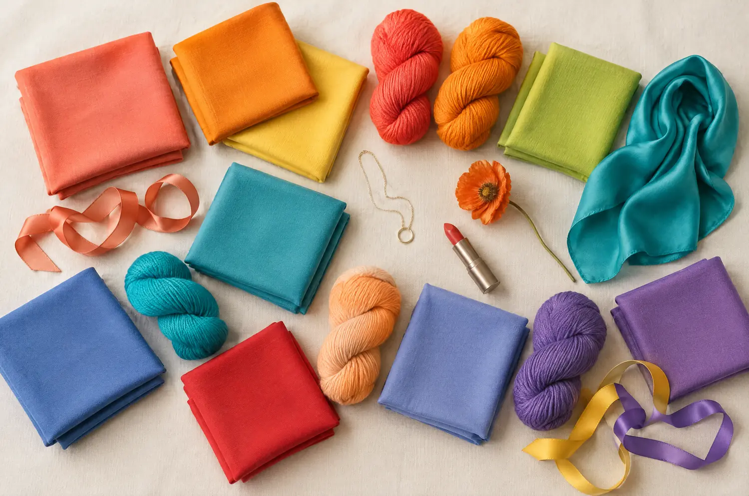
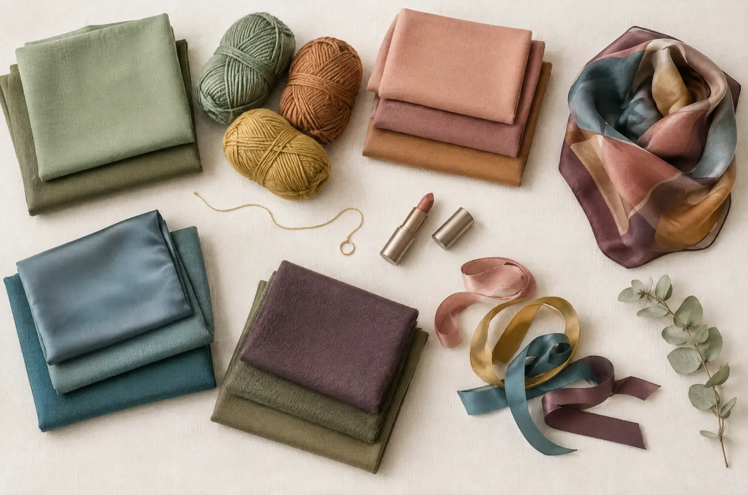
Same scale, same page: look at the swatches before you read the differences.
- Coral
#FF6F52 - Bright Orange
#FF8C1A - Sunshine Yellow
#FFD23F - Meadow Green
#5DB84C - Pear Green
#B5D334 - Warm Turquoise
#1FB7A6 - Lagoon Blue
#2E9CCA - Poppy Red
#E8382F - Salmon
#FF8E72 - Bright Peach
#FFAB6B - Warm Periwinkle
#6D7FD9 - Warm Violet
#8A5FBF
Neutrals
- Cream
- Camel
- Golden Brown
- Light Khaki
Colors to avoid
- Black
- Cool Fuchsia
- Blue Gray
- Optic White
- Sage Green
#9CAF88 - Soft Olive
#8A8B5C - Khaki
#7C7A4F - Light Terracotta
#C9805E - Soft Salmon
#E0A084 - Warm Dusty Rose
#C98F85 - Caramel
#B98654 - Soft Mustard
#C9A552 - Rosy Beige
#D8B9A2 - Soft Petrol Blue
#4F7C82 - Grayed Teal
#5E8A8E - Soft Eggplant
#6E4A5A
Neutrals
- Cream
- Sand Beige
- Warm Taupe
- Chestnut
Colors to avoid
- Black
- Optic White
- Fuchsia
- Electric Blue
The four axes
All four axes differ, none is shared
Temperature, lightness, intensity and contrast: the gauge shows where each one sits, the table says it in words.
The two sub-seasons
- Temperature
- 12Differs1 Very warm2 Neutral to warm
- Lightness
- 12Differs1 Medium to light2 Medium
- Intensity
- 12Differs1 Bright2 Very soft, desaturated
- Contrast
- 12Differs1 Moderate2 Low to moderate
Line by line
| What is compared | Warm Spring | Soft Autumn |
|---|---|---|
| TemperatureDiffers | Very warm | Neutral to warm |
| LightnessDiffers | Medium to light | Medium |
| IntensityDiffers | Bright | Very soft, desaturated |
| ContrastDiffers | Moderate | Low to moderate |
| Signature color | Coral | Light Terracotta |
| Neutrals | Cream, Camel, Golden Brown, Light Khaki | Cream, Sand Beige, Warm Taupe, Chestnut |
| Metals | Yellow gold, golden brass, cream pearls. Turquoise and coral. | Matte gold, rose gold, soft copper, brushed brass. |
| Lips | Coral, poppy red, rich peach. Orange-leaning reds are your reds. | Rosy peach, apricot, soft caramel, warm rosewood. |
| Hair color | Golden blonde, honey, light copper, golden brown. Always keep warm tones. | Golden light brown, honey dark blonde, melted caramel. Warm tones, but never fiery. |
Warm Spring leads with warmth, and the brightness follows
Warm Spring is the heart of Spring. Its first word is warmth, the very warm kind, with a golden base under every color.
Then comes clarity. Coral, Poppy Red, Warm Turquoise and Sunshine Yellow all have a clean, sunlit finish. Nothing is veiled. Depth sits at medium to light, and contrast stays moderate.
On a face, that means color can speak up. A Warm Spring in Coral gets a healthy glow right away. The same person in Blue Gray or Cool Fuchsia looks dull, because the yellow in the skin comes forward instead of glowing.
Soft Autumn leads with softness, and the warmth stays filtered
Soft Autumn starts somewhere else. Its first word is softness. The temperature is neutral to warm, and every color arrives with a little gray in it.
Sage Green, Soft Olive, Caramel and Warm Dusty Rose all have that blended, countryside look. Depth sits at medium, and contrast runs low to moderate.
On a face, that means color should melt into the coloring, not announce itself. Bright shades can read like a costume. Fuchsia and Electric Blue break the harmony, and Black and Optic White sit too hard against the skin.
Which four differences set Warm Spring and Soft Autumn apart?
Here are the four, in the order the eye reads them.
Intensity comes first. Warm Spring is bright, so a color can be saturated and still look natural. Soft Autumn is very soft and desaturated, so the same saturated color looks loud. When someone says “that’s too much,” this is the axis.
Temperature comes second. Warm Spring is very warm, and Soft Autumn is neutral to warm. Soft Autumn keeps a golden base, but it never reaches the full heat of the Spring palette.
Lightness comes third. Warm Spring runs medium to light, and Soft Autumn sits at medium. The gap is small. Watch whether your face disappears into the color or the color takes over your face.
Contrast comes last, and it’s the subtlest. Moderate against low to moderate means the features of a Warm Spring can take a little more definition. On a Soft Autumn they blend.
What they share is small. Both lean warm, and both do without Black and Optic White. That overlap is why they get confused, and it ends there.
The two-color test. In daylight, with no makeup, hold a piece of fabric in each of these two colors up to your face. Rest your eyes between the two and redo it another day. If the same color keeps winning, you have a direction: a first hint, not a verdict.
Coral or Light Terracotta: which one lets your skin breathe?
Set up the test once, as in color draping at home, then spend your attention on this pair.
Hold Coral first. Look for a healthy glow and bright eyes, which points to Warm Spring. If the coral jumps out and you see it before you see your face, that points to Soft Autumn.
Now hold Light Terracotta. Look for a face that settles, with features that stay readable, which points to Soft Autumn. If it feels a little quiet next to the coral, that points to Warm Spring.
With each color, check the skin first: does it turn yellow or gray? Then check the volume of the color: is it shouting or fading? Last, check your eyes and lips: do they stay sharp, or blur into the fabric?
Swap the order and try again on another day. If Coral keeps coming out ahead, lean Warm Spring. If Light Terracotta does, lean Soft Autumn. Either way you have a direction, not a ruling.
What if you sit between Warm Spring and Soft Autumn?
Start with what leads. Ask yourself whether you need the color clear and sunny or filtered and blended. Intensity usually answers that first.
These two aren’t neighbors in the method, so a real tie deserves a second look. It can mean a third sub-season fits you better. Warm Autumn shares Warm Spring’s heat, and Soft Summer shares Soft Autumn’s softness. Read those two comparisons before you decide.
If both palettes flatter you, try Salmon from Warm Spring and Soft Salmon from Soft Autumn side by side, and watch your skin.
In my view, bright saturated shades are the first to break the harmony of a Soft Autumn palette.
A quiz or an app can’t settle this pair. They can’t see your skin react to a color, and softness versus brightness is exactly a reaction. My advice: use the free color analysis quiz to get a likely season, then run the duel above to check it. The Soft Autumn makeup page shows the lip and cheek shades if you want to test on your face.
Keep exploring
More on these two sub-seasons
Palette Warm Spring color palette
Sunshine in your skin: golden, cheerful, clear colors.
Compare Cool Summer vs Warm Spring
Cool Summer vs Warm Spring comes down to three differences you can see on a face. I show what each looks like and how a two-color test gives you a direction.
Compare Light Spring vs Warm Spring
Light Spring vs Warm Spring: all four axes differ. Here is what each difference looks like on your face and how a quick drape test settles it at home.
Compare Soft Summer vs Warm Spring
Soft Summer vs Warm Spring: all four axes differ, so the two palettes rarely overlap. See what each looks like on a face and how to settle it with one test.
Compare Warm Spring vs Bright Spring
Warm Spring vs Bright Spring: four axes set them apart, from temperature to contrast. Here is what each looks like on a face and how to settle it at home.
Compare Warm Spring vs Warm Autumn
Warm Spring vs Warm Autumn share their warmth. Two things set them apart: lightness and intensity. Here is what that looks like on a face, and how to decide.
Questions
Warm Spring or Soft Autumn: your questions
Which metal suits Warm Spring and Soft Autumn?
It depends on your skin, so hold each metal near your face. As a direction, Warm Spring points to yellow gold, golden brass and cream pearls. Soft Autumn points to matte gold, rose gold, soft copper and brushed brass, and often goes back and forth between gold and silver.
Does hair color or gray hair decide between them?
No. Honey and golden brown show up on both sides, and gray hair doesn’t pick a team either. Cover your hair when you test, and read what your skin and eyes do.
Is Soft Autumn just a muted Warm Spring?
No. Muting a Warm Spring palette doesn’t give you Soft Autumn, because the warmth itself changes: neutral to warm instead of very warm. The pieces don’t match one for one, and the palettes only overlap at the edges.
My quiz says one and my drape test says the other. Which do I trust?
Both are hints. I would weigh the fabric more, because a quiz asks about you in words while a fabric shows your skin react. Repeat it another day, then read both season pages and see which one describes your face.
What should each of them avoid?
Black and Optic White sit badly near the face on both. Warm Spring should also steer clear of Cool Fuchsia and Blue Gray, which bring out the yellow in the skin. Soft Autumn should skip Fuchsia and Electric Blue, which are too sharp for its blended coloring.
Warm Spring or Soft Autumn? Check it.
The free quiz shows you your likely season in two minutes. Then run the two-color test on your own bare face, in daylight: a first hint, not a verdict.