
Beige
#D7BEA2- Linen
- Wheat
- Desert Sand
- Sand
Color comparison
“Khaki is the green one. Beige is the tan one.” Put them side by side and that falls apart. Both are light. Both are muted. Both sit in the orange range.
#D7BEA2#C3B091Side by side
The two are about as light and as vivid as each other; both sit in the orange range.
Beige runs through Linen, Wheat, Desert Sand, Beige itself and Sand. The plain Beige is light, muted and leans orange.
Linen is the outlier: very light, with almost no hue at all. Next to a face it fades into the room. Wheat is very light, muted and orange. Desert Sand is very light and muted, and tips toward red-orange.
Sand comes last by lightness and carries the most intensity of the five. Its hue turns yellow. Near a face, that gives beige a wide range. Linen and Wheat stay out of the way, and Sand speaks a little louder.
Khaki is made of Khaki, Dark Khaki, Light Khaki and Dull Khaki. The plain Khaki is light, muted and orange, the same three words as plain Beige.
Dark Khaki and Light Khaki are light too, but medium in intensity, and both lean yellow. Dull Khaki is the only one at medium lightness. It’s muted and yellow.
Of the four, plain Khaki is the quietest. So the khaki you picture is the gentlest member of its own family. And a name on a tag won’t tell you much: Dark Khaki sits among the light ones.
Not much, at first. The plain shades match in lightness, in intensity and in hue range. Both are quiet, both warm, both easy to use as a background. Don’t hunt for a gap there.
The gap lives in the families around them. Beige reaches much paler: Linen and Wheat are very light, and Linen has no clear hue. Khaki never gets that pale, and two of its four shades carry medium intensity with a yellow lean.
On a fabric, Dark Khaki and Light Khaki, both medium in intensity and yellow, can read a touch stronger than plain Beige. Near a face, a very pale beige can fade into the skin beside it, while a yellow-leaning khaki keeps its edge and shows more of its own color. Neither is wrong. They just do different jobs under your chin.
No. The picks come out as pairs. Two sub-seasons take both outright, four take both as neighbors of the palette, and six take neither.
Light Spring is slightly warm, very light and fresh. Beige matches Golden Beige in its palette, and Khaki matches Warm Light Gray. Soft Autumn is neutral to warm and very soft, with low to moderate contrast. Both land on Sand Beige, a palette color, and muted is exactly its home.
The neighbors stop one step short. Warm Spring, very warm and bright, has a neighbor of Beige in its palette, Golden Ivory, and a neighbor of Khaki, Camel. Soft Summer, neutral to cool and grayed, ties both to Pebble Gray. Warm Autumn and Deep Autumn both come near Cream.
Then the six. Bright Spring and Bright Winter are very bright, and both colors sit close to Grayed Beige, which they avoid. Camel stands in for Bright Spring. For Bright Winter it’s Light Pearl Gray with Beige and Silver Gray with Khaki.
Deep Winter avoids Golden Beige, and both colors sit close to it. Pure White is its closest palette color, a stand-in.
Light Summer, Cool Summer and True Winter have no match at all. Light Summer’s closest is Soft White for Beige and Rosy Taupe for Khaki. Cool Summer’s is Soft White. True Winter’s is Cool Pearl Gray. All of these are stand-ins, not matches.
Try one swatch at a time against a bare face by a window, as laid out in color draping at home, and keep the one that leaves your face in front.
White, navy and olive go with both. Beige then takes chocolate, baby pink and black. Chocolate gives it a dark brown base. Baby pink softens it. Black sets it against a very dark neighbor.
Khaki takes burgundy, denim blue and charcoal. Burgundy sets a dark red beside it, denim blue adds a blue, and charcoal gives it a dark gray base. My advice: if you’re unsure which of the two to buy, buy the one that shares the partners you already own. Other colors have their own pairings in the color guides.
Which one suits you
Each color is checked against the palette of each sub-season, color by color. This is a first hint, not a verdict: see how it looks on your own face.
Both work for you
Both are close to your palette
Neither is for you
Closest in your paletteCamel
Neither is for you
Closest in your paletteSoft White
Neither is for you
Closest in your paletteSoft White
Both are close to your palette
Both work for you
Both are close to your palette
Both are close to your palette
Neither is for you
Closest in your palettePure White
Neither is for you
Closest in your paletteCool Pearl Gray
Neither is for you
Closest in your paletteLight Pearl Gray
Questions
No, but they’re close. The plain shades of each are light, muted and orange-leaning, so they land in the same neighborhood. What differs is the family around them: beige reaches very pale, almost colorless shades, while khaki stays light to medium and carries more yellow.
Side by side, the plain versions match. The difference shows in the families. Beige runs down to Linen, Wheat and Desert Sand, all very light. The lightest khaki is only light, and Dull Khaki reaches medium. If you want the palest option, look at beige.
Your sub-season settles it, and none takes just one. Light Spring and Soft Autumn take both, and six take neither. The ten-question color quiz points to a likely season and a hint of your sub-season. Treat it as a hint to check with fabric, not a verdict.
Yes. Treat it as tone-on-tone: pick a very pale beige such as Linen or Wheat and Dull Khaki, the darkest of the khakis, so the two read as different on purpose, not as a near miss. White, navy and olive bridge them, since both colors take all three.
Barely. A code is a reference, not the color you’ll wear. Screens, bulbs and dye all shift both colors, and they sit close enough that a screen can blur them. Check the fabric itself in daylight before you buy.
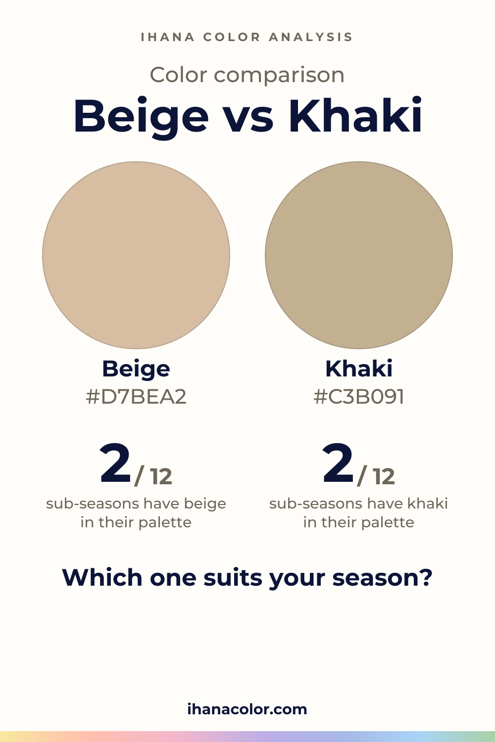
Keep it
The two colors side by side, ready to pin or to keep on your phone.
Download the imageKeep exploring
Colors that go with beige: white, navy, olive and more. The five beiges, the version each sub-season wears, where Deep Winter differs, and what to skip.
What colors go with khaki? I name the partners that work, then show you which version of khaki belongs to your sub-season and which pairings flatten it.
Taupe vs beige: taupe is deeper and nearly neutral, beige is lighter with an orange lean. See which one belongs to your sub-season and how to test it.
Beige vs cream: cream is lighter and leans yellow, beige leans orange. See which one belongs to your sub-season and how to wear and test each at home.
Khaki vs tan: the plain shades match, but their shade families don’t. See how each sits on a face and which sub-seasons take khaki, tan, both or neither.
The quiz shows you your likely season and a sub-season hint, with no sign-up. A first hint, not a verdict.
Full palette, capsule wardrobe, makeup, hair and a shopping list for each sub-season. Not on sale yet: join the waitlist.
Twelve sub-seasons instead of sixteen, the three things we look at, and why a quiz is only a first hint.
The free quiz shows you your likely season in two minutes. Then hold both colors up to your bare face, in daylight: a first hint, not a verdict.