
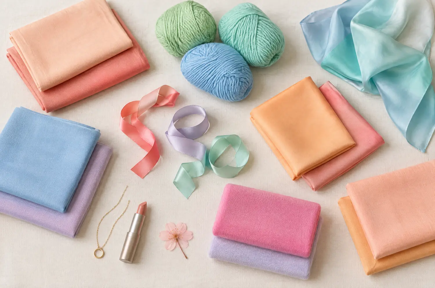
Compare · neighboring sub-seasons
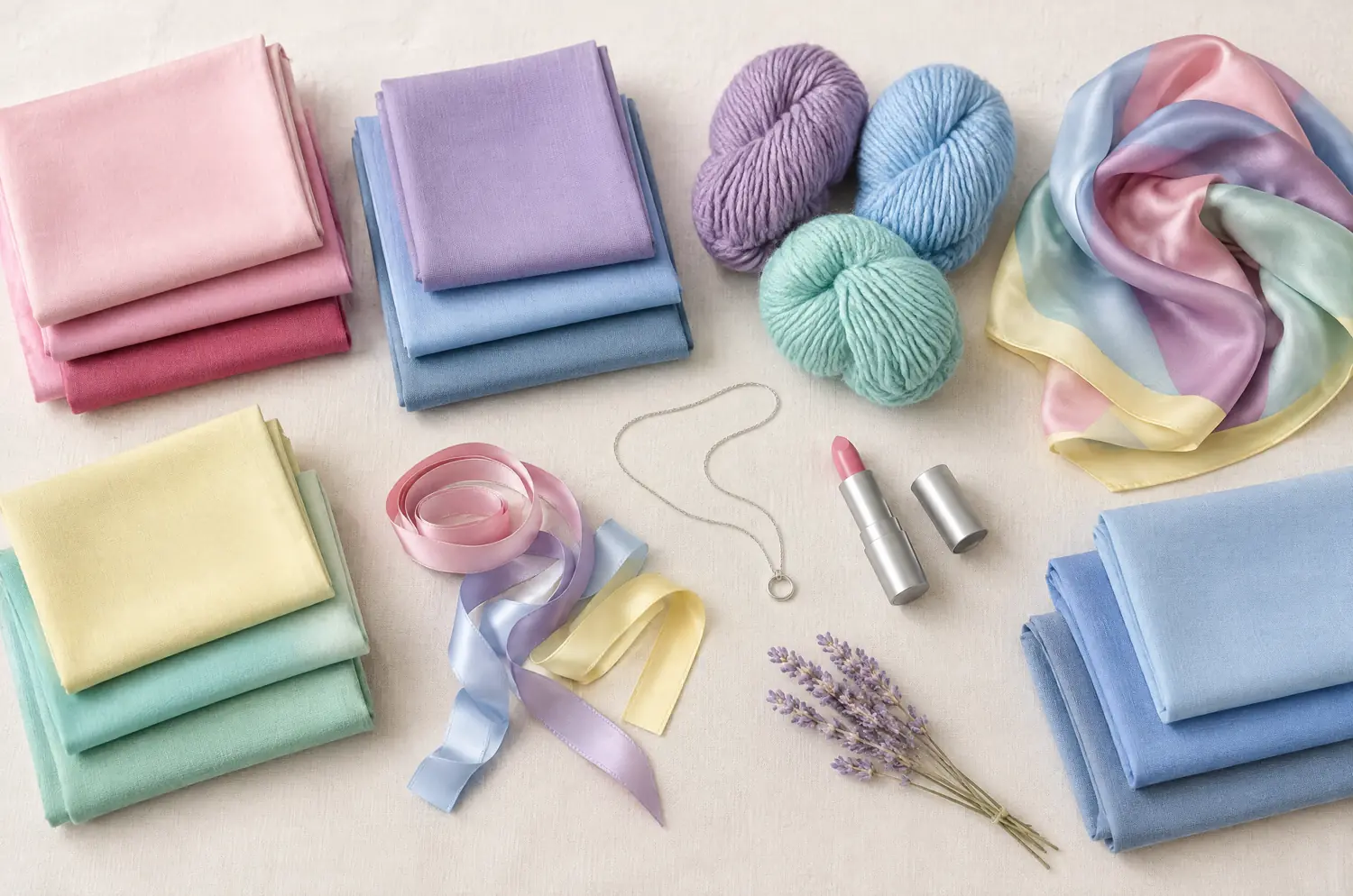
Light Spring vs Light Summer: Two Differences That Matter
Your quiz result says Light Spring. Then you hold a powder pink sweater under your chin. Your face doesn’t go flat. Now what?
Side by side
Light Spring and Light Summer palettes
Same scale, same page: look at the swatches before you read the differences.
- Peach
#FFCBA4 - Light Coral
#FF8F7A - Apricot
#FBB87A - Butter Yellow
#F9E38C - Fresh Apple Green
#B8D98A - Mint
#A8E0C0 - Aqua
#7FD6CF - Sky Blue
#8EC5E8 - Light Periwinkle
#A5B4E8 - Salmon Pink
#FFA59B - Warm Candy Pink
#F78FA7 - Light Lilac
#C8B1E4
Neutrals
- Ivory
- Golden Beige
- Light Camel
- Warm Light Gray
Colors to avoid
- Black
- Burgundy
- Charcoal
- Dark Brown
- Powder Pink
#F4C2D0 - Sugar Pink
#F29CB8 - Light Raspberry
#D9577E - Lavender
#C3B3E6 - Mauve
#B48CC8 - Sky Blue
#A9CFEF - Periwinkle
#8FA6E0 - Light Denim Blue
#7F9CC9 - Pale Aqua
#A6DCD9 - Seafoam Green
#8FCFBF - Cool Mint
#B5E2CF - Pale Lemon
#F6EFA6
Neutrals
- Soft White
- Pearl Gray
- Rosy Taupe
- Soft Navy
Colors to avoid
- Black
- Orange
- Mustard
- Warm Brown
The four axes
2 axes differ, the rest is shared
Temperature, lightness, intensity and contrast: the gauge shows where each one sits, the table says it in words.
The two sub-seasons
- Temperature
- 12Differs1 Slightly warm2 Slightly cool
- Lightness
- 12SameVery light
- Intensity
- 12Differs1 Medium, fresh2 Soft
- Contrast
- 12SameLow
Line by line
| What is compared | Light Spring | Light Summer |
|---|---|---|
| TemperatureDiffers | Slightly warm | Slightly cool |
| Lightness | Very light | Very light |
| IntensityDiffers | Medium, fresh | Soft |
| Contrast | Low | Low |
| Signature color | Peach | Powder Pink |
| Neutrals | Ivory, Golden Beige, Light Camel, Warm Light Gray | Soft White, Pearl Gray, Rosy Taupe, Soft Navy |
| Metals | Light yellow gold, rose gold, fine gold tones. Delicate pieces rather than chunky ones. | Silver, white gold, very pale rose gold. Pearls, moonstone. |
| Lips | Peach, light coral, salmon pink. Light, glossy formulas rather than matte, dark ones. | Fresh pink, light raspberry, rosewood. Sheer formulas. |
| Hair color | Golden blondes, honey, light strawberry blonde and bright highlights. Avoid very dark or ash-toned hair colors. | Light ash blonde, beige blonde, cool light brown. Avoid strong golden or coppery tones. |
What does Light Spring look like when lightness comes first?
Light Spring is light before it is anything else. Your colors are pale and clean, and your hair, eyes and skin sit close together. Contrast is low.
The temperature is slightly warm, and that is gentle: a golden base, not a hot one. Think Peach, Apricot and Butter Yellow. Mint and Aqua belong here too, which surprises anyone who files every green and blue under cool.
Intensity, meaning how clear or how softened a color is, sits at medium and fresh. Fresh means clean with a little sparkle. It doesn’t mean loud.
Black, charcoal and dark brown ask too much of your face. They create a contrast your coloring can’t carry. The full Light Spring palette shows what to reach for instead.
What makes Light Summer light, cool and powdery?
Light Summer leads with lightness too. The contrast is just as low, so the whole face reads as one soft, even picture.
The temperature is slightly cool, with a pink or bluish base under everything. Powder Pink, Lavender, Sky Blue and Seafoam Green are the shades that rest your complexion. Silver and white gold sit well beside them.
Intensity is soft. Your colors look as if a light veil lay over them, like hydrangeas seen through morning haze.
Orange and mustard drain you, and black and warm brown look harsh. If you want the whole set, the Light Summer palette lays it out.
Two differences set them apart: what do temperature and intensity look like on a face?
Temperature comes first, because the eye catches it first. On a Light Spring, a peachy shade warms the skin and gives you color in the cheeks. On a Light Summer, the same shade can pull the skin toward yellow, while a cool pink makes the face look rested. Try it and watch.
Intensity comes second, and it’s quieter. Light Spring is medium and fresh: colors that look clean and awake. Light Summer is soft: colors that look veiled, almost powdery. Hold one of each near your face and watch whether it feels crisp or hazy.
Now what they share. Both are very light, and both have low contrast. So the question “am I too pale for strong color?” gets the same answer in both. Each palette even has its own Sky Blue, which makes it easy to think you’ve found a difference where there is only a version.
What happens when you hold Peach and Powder Pink side by side?
The setup is in the article on color draping at home: solid fabrics, daylight, one color at a time.
Spend your attention on this pair instead. With the Peach, does your skin warm up, or does it go yellow? With the Powder Pink, does your face look rested, or does it go gray and flat?
Then look at intensity. Does one color look louder than you? Does the other look faded?
Skip contrast. It’s low for both, so it can’t help you.
Repeat with Butter Yellow against Pale Lemon, then Mint against Cool Mint, and watch your skin each time. If the same palette keeps coming out ahead, you have a direction. That’s a lean, not a final ruling.
The two-color test. In daylight, with no makeup, hold a piece of fabric in each of these two colors up to your face. Rest your eyes between the two and redo it another day. If the same color keeps winning, you have a direction: a first hint, not a verdict.
How do you read a result that falls halfway between the two?
Start with what doesn’t move. You are light either way, so the only open question is a slight difference in temperature. A slight difference leaves room for overlap, and these two are neighbors in the method.
Some shades cross over without breaking either harmony. Sky Blue, mint and lilac exist in both palettes, in two versions each. Rose gold also works for both: very well on Light Spring, in a very pale tone on Light Summer.
My advice: take the side your skin keeps choosing, then try the shared families from the other side and watch your skin. If you lean Summer and wonder how soft you should go, Light Summer against Soft Summer is the next comparison.
A quiz can’t settle this pair. It reads your answers and never sees what peach does to your cheekbones. Use the free color analysis quiz for a first direction, then test it with fabric. After that, read both pages, Light Spring and Light Summer, with a mirror nearby.
Does a peach lip or a rosewood lip say anything about your season?
A little, but it confirms more than it decides. Makeup changes your skin, so use it to check a result, not to find one.
Light Spring lips go peach, light coral and salmon pink, in light, glossy formulas. Light Summer lips go fresh pink, light raspberry and rosewood, in sheer formulas. Brown mascara suits one, gray-brown or navy the other.
Hair is the weakest guide of all. Golden tones lean Light Spring and ash tones lean Light Summer, but hair can be dyed and never places you alone. Cover it, then read your skin and eyes.
Keep exploring
More on these two sub-seasons
Palette Light Spring color palette
The lightest of the warm seasons: all light and freshness, never heavy.
Palette Light Summer color palette
The lightest of the cool seasons: fresh, airy, powdery colors.
Compare Light Summer vs Soft Summer
Light Summer vs Soft Summer comes down to three axes: temperature, lightness and intensity. Here is what each looks like on a face and how to settle it.
Questions
Light Spring or Light Summer: your questions
How do I tell Light Spring from Light Summer?
Look at two things only: temperature and softness. Peach, apricot and butter yellow warm a Light Spring and look clean. Powder pink, lavender and seafoam green rest a Light Summer and look softly veiled. Lightness and contrast are the same for both, so they won’t help you decide.
Is Light Summer gold or silver?
Silver and white gold suit Light Summer better than yellow gold, and very pale rose gold and pearls work too. Light Spring leans the other way, toward light yellow gold, with rose gold also working very well. Take that as a lean, then hold each metal beside your face and see which one looks right.
Can I be both Light Spring and Light Summer?
You belong to one sub-season, but these two are neighbors, so you can feel pulled both ways. Their palettes overlap in sky blue, mint and lilac. Choose the side your skin keeps answering to, then try the overlapping shades and watch your skin.
My quiz says Light Spring and my fabric test says Light Summer. Which one counts?
Go with what your skin shows. A quiz works from your answers, so treat its result as a starting point. Repeat the peach and powder pink comparison on another day, in daylight, then add the yellow and mint pairs.
Which shades do Light Spring and Light Summer share?
Both palettes have a Sky Blue, a mint and a lilac, each in its own version: Mint and Cool Mint, Light Lilac and Lilac. Rose gold shows up on both metal lines too. Try each version beside your face and watch your skin, because the base tone isn’t the same.
Light Spring or Light Summer? Check it.
The free quiz shows you your likely season in two minutes. Then run the two-color test on your own bare face, in daylight: a first hint, not a verdict.