
Compare · two sub-seasons
Cool Summer vs Warm Autumn: The Two Differences That Matter
Stand by a window. Hold something rust under your chin, then something raspberry. One of them will warm your face. The other will flatten it. Ten seconds is enough to see which.
Side by side
Cool Summer and Warm Autumn palettes
Same scale, same page: look at the swatches before you read the differences.
- Raspberry
#C73866 - Pink
#E57BA2 - Cool Watermelon
#E0607E - Soft Cherry
#B5364F - Mauve
#A777B8 - Light Plum
#8E5A8E - Cool Lavender
#9E8FD1 - Cool Sky Blue
#8FBDE3 - Denim Blue
#4F6FA8 - Gray Blue
#7C93B5 - Cool Turquoise
#4FA8A8 - Soft Spruce Green
#3F7F73
Neutrals
- Soft White
- Medium Gray
- Cool Taupe
- Navy
Colors to avoid
- Orange
- Golden Yellow
- Terracotta
- Black
- Terracotta
#C1502E - Rust
#A8451F - Burnt Orange
#D2691E - Burnt Coral
#E0623F - Tomato Red
#C8321F - Mustard
#D4A017 - Ochre
#C9862B - Olive Green
#6B7A2A - Moss Green
#4F6B3A - Warm Forest Green
#2F5D3A - Warm Turquoise
#2A8C82 - Petrol Blue
#1F5F6B
Neutrals
- Cream
- Camel
- Khaki
- Chocolate
Colors to avoid
- Black
- Fuchsia
- Cool Gray
- Glacier Blue
The four axes
2 axes differ, the rest is shared
Temperature, lightness, intensity and contrast: the gauge shows where each one sits, the table says it in words.
The two sub-seasons
- Temperature
- 12Differs1 Very cool2 Very warm
- Lightness
- 12SameMedium
- Intensity
- 12Differs1 Soft to medium2 Rich, slightly muted
- Contrast
- 12SameModerate
Line by line
| What is compared | Cool Summer | Warm Autumn |
|---|---|---|
| TemperatureDiffers | Very cool | Very warm |
| Lightness | Medium | Medium |
| IntensityDiffers | Soft to medium | Rich, slightly muted |
| Contrast | Moderate | Moderate |
| Signature color | Raspberry | Rust |
| Neutrals | Soft White, Medium Gray, Cool Taupe, Navy | Cream, Camel, Khaki, Chocolate |
| Metals | Silver, white gold, platinum. Gray pearls, amethyst, aquamarine. | Yellow gold, copper, bronze, brass. Amber, tiger’s eye, turquoise. |
| Lips | Raspberry, blue-toned pink, soft cherry. Your red is a cool red. | Terracotta, brick, tomato red, burnt coral. |
| Hair color | Ash tones: ash blonde, ash brown, cool brown. Gray or white hair looks naturally good on you. | Red, coppery, auburn, golden brown, dark honey. Warm tones were made for you. |
Cool Summer is blue-based, fresh and never loud
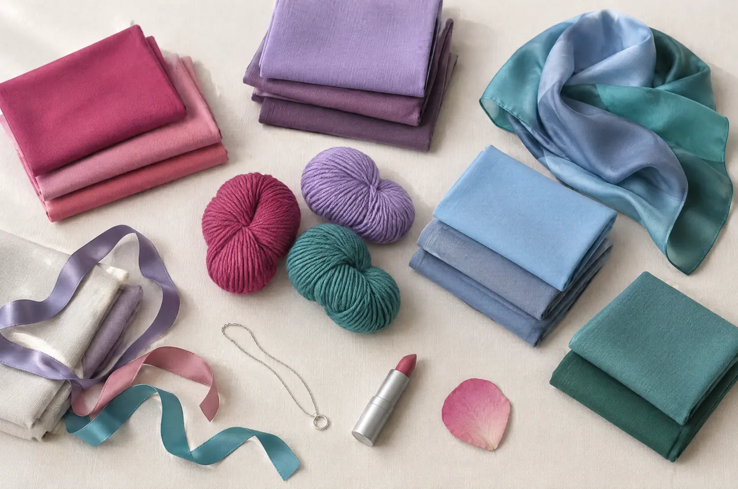
Coolness leads. Every color in Cool Summer leans toward blue, from the pinks to the greens. Depth sits in the middle, intensity runs soft to medium and contrast is moderate.
Picture lavender and old roses in flat gray light. Raspberry, Cool Lavender and Denim Blue, held together by Soft White, Medium Gray and Navy.
On a face, bluish pinks and raspberries give a healthy glow. Silver sits better than gold. Orange, golden yellow and terracotta muddy the complexion, and black is too harsh. Navy does the job black can’t.
Warm Autumn is gold-based, earthy and a little smoky
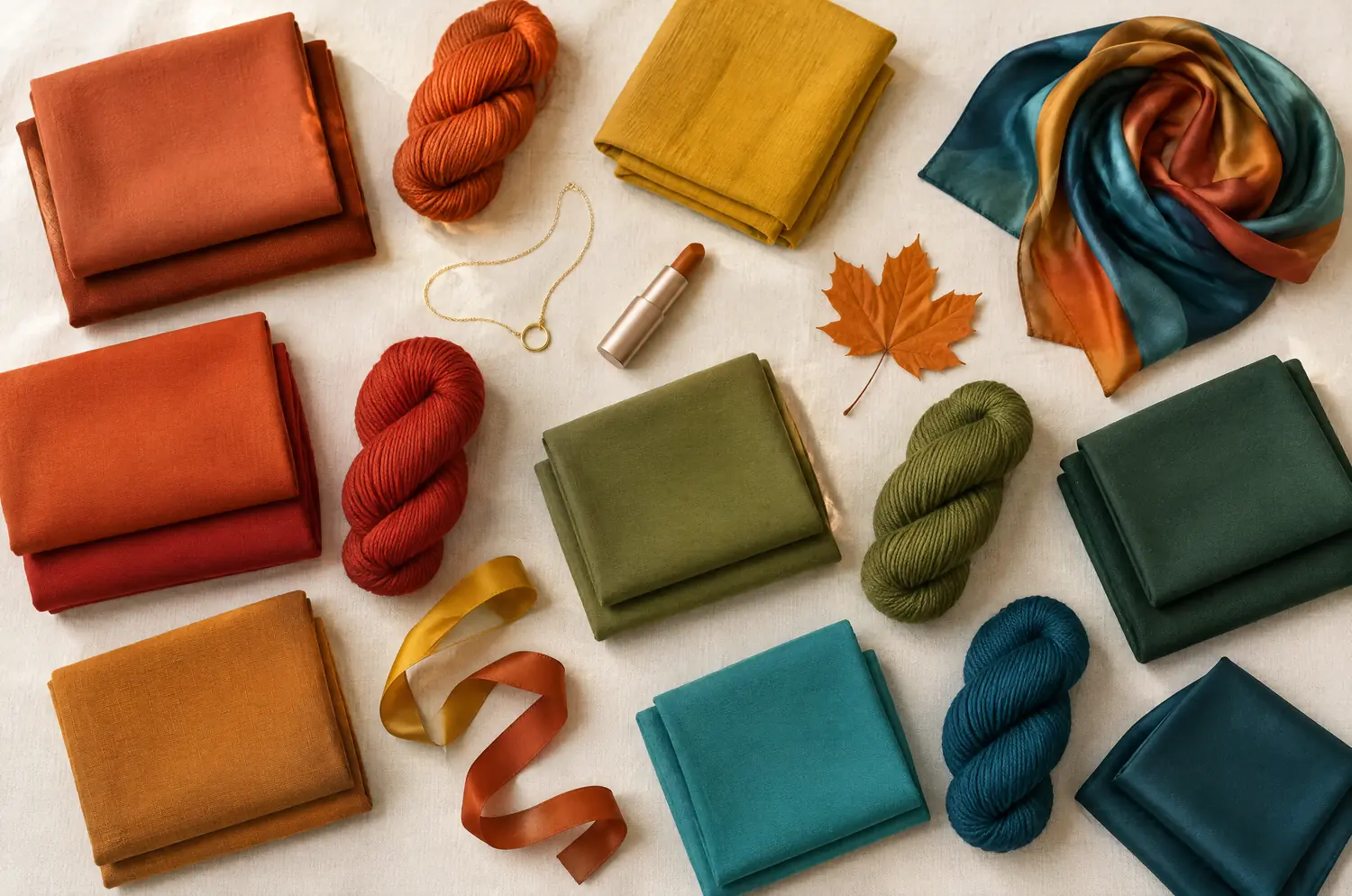
Warmth leads. Warm Autumn is very warm, medium in depth, rich with a slight haze, and moderate in contrast.
Its colors come from bark, moss and berries: Rust, Mustard, Olive Green, Petrol Blue. Cream, Camel and Chocolate carry them.
On a face, yellow gold, copper and bronze sit better than silver, and the warmth reads as health.
Mustard and rust, hard colors for almost everyone, are where a Warm Autumn glows. Cool colors do the opposite. Fuchsia and glacier blue bring out redness, and cool grays dim the complexion. Coppery or golden hair often goes with this palette, but cover your hair and read the skin.
Blue against gold, soft against rich: what separates these two palettes?
Temperature comes first, and it is the loudest difference. These sit at opposite ends of the axis. Cool Summer is very cool. Warm Autumn is very warm.
Put Raspberry next to Rust and you see it at once. One is a cool pink-red, the other an orange-brown red. A warm color on a Cool Summer turns the skin muddy or yellow. A cool color on a Warm Autumn turns it gray, or brings out the redness.
Intensity comes second, and it is subtler. Cool Summer runs soft to medium. Warm Autumn runs rich and slightly muted. You notice it more once temperature is out of the way.
Now what they share. Both sit at medium depth and moderate contrast. Neither palette asks for pale pastels or deep darks.
So don’t go looking for a lightness difference. There isn’t one.
The two-color test. In daylight, with no makeup, hold a piece of fabric in each of these two colors up to your face. Rest your eyes between the two and redo it another day. If the same color keeps winning, you have a direction: a first hint, not a verdict.
What does your skin do next to Raspberry, then next to Rust?
Follow the setup in color draping at home, then look only at these two.
Temperature is the first look. Under Rust, does your skin warm up and look healthy, or does it go yellow and tired? Under Raspberry, does it turn fresh and pink, or does it go gray and flat?
If Rust warms you and a bluish pink flattens you, you’re leaning Warm Autumn. If Raspberry clears your face and Rust makes you look sallow, you’re leaning Cool Summer. Watch whether dark circles stand out under Rust.
Intensity is the second look. If the temperature looks right but the color still feels off, check the softness. A color that seems to shout next to your face points toward the softer palette. One that looks faded points toward the richer one.
If one side comes out ahead each time you try, that is a direction. If the results flip, redo the drape on another day before you decide.
Raspberry and Rust both seem fine on you: what then?
These two sit at opposite ends of the temperature axis, so a true tie is rare. In my view, redo the drape on another day before you look for a third answer.
If it still ties, read it by the leading trait. If Raspberry edges ahead, compare Cool Summer with True Winter, the neighbor with the same coolness. If Rust edges ahead, compare Warm Autumn with Warm Spring, the neighbor with the same warmth.
Blue-green is one family both palettes touch. Cool Turquoise and Soft Spruce Green sit on one side, Warm Turquoise and Petrol Blue on the other. Same family of hue, but each leans its own way.
A quiz or an app can’t settle this, because neither one watches your skin react. Use the ten-question color quiz for a starting point, then go back to the fabric.
Lipstick and metal lean opposite ways, and hair gives only a direction
Lips follow the temperature. Cool Summer looks right in raspberry, blue-toned pink and soft cherry, and its red is a cool red. Warm Autumn goes to terracotta, brick, tomato red and burnt coral.
Metals lean the same way: silver, white gold and platinum for one, yellow gold, copper and bronze for the other. Treat that as a direction and test it near your face.
Hair is the weakest vote. Ash tones belong to Cool Summer, and red, auburn or golden brown to Warm Autumn. But dyed hair changes nothing about your season. Cover it and read the skin.
Keep exploring
More on these two sub-seasons
Palette Cool Summer color palette
Cool made gentle: blues, pinks and raspberries without any harshness.
Outfits Cool Summer outfits and capsule wardrobe
Cool Summer outfits built on eight pieces: navy, gray, raspberry and soft white, how to wear them, and what to do with orange and black. Start with navy.
Compare Cool Summer vs Bright Winter
Cool Summer vs Bright Winter: the three differences that matter, what each looks like on your face, and a drape test with Raspberry and Fuchsia to settle it.
Compare Cool Summer vs Deep Winter
Cool Summer vs Deep Winter: all four axes differ. I show what each difference looks like on a face and how a quick drape test settles the question for you.
Compare Cool Summer vs Light Summer
Cool Summer vs Light Summer: all four axes differ, so the answer is on your face. Here is what each difference looks like and how to settle it at home.
Compare Cool Summer vs Soft Autumn
Cool Summer vs Soft Autumn: three differences that matter, what each looks like on a face, and a quick drape test to settle it, even if you sit between.
Questions
Cool Summer or Warm Autumn: your questions
How do I tell if I’m a Cool Summer or a Warm Autumn?
Watch which undertone brightens your skin. A bluish pink should make you look fresh if you’re a Cool Summer, while a rust or terracotta makes you look sallow. For a Warm Autumn it is the reverse. Do it in daylight with makeup off.
Can a Cool Summer wear Warm Autumn colors?
Not the core ones. Orange, golden yellow and terracotta are on the Cool Summer avoid list because they muddy the complexion. Hold one under your chin and see for yourself. A bag or shoes in a color you love is your call, since the best color is sometimes the one that serves your goal.
What colors should a Warm Autumn avoid?
Black, fuchsia, cool gray and glacier blue. All four are too cool for this sub-season. They bring out redness and gray out the complexion. Next to your face, try Chocolate, Khaki or Olive Green instead, and watch your skin.
Is this the same as True Summer vs True Autumn?
Yes. Cool Summer is also called True Summer, and Warm Autumn is also called True Autumn. They are the same two sub-seasons under different names, so everything here applies whichever name you typed.
My quiz said one, but the other looks better on me. Which is right?
A quiz is a first hint. It asks about you but can’t see your skin react to color. The drape shows what the quiz can’t. Trust the fabric that keeps flattering you, then read the matching season page to check it.
Cool Summer or Warm Autumn? Check it.
The free quiz shows you your likely season in two minutes. Then run the two-color test on your own bare face, in daylight: a first hint, not a verdict.