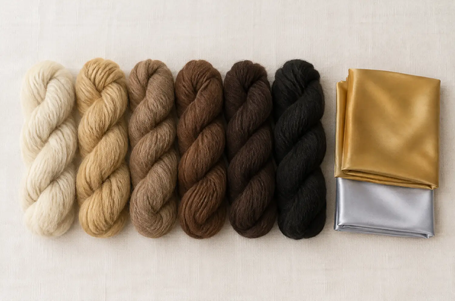
Skin tone alone doesn’t pick a palette. Three things do: temperature (warm, cool or neutral), lightness (how light or deep your whole coloring reads) and intensity (how soft or bright it looks). Hair and eyes count as much as skin.
The three axes are laid out on the seasonal color analysis page. Here are six readings, each with a few shades taken from the palette of its sub-season.
| One example of a coloring |
Sub-season it can point to |
A few palette colors |
| Slightly warm, very light |
Light Spring |
Peach, Light Coral, Butter Yellow |
| Slightly cool, very light |
Light Summer |
Powder Pink, Lavender, Sky Blue |
| Neutral to warm, very soft |
Soft Autumn |
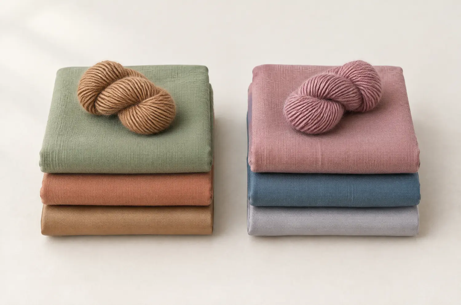
Sage Green, Light Terracotta, Caramel |
| Neutral to cool, very soft |
Soft Summer |
Dusty Rose, Slate Blue, Cool Sage |
| Neutral to warm, dark and rich |
Deep Autumn |
Warm Burgundy, Brick Red, Spruce Green |
| Neutral to cool, dark and saturated |
Deep Winter |
Cool Burgundy, Plum, Midnight Blue |
Bright palettes follow the same logic. Bright Spring brings Bright Coral and Turquoise. Bright Winter brings Shocking Pink and Electric Blue.
Two neighbors show how fine the differences get. Light Spring and Light Summer are both very light. Temperature separates them: slightly warm for one, slightly cool for the other. Peach belongs to the first, Powder Pink to the second.
Two sub-seasons can share a temperature and still differ. Soft Autumn and Deep Autumn are both neutral to warm, but one is medium and soft, the other dark and rich. They are not interchangeable, because depth and intensity count as much as temperature.
Now look at what the table leaves out: fair, olive, brown, deep. That’s deliberate.
Each skin tone turns up in all four seasons. What sorts people is the temperature, depth and intensity of the whole coloring, hair and eyes included. The rows above are colorings, not skin tones.
You can browse all twelve sub-seasons and compare palettes with what you saw in the mirror.