Free: the color analysis quiz. Find your season in 2 minutes →Free quiz: your season in 2 minutes →

Color Analysis Glossary: The Terms I Use, in Plain English

Overtone vs undertone, plus lightness, intensity and contrast. Each term in plain English, with swatch examples and the words I use on this site instead.

Lisa Routa, color analyst

By Lisa RoutaPublished · 8 min read

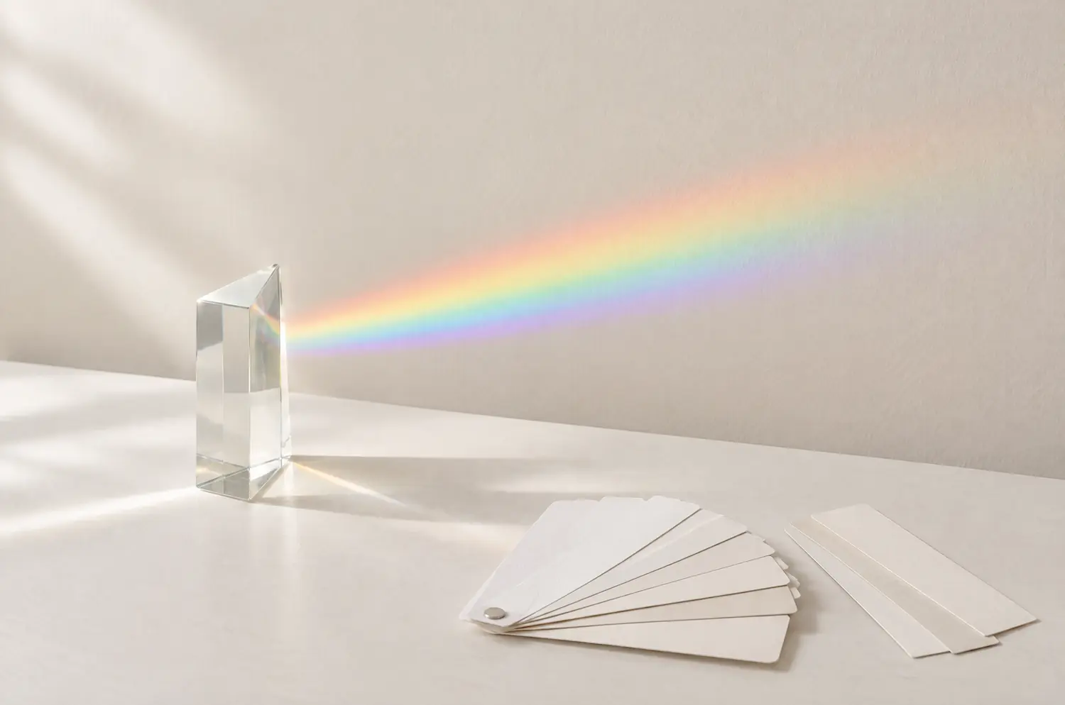
A glass prism casting a spectrum of colors on a light wall, next to blank paper swatch cards
On this page8 sections
  1. Why can two people share a skin tone and not an undertone?
  2. Does a color have a temperature too?
  3. Is lightness the same as value, and where does depth fit?
  4. What is chroma in color analysis, and why call it intensity?
  5. What does contrast level mean in color analysis?
  6. Which analyst words get a plainer name on this site?
  7. Questions people ask
  8. Which word will you check on your own face first?

You don’t need color theory to find your colors.

Skip the color wheel.

Skip tints, shades and complementary pairs.

Skip any word you can’t use at a mirror.

A handful of words does the work. Five of them, really.

The mix-ups start with two that sound alike: overtone and undertone. They sound alike, so they get mixed up.

Start there. Lightness, intensity and contrast follow, each with the analysts’ word next to mine.

Why can two people share a skin tone and not an undertone?

Skin tone is the color your skin looks: fair, light, medium, tan, deep. It tells you how light or deep the surface reads. That’s all it tells you.

Overtone is the color sitting on top, sometimes named surface tone. A tan moves it. So do redness, a flush and a long afternoon outdoors.

Undertone is the part that stays put. A golden or peachy cast reads warm. A pink or bluish cast reads cool.

Neutral sits in the middle, with neutral-warm and neutral-cool as the readings around it. Olive carries a muted, slightly green cast.

Picture two people with the same medium skin tone. After a week outdoors, both look different. Their overtones moved. Their undertones didn’t, and that is where the two may still differ.

That’s why skin tone vs undertone trips people up. The two words answer different questions. Skin tone asks how light or deep. Undertone asks which way the color leans.

Two people can share a skin tone and lean opposite ways. A fair person and a deep-skinned person can share an undertone.

Term What it describes What moves it Plain example
Skin tone How light or deep your skin looks Sun, makeup, time outdoors Fair, medium, tan, deep
Overtone The surface color on top A tan, redness, a flush Pink cheeks on a fair face
Undertone The steady tone beneath Hardly anything Golden, pinkish-blue, in between, or a green-gray cast

A tan changes your overtone for a while. For what it really changes, see the article on whether your season can change.

For a full guide to reading yours, see skin undertone. Olive doesn’t sort neatly into warm or cool, so it has its own page: olive skin tone colors.

Does a color have a temperature too?

Yes. Colors lean the way undertones do. The lean is called temperature: a pull toward yellow reads warm, a pull toward blue reads cool.

Temperature slides. It doesn’t switch.

Take two red-pinks. Coral #FF6F52 pulls toward orange, so it’s warm. Raspberry #C73866 pulls toward blue-violet, so it’s cool. Same family, and they can do opposite things near the same face.

Beige follows the same logic. A golden-leaning beige is warm, a pinkish one is cool. That’s why two garments sold as “beige” can behave nothing alike on you.

Orange is the case that shows how it works. Every orange stays warm. You can soften it with gray or white, but you can’t turn it cool.

Some faces read neutral. They react less to temperature, so lightness and intensity do more of the sorting.

Temperature, lightness and intensity are the three axes behind seasonal color analysis.

Is lightness the same as value, and where does depth fit?

Yes, and depth is the same thing again. Lightness is how light or dark a color is. Analysts call it value, and you’ll also see depth. One axis, three names. Lightness is the word to keep, because nobody has to translate it.

Take two warm colors. Peach #FFCBA4 is very light. Chocolate #4E2F1E is dark. Same warm lean, very different weight near a face.

Your own lightness comes from skin, hair and eyes together. A very light coloring, like Light Spring, can look overpowered by a heavy, dark color. A dark coloring, like Deep Winter, can make a pale color look faint.

Lightness is often the first thing you register in an outfit, before you name the color. So a color can be right in temperature and still feel wrong. It was simply too dark or too pale for you.

You’ll also read hue, tint, shade and tone. Hue is a color’s name: red, blue, green.

Tint is a hue plus white, so it gets lighter and softer. Shade is a hue plus black, so it gets deeper. Tone is a hue plus gray, so it gets quieter.

Good to recognize on a paint chip. For your face, lightness and intensity say the same things with fewer words. And tone already hides inside skin tone, undertone and overtone, which is enough.


What is chroma in color analysis, and why call it intensity?

Chroma is how strong or pure a color is. Analysts also say saturation. Intensity is the word to use here, because you can feel it: a color is loud or quiet.

High chroma colors are vivid and clean, with no gray in them. Low chroma colors are muted: gray has taken the edge off. Neither is better. They ask different things of a face.

Shocking Pink, Electric Blue and Lime Green are high chroma. You’ll find them in the Bright Winter and Bright Spring palettes. Slate Blue, Sage Green and Grayed Mauve are low chroma, and they live in the Soft Summer and Soft Autumn palettes.

Compare two pinks. Fuchsia #E0119D is pure and loud, the signature color of Bright Winter. Dusty Rose #C48A94 is soft and grayed, the signature color of Soft Summer.

Intensity and lightness are separate. Powder Pink #F4C2D0 is very light and soft. Bright Coral #FF5A4D is medium in lightness and vivid. A pale color isn’t automatically a soft one.

Dull describes what a wrong color does to you, never a palette. A soft palette is muted, not dull. Dull is the gray cast your skin takes on next to a color that doesn’t suit you.

If you’ve ever decided you’re “not a color person,” test intensity before you give up on color. A very loud color near a soft face can make people see the garment first.

What does contrast level mean in color analysis?

Contrast is the distance between your hair, eyes and skin, seen together. It reads as low, moderate or high. Light hair, light eyes and fair skin sit close together, so the contrast is low. Dark hair against fair skin and light eyes pushes it up.

It’s a clue, not a rule. Contrast can point toward a season, but it can’t settle one alone, because quite different sub-seasons share it.

Sub-season Contrast Lightness Intensity
Light Summer Low Very light Soft
Soft Summer Low Medium Very soft, grayed
Soft Autumn Low to moderate Medium Very soft, desaturated
Deep Autumn High Dark Rich and intense
Bright Winter Very high Medium Very bright

Look at the first two rows. Light Summer and Soft Summer are both low contrast. One is very light and soft, the other medium and very soft. Contrast can’t tell them apart. Lightness and intensity can.

The word also describes outfits. A white shirt with navy pants is high contrast. A camel sweater with cream pants is low. Test it yourself: hold a tone-on-tone outfit against a high-contrast face and see whether it flattens.

Read your contrast first, with hair, eyes and skin all in view. Then cover your hair when you hold colors up, so it stops reflecting its color onto your skin.

Which analyst words get a plainer name on this site?

Here is the whole translation in one place. When you read another site, this tells you what it means.

Word elsewhere Word on this site What it means Swatch pair
Value, depth Lightness How light or dark Ivory #FFF6E3 (Light Spring) to Espresso #2B1B14 (Deep Autumn)
Chroma, saturation Intensity How soft or bright Grayed Navy #3F4A5F (Soft Summer) to Bright Navy #1B2A6B (Bright Spring)
Warm, cool Temperature The lean toward yellow or blue Cream #F5E6C8 (Warm Autumn) to Soft White #F4F4F2 (Cool Summer)
Season type Season, sub-season Four seasons, twelve sub-seasons Soft Autumn is a sub-season of Autumn

A palette is a set of colors. One color chip is a swatch. Neutrals are the base colors of a wardrobe: black, white, beige, gray, navy, brown.

You can skip complementary, analogous and harmony. They belong to the color wheel. They help you pair two colors in an outfit, but they don’t tell you what your skin does with either one.

In my view, a color term is worth knowing only if it changes what you do in front of the mirror. My advice: read this once, then put it down and look at a face.

Questions people ask

How do I check my undertone?

Compare a warm and a cool version of one color against your bare face. Try Coral and Raspberry, held under your chin by a window, hair pulled back. One pair gives a direction, not an answer, so repeat it with other pairs. Veins and jewelry can mislead you, so read warm vs cool undertone if your tests disagree.

Are there four types of skin color?

No. Skin tone has no set number of types. Charts usually run from fair to deep, with undertone added as warm, cool, neutral or olive. The four you may be thinking of are the seasons, which describe colors and coloring, not skin types. For the chart itself, see this skin tone chart.

What colors look good with warm undertones?

Colors with a golden or peachy lean often do. But warm undertones appear in more than one season, so lightness and intensity matter as much as temperature. Coral is the signature color of Warm Spring, light and bright. Rust is the signature of Warm Autumn, richer and slightly muted. Same warmth, different faces.

Can AI tell me my skin tone?

A photo carries the light of the room and the camera, so any shade read from it is an estimate. No tool can see your skin react to colors held near your face. The article on ChatGPT and color analysis shows where AI and apps go wrong, and how to use them as a rough marker.

How do I know what season my coloring is?

Read your temperature, lightness, intensity and contrast. Then hold colors in pairs against your bare face, hair covered. A single pair only suggests a direction. Watch several pairs, then repeat on another day, at another hour, before you trust what you saw.

Which word will you check on your own face first?

Pick one: temperature, lightness, intensity or contrast. Read it on yourself this week, before you read anything else.

A color word only matters once you’ve seen what the color does to a face, yours first.

When you want a likely season to test against, try my free color analysis quiz. It takes about two minutes and needs no sign-up. You get a probable season and a sub-season pointer to compare with what you saw on your own face.

With all my heart and passion, Lisa

Free quizWhat’s your color season?10 questions, no sign-upTake the quiz

Go further

A closed cream booklet on linen, surrounded by fabric squares and paper chips in a pastel gradientPDF guides by sub-seasonOne guide for each of the 12 sub-seasons: palette, outfits, makeup and hair.Coming soon
A closed cream booklet on linen, surrounded by fabric squares and paper chips in a pastel gradient

Free

Get Lisa’s color advice by email

New articles from Lisa, and a note when the PDF guides open.

Keep reading

Read next

Seasons mentioned in this article

Ready to find your colors?

Take the free quiz for a first hint of your season, then explore the 12 seasons to see your palette.

Free quizThe 12 seasons